| Image |
Comment |
| 05/29/2003 06:10:41 AM |
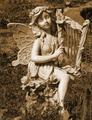
Cemetery Angelby sunflowerComment: What a charming model. :-> And good lighting to bring out her personality and contrast her from the background. |
 Photographer found comment helpful. Photographer found comment helpful. |
| 05/29/2003 06:10:12 AM |
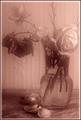
Black & white H2Oby ladpupmoeComment: Very contrasty, which is sort of good, but the very flatness of the tones makes it look more like an abstract painting (in chunks of solid color) than a duotone or nuanced photograph. Also, the glass, straw, and bottom drape are all just enough out of focus to be kind of annoying ... to me. Personal taste. :-> 6. |
| Photographer found comment helpful. |
| 05/29/2003 06:07:47 AM |
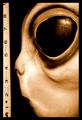
Fragility in Blueby moodvilleComment: Gorgeous focus, lighting, contrast. The color adds nicely without being distracting (despite its strong saturation). Very, very well done. |
| Photographer found comment helpful. |
| 05/29/2003 06:07:23 AM |
|
| Photographer found comment helpful. |
| 05/29/2003 06:07:03 AM |
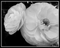
Queen of the gardenby pitsamanComment: Nice focus, clean, tidy, good contrast with the background. The flowers pop, as if they were glued to my monitor. |
| Photographer found comment helpful. |
| 05/29/2003 06:06:35 AM |
wiltingby Pep VentosaComment: I know you did it on purpose, but the blur makes it look like there's a dirty window between me and the subject, and is distracting as hell. The lighting is very bright and harsh on the right and very dark on the left, without seeming to highlight where we're 'supposed to look' in any way. The only real focus of attention I can find is the fallen petals at the bottom or the shapes on the wall ... which I doubt is what you intended. |
| Photographer found comment helpful. |
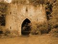
| 05/29/2003 06:02:40 AM |
Castleby trishComment: A little more contrast/blackpoint might have helped the castle jump from the background a bit more strongly. This might have been a 9 or 10 ... but even as-is, definitely 7. |
| Photographer found comment helpful. |
| 05/29/2003 06:01:59 AM |
Rain, Rain, Stay and Play!by christeyComment: The blurred arm distracts from the shot, especially since nothing in the frame is really *in* focus. The eye tries to fasten on the kid, but then slides off to the plants because of focus and lighting. A good 'almost' shot. If time and equipment permitted, I'd have shot lots of frames of the same session, and picked the one that worked out of twenty or so. |
| Photographer found comment helpful. |
| 05/29/2003 06:00:10 AM |
The source of all of the colour BROWNby MorganComment: The color is so saturated that it actually distracts from the image - it makes it harder to distinguish the subject from the background, because they all bleed together with no clear boundary. Focus and composition decent, though. |
| Photographer found comment helpful. |
| 05/29/2003 05:59:32 AM |
Lancing collageby marboComment: Hrm. I know the focus artifacts in this are probably on purpose, but I find them incredibly distracting. It draws the eye to the bush in front and drops it there (and I doubt the bush was your intended center of attention). 6, but coulda been 8. |
| Photographer found comment helpful. |
Home -
Challenges -
Community -
League -
Photos -
Cameras -
Lenses -
Learn -
Help -
Terms of Use -
Privacy -
Top ^
DPChallenge, and website content and design, Copyright © 2001-2025 Challenging Technologies, LLC.
All digital photo copyrights belong to the photographers and may not be used without permission.
Current Server Time: 04/08/2025 04:36:49 AM EDT.