| Image |
Comment |
| 07/22/2003 07:32:23 PM |
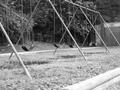
Swingsetby DavidLevinComment: I like the repetitive elements in the picture a lot, David, even though the photo is a bit "busy" and there's no obvious center of focus.
You might try a different crop to get the swings and poles to show better, perhaps cutting out the set of swings that isn't really complete on the left hand side of the photo, and getting rid of the large area of foreground. Once you get a tight crop and those repetitive elements don't have to compete with the surrounding area, you might be able to get a better light and dark contrast.
I don't know what it is, but there's always something about a photo of an empty swing set that really gets me emotionally. Good choice of subject! Ruth :)
|
 Photographer found comment helpful. Photographer found comment helpful. |
| 06/06/2003 09:37:44 AM |
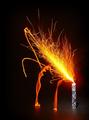
Moonlight Sonataby qachykComment: I like the idea, but there seems to be no focus in this photo at all and, for me, that makes it very hard to look at. |
| Photographer found comment helpful. |
| 06/06/2003 09:33:48 AM |
|
| Photographer found comment helpful. |
| 06/06/2003 09:33:30 AM |
Loud!by jodiecostonComment: I like the photo for the "sound" topic, but I think the lack of contrast makes it a very flat photo, and it might be improved by playing with the levels some to add give it a little more dimension. |
| Photographer found comment helpful. |
| 06/06/2003 09:27:22 AM |
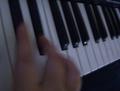
Sound of Musicby sherryk471Comment: I like the idea for the photo, but the focus is a little bit off -- at least my eye goes immediately to his thumb, and the focus appears to be on the top of his hand. |
| Photographer found comment helpful. |
| 06/06/2003 09:25:52 AM |
|
| Photographer found comment helpful. |
| 06/06/2003 09:24:11 AM |
Not so loudby Crafty SueComment: I personally might have cropped out some of the bottom (to their waists) and some of the hedge on the right to bring the focus a little more on the children's upper bodies, but however you crop it, it's a great photo for "sound." 8 |
| Photographer found comment helpful. |
| 05/29/2003 11:34:42 AM |
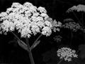
whites in the May duskby kenboComment: There's a bit too much contrast here for me -- I have to squint when I look at the main blossom and its brightness seems to weigh the picture down on that side -- it looks like the photo is about to fall forward. |
| Photographer found comment helpful. |
| 05/29/2003 11:30:36 AM |
|
| Photographer found comment helpful. |
| 05/29/2003 11:29:00 AM |
|
| Photographer found comment helpful. |
Home -
Challenges -
Community -
League -
Photos -
Cameras -
Lenses -
Learn -
Help -
Terms of Use -
Privacy -
Top ^
DPChallenge, and website content and design, Copyright © 2001-2025 Challenging Technologies, LLC.
All digital photo copyrights belong to the photographers and may not be used without permission.
Current Server Time: 04/07/2025 08:38:41 AM EDT.