DPChallenge: A Digital Photography Contest You are not logged in. (log in or register
 
Challenge Entries
Portfolio Images
This image is not part of a public portfolio.
whites in the May dusk
kenbo


Photograph Information Photographer's Comments
Challenge: Duotones (Classic Editing)
Camera: Sony DSC-P1
Location: Sakata, Japan
Date: May 23, 2003
Aperture: f/7.1
ISO: 100
Shutter: 1/204
Galleries: Nature
Date Uploaded: May 23, 2003

N/A

Statistics
Place: 127 out of 147
Avg (all users): 4.9492
Avg (commenters): 5.6667
Avg (participants): 4.9186
Avg (non-participants): 5.0313
Views since voting: 857
Votes: 118
Comments: 4
Favorites: 0


Please log in or register to add your comments!

AuthorThread
06/08/2003 06:19:34 PM
*Critique Club*
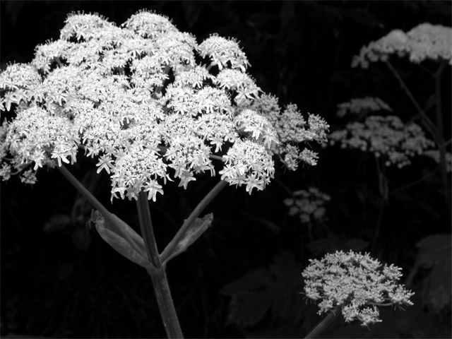
What I notice first, is how bright the main bunch of flowers is. It's texture in combination with the brightness kind of makes the individual little flowers just blend in with each other making one large blob. This looks like what we call "Queen Anne's Lace".
What I notice next howeve, is that the bright bunch is still actually greyish, so lessening the brightness would make it even greyer and leaving this a really grey image. I'm not really sure what can be done to help fix this problem, with the issue of the brightness and greyness. I'd rather have the brightness, than the greyness.
The next thing I notice is the way each little flower puff is a different shade, and one is darker than the next. I like how this creates depth within the photo. As the photo fades into darkness, so do the flowers. I find this really visually appealing.
Your focus and DOF are really good. The focus of the main flower in the front, on the stem is really clear. Probably clear on the flower part also, but the brightness making is all blend together makes determining focus of that section difficult. Then, as the DOF fades into the background, with the darkening of the flower puffs is really looks good.
I wonder how it would effect the impact had the entire main flower been in the frame. You have cut off a small portion of it, which doesn't seem to effect it much, if at all. Curious to see if it has an impact being all in the frame.
I think it's nice. That brightness does effect it though in a negative way. Had not been for this, this would be a VERY nice shot.
~Heather~
  Photographer found comment helpful.
 Comments Made During the Challenge
05/31/2003 06:20:34 AM
I'm split on this shot. I wish there was a bit more on the left - the crop/composition is too tight. I like the DoF but not the exposure - the whites seem almost too bright in the closest flower. A very hard to judge shot, but one that appeals to me. 8
  Photographer found comment helpful.
05/29/2003 11:34:42 AM
There's a bit too much contrast here for me -- I have to squint when I look at the main blossom and its brightness seems to weigh the picture down on that side -- it looks like the photo is about to fall forward.
  Photographer found comment helpful.
05/26/2003 12:21:17 PM
Seems to be missing a bit of oomph. Maybe not as dark of a background and brighter flowers . Jacko.
  Photographer found comment helpful.


Home - Challenges - Community - League - Photos - Cameras - Lenses - Learn - Help - Terms of Use - Privacy - Top ^
DPChallenge, and website content and design, Copyright © 2001-2025 Challenging Technologies, LLC.
All digital photo copyrights belong to the photographers and may not be used without permission.
Current Server Time: 04/07/2025 12:54:02 PM EDT.