| Image |
Comment |
| 07/04/2006 10:36:11 AM |
... A little over the shoulder!by jah_luvComment: Technical: Focus - 1
Exposure - 1
Quality - 0
Aesthetic: Comp. - 0
Light - 1
Color - 0
Wow Factor: 0
Personal Tilt: 1/3
What I liked: Reflection in the shiny shaker cap is cool. The blue is cool.
What I didn't like: Low image quality, the yellow in the corners is distracting |
 Photographer found comment helpful. Photographer found comment helpful. |
| 07/04/2006 10:34:06 AM |
Taste Like Chicken.by BullieComment: Technical: Focus - 1
Exposure - 1
Quality - 1
Aesthetic: Comp. - 0
Light - 1
Color - 1
Wow Factor: 0
Personal Tilt: 2/3
What I liked: Cute pic. Funny title. Detail in the wiskers.
What I didn't like: Centered composition. |
| Photographer found comment helpful. |
| 07/04/2006 10:34:02 AM |
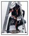
Black Cat Under The Ladder!by KitaComment: Technical: Focus - 1
Exposure - 1
Quality - 1
Aesthetic: Comp. - 1
Light - 1
Color - 1
Wow Factor: 0
Personal Tilt: 2/3
What I liked: Good idea, well executed.
What I didn't like: Position of the models hands. The angle of the face with the expression. |
| Photographer found comment helpful. |
| 07/04/2006 10:33:59 AM |
Blackeyed Peas on New Year's - Money all Year!by crikComment: Technical: Focus - 1
Exposure - 1
Quality - 1
Aesthetic: Comp. - 1
Light - 0
Color - 1
Wow Factor: 0
Personal Tilt: 1/3
What I liked: Blackeyed peas, $20, new years. Haha, also, I like the composition with the negative space in the upper right.
What I didn't like: Subject isn't very enthralling, and the paper is a different shade of white than the background was. Light seems fairly flat. |
| Photographer found comment helpful. |
| 07/04/2006 10:25:59 AM |
Lookin' for a wee bit o' luck...by DemonLlamaComment: Technical: Focus - 1
Exposure - 1
Quality - 1
Aesthetic: Comp. - 1
Light - 1
Color - 1
Wow Factor: 0
Personal Tilt: 0/3
What I liked: Use of desaturation and color.
What I didn't like: I don't especially like the content of the image. |
| Photographer found comment helpful. |
| 07/04/2006 10:20:27 AM |
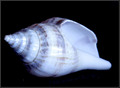
So you can hear the ocean?by TrollManComment: Technical: Focus - 1
Exposure - 1
Quality - 1
Aesthetic: Comp. - 1
Light - 1
Color - 1
Wow Factor: 0
Personal Tilt: 1/3
What I liked: Very well taken exposure. Nice shell
What I didn't like: Seems a bit blue, getting more in focus may have been beneficial. |
| Photographer found comment helpful. |
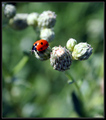
| 07/04/2006 10:18:42 AM |
Lucky Ladybugby Sparky9001Comment: Technical: Focus - 1
Exposure - 1
Quality - 1
Aesthetic: Comp. - 1
Light - 1
Color - 1
Wow Factor: 1 for a great POV and really beautiful colors.
Personal Tilt: 3/3
What I liked: Great shot of the ladybug, I love the shallow DOF.
What I didn't like: Might have been a bit better without that second seed thing there, but I gave this a 10, obviously, I'm not holding it against you =) |
| Photographer found comment helpful. |
| 07/04/2006 10:16:46 AM |
NEVER Play Alone!by skasubaComment: Technical: Focus - 1
Exposure - 1
Quality - 1
Aesthetic: Comp. - 1
Light - 1
Color - 1
Wow Factor: 0
Personal Tilt: 1/3
What I liked: Texture is nice. Quality of the entire image is very good.
What I didn't like: It's not your fault, but the white thing doesn't seem to match the board very well. The fact that there is a black strip where the board doesn't fill the frame at the top. |
| Photographer found comment helpful. |
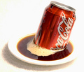
| 07/04/2006 10:14:01 AM |
Acidic enough to eat through metal...by TygerrComment: Technical: Focus - 1
Exposure - 1
Quality - 1
Aesthetic: Comp. - 1
Light - 1
Color - 1
Wow Factor: 0
Personal Tilt: 2/3
What I liked: Stands out very well. I like the red.
What I didn't like: Texture under the plate is distracting. |
| Photographer found comment helpful. |
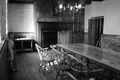
| 07/04/2006 10:10:23 AM |
Haunted castle at Fort Niagaraby lwkimagesComment: Technical: Focus - 0
Exposure - 1
Quality - 1
Aesthetic: Comp. - 1
Light - 1
Color - 1
Wow Factor: 0
Personal Tilt: 2/3
What I liked: The image itself is intersting. I like the black and white.
What I didn't like: Not sure what's supposed to be in focus. It seems a little soft to me, overall. |
| Photographer found comment helpful. |
Home -
Challenges -
Community -
League -
Photos -
Cameras -
Lenses -
Learn -
Help -
Terms of Use -
Privacy -
Top ^
DPChallenge, and website content and design, Copyright © 2001-2025 Challenging Technologies, LLC.
All digital photo copyrights belong to the photographers and may not be used without permission.
Current Server Time: 04/16/2025 06:48:33 AM EDT.