| Image |
Comment |
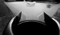
| 09/13/2005 08:49:20 PM |
Impactby IncarlightComment: Great long exposure shot and some classic B&W to boot. Glad to actually see some bits of creativity in some of these submissions. |
 Photographer found comment helpful. Photographer found comment helpful. |
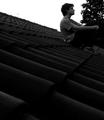
| 09/13/2005 08:48:02 PM |
Sad Timeby WawaaComment: Think this could really use a different F-stop, it's looking really under-exposed. |
| Photographer found comment helpful. |
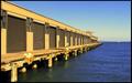
| 09/13/2005 08:43:18 PM |
In to the blue...by hitendraComment: From what I've seen, there seems to be very few photographs in perspective, and even those that are, doesn't seem to add any drama to the photo. Thank you for submitting this, it breaks the mold. Love the saturated brown against the background of the blue sea and atmosphere. |
| Photographer found comment helpful. |
| 09/13/2005 08:29:45 PM |
I see a new beginning...by dwterryComment: Interesting twist on perspective (I, like most never would've thought of that...was thinking purely physical), I'd like to see how this does. |
| Photographer found comment helpful. |
| 09/06/2005 06:55:07 PM |
Silhouetted Balconyby SteveinnzComment: This has a lot of potential, but in all honesty just really lacks in composition. The top of the window is cut off, the bottom is obstructed, and the entire scene is slightly tilted. My recommendation is that on the next shot, to crop out the entire bottom portion that's obstructed, and focus on what you're able to capture...and composing the picture in a more rectilinear manner will give the shot more potency. |
| Photographer found comment helpful. |
| 09/06/2005 12:50:36 AM |
Convergenceby justin_hewlettComment: I think the idea is good, the perspective on this is great, but it actually suffers from a lack of contrast...too much grey where they could be white. Advanced editing was allowed, so I think you could've played with the results a little. :) |
| Photographer found comment helpful. |
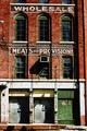
| 09/05/2005 01:42:31 PM |
Train Yard Storiesby KaDiComment: Love the photo, dig warehouse buildings - I do think this could benefit from some editing. At first glance, this appears slightly tilted to the right. In addition, it could use some crop...either while taking the photo, or post-editing. For example, consider the light on the lower left hand at top...it's just sort of sitting there without a purpose. Do you include more around it, to use it in the composition, or do you completely crop it out? Likewise with the shadow of the door that bleeds off the lower-left hand side. |
| Photographer found comment helpful. |
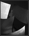
| 09/05/2005 01:37:56 PM |
Asymetricalby TelehubbieComment: Looks like a Gehry building. I like the composition, could probably benefit from a little bit more daylight reflection, perhaps at a differenttime of day. |
| Photographer found comment helpful. |
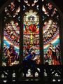
| 09/05/2005 01:37:10 PM |
Cathedral of Colourby MatthewComment: First of all, this is excellent exposure. Great colors, and this fits in well with the subject. I do have to say, the inclusion of a figure really takes away some of the inherent mystique and aura of this photograph, especiallyin regular street clothes. |
| Photographer found comment helpful. |
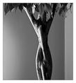
| 09/05/2005 08:26:39 AM |
Woman In Boudoirby johansecComment: This trunk is very human, even feminine in profile. The contrast really accentuates this...good greyscale and a good catch. |
| Photographer found comment helpful. |
Home -
Challenges -
Community -
League -
Photos -
Cameras -
Lenses -
Learn -
Help -
Terms of Use -
Privacy -
Top ^
DPChallenge, and website content and design, Copyright © 2001-2025 Challenging Technologies, LLC.
All digital photo copyrights belong to the photographers and may not be used without permission.
Current Server Time: 04/07/2025 10:12:39 PM EDT.