| Image |
Comment |
| 01/28/2003 12:47:02 PM |
Avenueby mciComment: ..from Critique Club...
Hi Micheal
First of all, I think this photo should have scored better. It's tones and composition are very attractive to the eye. Your use of a shallow DOF only made this a 'classier' shot, and in my opinion works very nicely. The style of lettering on the sign is really cool and reminds me of David Carson's work.
Technically the photo is well done. the focus is good (understanding that you wanted a shallow dof). the lighting could have been a bit better. i'm not too crazy about the over-exposure happening on the top left.
Welcome back to the site, and hope to see more from you.
z |
 Photographer found comment helpful. Photographer found comment helpful. |
| 01/26/2003 06:47:36 AM |
Newcastle Sunsetby AndyLeeG4Comment: ...from Critique Club...
Hi Andy
FIRST IMPRESSION:
Nice and dramatic :)
COMPOSITION:
Perfect...I really don't know what I would change...perhaps making the photo larger by getting a bit more sky in. :)
TECHNICAL:
Maybe a tad under-exposed. I'm not too crazy about the cyan water...maybe you could have fixed that in post-processing. Focus is very nice. :|
ARTISTIC:
Very good eye. The sky compliments the roughness of the see and waves breaking agains the rocks. Nice job :)
OVERALL:
A great shot, a dramatic shot. :)
Cheers and good luck in the future challenges. |
| Photographer found comment helpful. |
| 01/22/2003 08:50:38 AM |
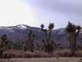
Where the mountains meet the desert...by terik65Comment: ...from Critique Club...
Hi Teri
FIRST IMPRESSION:
Nice scene. :|
COMPOSITION:
I don't have any problems with the setup of the photo. Maybe getting lower and shooting 'up' a bit more would get you a bit more sky and eliminate the bottom of the photo (path?) :)
TECHNICAL:
Your lighting seems a bit dark on the foreground. Also, there is quite a bit of noise on the photo. I realize that you are using a Sony camcorder, and I'm sure you don't have much control over exposure/shutter. :|
ARTISTIC:
I honestly think that this was a nice scenery to which the camera did no justice. :|
OVERALL:
A fair shot, technically poor. :(
Cheers and good luck in the future challenges. |
| Photographer found comment helpful. |
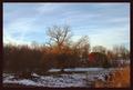
| 01/22/2003 08:26:46 AM |
Down On The Farmby GekkerComment: ...from Critique Club...
Hi Carey
FIRST IMPRESSION:
Nice...a bit dark :|
COMPOSITION:
It seems a bit too 'split in half'. I think that if you got more of the sky it would have looked better. I'm also not too crazy about the tree being right in the center. :(
TECHNICAL:
I guess because of the sky being so bright, the foreground turned out a bit dark. Playing with the levels might have helped a bit. Focus seems pretty good, as does the aperture selection. :|
ARTISTIC:
This is where your photo stands out. I think the colours are really nice, and the contrast between the sky blue and the red/orange tones of the barn and trees really work nice. :)
OVERALL:
I good idea that suffered a bit cause of the lighting.
Cheers and good luck in the future challenges. |
| Photographer found comment helpful. |
| 01/20/2003 12:30:53 PM |
|
| Photographer found comment helpful. |
| 01/20/2003 12:24:41 PM |
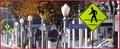
Traumaby PHOTOCHlXComment: i see what you were trying to do here, but maybe if you had gotten closer to the sign it would have worked better...good luck... :) |
| Photographer found comment helpful. |
| 01/20/2003 12:22:51 PM |
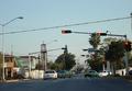
Where am I?by hardwaybetsComment: very nice colours on this shot...would like to see more of a symmetry, though...good luck :) |
| Photographer found comment helpful. |
| 01/20/2003 12:19:36 PM |
|
| Photographer found comment helpful. |
| 01/20/2003 12:17:42 PM |
First Stopby emagenComment: Mui buena, amigo. Me gusta de las colores...la composicion esta linda....and my spanish not so great :) |
| Photographer found comment helpful. |
| 01/20/2003 12:16:29 PM |
Chaoticby mliborioComment: i thinking shooting at such a wide angle creates a very distracting photo with nothing being the main subject. |
| Photographer found comment helpful. |
Home -
Challenges -
Community -
League -
Photos -
Cameras -
Lenses -
Learn -
Help -
Terms of Use -
Privacy -
Top ^
DPChallenge, and website content and design, Copyright © 2001-2025 Challenging Technologies, LLC.
All digital photo copyrights belong to the photographers and may not be used without permission.
Current Server Time: 04/09/2025 01:23:51 PM EDT.