| Author | Thread |
Comments Made During the Challenge  |
|
|
01/26/2003 04:41:54 PM |
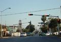
| This picture loses its detail as it is too small. jgillard5 |
|
|
|
01/26/2003 01:45:34 PM |
| good idea, good subject-too small. |
|
|
|
01/26/2003 07:04:46 AM |
| the signs should be closer. it is too distracting for me |
|
|
|
01/26/2003 02:15:43 AM |
| This image is just too small to be properly assessed. |
|
|
|
01/25/2003 04:51:21 AM |
| Like the helicopter in the shot |
|
 Photographer found comment helpful. Photographer found comment helpful. |
|
|
01/24/2003 01:07:18 PM |
| sorry, but I can't read the signs, their too small. |
|
|
|
01/23/2003 08:45:04 PM |
| Its a pitty the image is so small the detail is difficult to make out |
|
| Photographer found comment helpful. |
|
|
01/23/2003 06:55:41 PM |
| There was one of those at the helipad 6 blocks from my house just tonight... |
|
|
|
01/23/2003 09:00:35 AM |
| Just a bit too small. :-( |
|
| Photographer found comment helpful. |
|
|
01/22/2003 06:00:24 PM |
| It looks like something bad has happened when resizing this image - the text has become very blocky. Perhaps you could have tried not resizing it as small? Composition is pretty good - although perhaps you could have included the tail of the helicopter completely. |
|
|
|
01/22/2003 09:44:40 AM |
|
|
|
01/22/2003 02:25:50 AM |
| This would have been a great photo had it been larger, it seems much to small. I also think that zooming in some to cut out the tree on the left and bring the signs in closer to the viewer would have worked well. The helicopter in the background was a nice touch, it really adds to the atmosphere. |
|
| Photographer found comment helpful. |
|
|
01/21/2003 02:30:58 PM |
| Over all this is not an exciting photo when you first look at it. Was having trouble seeing any thing special about the sign. THEN I spotted the helicopter and the whole photo took on a different look. Wish you could have focused in on it better. That would have grabbed the attention. That would have been closer to a 10. But I will still give it a 7, even though I had to look for the "wow". |
|
| Photographer found comment helpful. |
|
|
01/21/2003 12:44:49 PM |
| Good shot, extremely clear, even if a bit small (hint). Other small nits: the tree trunk (foreground) is a bit pixelated (jaggy), as are some of the edges of the stop sign. I could have easily lived with just the right 2/3s of this shot (cropped just to the left of the stop sign) and a larger view. I'm not going to knock off a lot of points for this, just thought you should know...... 7 Swash |
|
| Photographer found comment helpful. |
|
|
01/21/2003 11:35:06 AM |
| Too small, too grainy, poor focus.. Cub |
|
|
|
01/21/2003 12:15:47 AM |
| This would have been a great shot if it had been a little more in focus and cropped differently. It is also a tad too noisy. The idea is good, there is quite a distance between those signs. Actually I first wanted to do something similar for my photo. |
|
|
|
01/20/2003 12:24:41 PM |
| i see what you were trying to do here, but maybe if you had gotten closer to the sign it would have worked better...good luck... :) |
|
| Photographer found comment helpful. |
|
|
01/20/2003 09:05:29 AM |
|
| Photographer found comment helpful. |
Home -
Challenges -
Community -
League -
Photos -
Cameras -
Lenses -
Learn -
Help -
Terms of Use -
Privacy -
Top ^
DPChallenge, and website content and design, Copyright © 2001-2025 Challenging Technologies, LLC.
All digital photo copyrights belong to the photographers and may not be used without permission.
Current Server Time: 04/07/2025 12:49:08 PM EDT.