| Image |
Comment |
| 06/22/2005 12:01:08 PM |
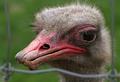
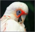
Caged Beautyby lawlessComment: From the Critique Club
Striking pose, fills the frame nicely. Maybe a bit to cropped off on top, just by a hair. Great detail in the hair,face and beak.
I think what may have hurt the image was opinions it was an ugly and beat up looking bird. I still find it very pleasing and not in that sort of mood.
I think the fence frames the bird nicely but a little more clarity might have given more emphasis with that. |
 Photographer found comment helpful. Photographer found comment helpful. |
| 06/22/2005 11:43:10 AM |
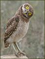
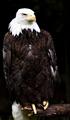
HUH ?by Jeff OComment: From the Critique Club
Very striking image, great mood and depth to the photo. Everything is beautifully detailed. I do find the tree limb to be a bit lackluster. I do not mind the business of the background. it does compete with the colors of the bird somewhat but not displeasing.
Nicely proportioned and centered well. I am not sure why the image did not do better. The border is nice and distracting. Probably came down to personal taste and you can never please everyone. |
| Photographer found comment helpful. |
| 06/22/2005 11:32:40 AM |
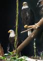
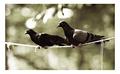
bald eagles in captivityby U622Comment: From the Critique Club
Stunning image, very well balanced. Nice tones and detail in the birds and textures. I do find the twigs/branches in the upper right corner a bit distracting.
I personally do not like the bamboo/cane/vine splitting the 2 birds. But I could see where others would welcome it.
The background seems a bit muddled but nothing you could have done about it. Overall a powerful image with what has become of our national birds. A closer crop or zoom might have gained it some points. |
| Photographer found comment helpful. |
| 06/22/2005 08:43:07 AM |
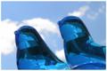
Singby edwalk74Comment: From Critique Club
I like the scale of the glass birds. I do find the sky as a background to distract from the overall color of the birds. If something a bit darker was used it would have also taken the reflections and bubbles from inside of the glass.
I like the concept and the blue of the birds. The angle seems fine but maybe a more level head on shot would have worked better.
The border is fine but I do not think you really needed a border. |
| Photographer found comment helpful. |
| 06/22/2005 08:35:50 AM |
Sorryby NitinComment: From Critique Club
I find the bottom center feathers a bit overexposed. I do not know if it was a result of some other factor or in the original image. it does not detract to much but almost appears fake to me.
Lots of detail in the face but for some reason the eye seems a bit soft in focus. Might just be the angle or some post preocessing artifact.
Nice scale to the overall bird. Does not compete with the background for the viewers attention. The border works well...nice size and enough thickness. |
| Photographer found comment helpful. |
| 06/22/2005 08:24:05 AM |
Threatened National Birdby internerd2kComment: From the Critique Club
Nice bird, does not seem out of focus but lack detail on the feathers and head, probrably from USM. Highlights and colors are fine. The background makes the image seem a bit darker to me then it probrably is.
The way you cropped it emphasizes the tilt the bird has. Maybe a bit more room on the left would have helped in that area.
I like the scale of the bird, I think you had the right idea just some unknown sharpening issues.
|
| Photographer found comment helpful. |
| 06/22/2005 06:22:16 AM |
Balanceby ergoComment: From Critique Club
I find the image to be very pleasing and very nostalgic. The muddled background colors blend very well. I think the image is well balanced from top to bottom but not side to side. I would have liked to see the main bird more in the center of the image.
I am not sure why the image scored the way it did. I found it to stand out against the zoomed in closeups of birds at a zoo.
I think the border is a bit wide but only slightly...with the whiteness of the cord/string the birds seem to sit in the image if that makes sense. |
| Photographer found comment helpful. |
| 06/22/2005 05:39:41 AM |
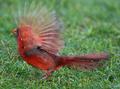
Male Northern Cardinal Taking Flightby janrussComment: From Critique Club
The motion blur of the wings is very striking at first. But with this style it leaves out alot of detail in the face and wings. I am not saying either is wrong. Just two different styles to approach.
The grass to me has a bluish tint and under exposed. I do find the colors and contrast to be refreshing and spot on. The legs seem a bit odd to me.
The overall placement is well balanced. The viewer sees the main subject without having anything competeing with it. I also like the lack of a border. I do not have anything against borders but find you really did not need one. |
| Photographer found comment helpful. |
| 06/22/2005 05:21:07 AM |
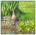
Watchfulby andrimComment: From Critique Club
The shot to me seems a bit unbalanced. The space above the ducklings seems to be wasted and with a undeatiled foreground it is more emphasized. On the left of the mother duck the reed/roots seems bit over exposed and competing against the foregrounds colors.
I do think the colors are very nice overall. If you were able to move further to the left and include more of the ducklings without so much of the foreground it would have improved your shot. The muddy water does not seem to pick up the reflection enough. Maybe it is from a product of noise reduction.
The border does not really work for me either. I do not care for the green and thought maybe a simple black or white thin border would have been better.
Overall a nice piece to get back into the swing of things. Looking forward to seeing more of your work. |
| Photographer found comment helpful. |
| 06/21/2005 01:35:16 PM |
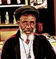
Back againby TuckersmomComment: Nice capture. Very expressive without doing much of anything. The shirt seems to be a bit light but maybe it was faded. I would have personally like to have seen the subject a bit closer. Seems to me to compete with the background. |
| Photographer found comment helpful. |
Home -
Challenges -
Community -
League -
Photos -
Cameras -
Lenses -
Learn -
Help -
Terms of Use -
Privacy -
Top ^
DPChallenge, and website content and design, Copyright © 2001-2025 Challenging Technologies, LLC.
All digital photo copyrights belong to the photographers and may not be used without permission.
Current Server Time: 04/07/2025 10:14:51 PM EDT.