| Image |
Comment |
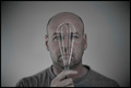
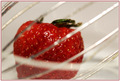
| 04/24/2007 10:42:15 PM |
Egg Whiskby Mr_PantsComment: Great photo. Maybe a littel flat - more contrast? It really sets a good mood though. |
 Photographer found comment helpful. Photographer found comment helpful. |
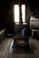
| 04/24/2007 05:57:40 PM |
Perfectby xianartComment: A very personal photo. The light from the window is a little overpowering though. |
| Photographer found comment helpful. |
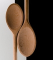
| 04/24/2007 05:15:09 PM |
Yin-Yangby meneleComment: The detail of the spoons is great. I think usually equal space is given for white and black but then again, having the spoons dead center may not have been that appealing either. |
| Photographer found comment helpful. |
| 04/24/2007 12:20:25 AM |
Toastedby SherwinJamesComment: I like where you were going with this though I think the dark and light elements aren't quite right to pull it off. |
| Photographer found comment helpful. |
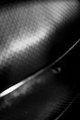
| 04/23/2007 04:34:17 PM |
Sieveby aznymComment: Interesting textures and tones. It pleasing to the eye though its hard to draw yourself to something in this photo. More focus somewhere? |
| Photographer found comment helpful. |
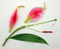
| 04/23/2007 04:33:08 PM |
|
| Photographer found comment helpful. |
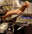
| 02/15/2007 04:00:00 AM |
Disectionby msdoubletroubleComment: I like where this photo is going. I imagine myself sitting at the end of the bench looking at whats going on. I think it needs to be framed a little better to see the subject more clearly and to delete some of the clutter in the foreground. There is also a yellow cast distracting. |
| Photographer found comment helpful. |
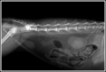
| 02/15/2007 03:57:31 AM |
Insidesby PDavisComment: The subject here - the insides - could be postitioned better higher up. Theres a lot of black hogging the top quarter of the photo. I think this would of been an excellent photo if framed better. Though from the xrays I've seen, that's not always easy to do. |
| Photographer found comment helpful. |
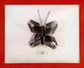
| 02/15/2007 03:55:25 AM |
|
| Photographer found comment helpful. |
| 02/15/2007 03:53:18 AM |
Anatomy of Filmby nadiaCComment: I love this. So clever and thoughtful and so outside the square of the other photos. The label in the photo is classic and the effort you went to obviously shows. The bright red frame does distract a little from your masterpiece however. |
| Photographer found comment helpful. |
Home -
Challenges -
Community -
League -
Photos -
Cameras -
Lenses -
Learn -
Help -
Terms of Use -
Privacy -
Top ^
DPChallenge, and website content and design, Copyright © 2001-2025 Challenging Technologies, LLC.
All digital photo copyrights belong to the photographers and may not be used without permission.
Current Server Time: 04/08/2025 06:16:09 AM EDT.