| Image |
Comment |
| 02/14/2005 11:14:48 AM |
|
 Photographer found comment helpful. Photographer found comment helpful. |
| 02/14/2005 11:13:47 AM |
Love Hurts.by SimmsComment: I'm afraid I just see red when people try to equate blood with pain. Nice strong lighting. |
| Photographer found comment helpful. |
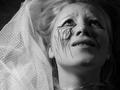
| 02/14/2005 11:11:41 AM |
Painful Awakening from Dreamingby kateasanovComment: The lighting and exposure are perfect. The veil is a pretty touch. Does anybody else find the black drawing on the face distracting? Or that little bump on the upper lip? |
| Photographer found comment helpful. |
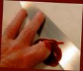
| 02/14/2005 11:08:45 AM |
SLIPped!by Bear_MusicComment: Don't you just hate it when people spill the ketchup on the counter. Sometimes towells aren't enough and you have to go after it with a kitchen knife. Would be just a bit more convincing if you couldn't actually see the finger doubled under. I like the gleam of the knife. |
| Photographer found comment helpful. |
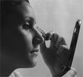
| 02/14/2005 11:04:01 AM |
Moments before "Pain"by XileboComment: The pains we take to make others yearn for us - to inflict the pain of jealousy and envy - on those closest to ourselves. Yes. Perhaps the pain is more than that little pin prick when the hair comes out. Perhaps the damage is more than skin deep. A beautiful photo, clearly apropos to the subject, yet not perfectly obvious. |
| Photographer found comment helpful. |
| 02/14/2005 10:58:56 AM |
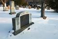
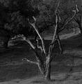
The Pain Of Knowingby bobgaitherComment: Does a live tree feel pain? Does a live cockroach feel pain? Does a rock? Does a dead tree? I love photos of dead trees as much as the next guy. In fact, I hardly ever pass up an opportunity to photograph one; yet I'm skeptical that this photo is about pain. Unless its our pain on the loss of a perfectly good tree, in which case I'd expect to see a tree fallen in its prime. It's a pretty good shot of a pretty photogenic tree, but the background is just a little too distracting - especially tha tree that's behind the right branch. |
| Photographer found comment helpful. |
| 02/14/2005 10:53:51 AM |
Pain of losing your love one.....by arbil14Comment: The composition is tight, the lighting is moody, the exposure is right-on. There's a nice tension between the dead, the live, and the ghosts (live persons reflected in the casket.) I like this photo very much, but to my sensibility, only two characters seem to display touching, photogenic human emotion: the woman in the striped shirt and the little girl just to the right of her in the photo. Impossible to catch without a longer lens, I suppose. |
| Photographer found comment helpful. |
| 02/14/2005 10:45:36 AM |
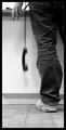
An Unexpected Callby cheekymunkyComment: So, is this a kind of 'I need to call the President but I'm out of quarters' pain of Dr. Strangelove vintage or 'I can't believe what I'm hearing at the other end of the line' kind of pain? The question makes the photo more interesting. It's an interesting concept and, for the most part, it is nicely executed - the motion of the receiver, the wrinkles in the jeans, the open hand, the wedding ring. But I find it annoying or distracting that the line of the work surface passed through the hand. It strips the hand of most of its expressive power.
|
| Photographer found comment helpful. |
| 02/14/2005 10:39:27 AM |
Outcast by L1Comment: Being laughed at - it is frequently more painful than sticks and stones: so there is a considerable amount of irony and some cruelty in the old ditty. This photo instantly evokes this idea. The bokeh is perfectly suited to the subject; less would cause us to be confused about the subject, but more would cause us to miss the sneering laughter of the people in the background. Hollywood would cast a more photogenic person as the hero - someone more people could identify with - but the casting here seems more natural, more realistic.
In a kind of photojournalistic sense this photo is almost flawless. Yet somehow it lacks a 'come hither' sensibility, a prettyness or photographic elegance. A really good effort! |
| Photographer found comment helpful. |
| 02/14/2005 06:44:42 AM |
Churchby giegaComment: This church is an architectural gem. The subtle lighing almost totally lacking in shadows helps us see all the details. The vast swath of grass and the looming mountains place the church in context. If there were a way to move the mountains away from the roofline of the church, I think this would improve the photo. This could have been done if a much longer lens had been used - or a much shorter one. Of course, we cannot tell whether these changes would have introduced other, more disturbing flaws.
There is a kind of stasis created by placing the church in the center third of the photo top to bottom, but this is counteracted by placing it in the right half of the field.
This is a striking photo; I hope it gets lots of attention. |
| Photographer found comment helpful. |
Home -
Challenges -
Community -
League -
Photos -
Cameras -
Lenses -
Learn -
Help -
Terms of Use -
Privacy -
Top ^
DPChallenge, and website content and design, Copyright © 2001-2025 Challenging Technologies, LLC.
All digital photo copyrights belong to the photographers and may not be used without permission.
Current Server Time: 04/07/2025 10:17:48 PM EDT.