| Image |
Comment |
| 06/20/2003 11:46:07 AM |
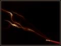
Incenseby jodiecostonComment: this is a nice shot. the tones and textures of the smoke are really cool. i'm not so sure about the placement of the incense stick, jutting into the photo in the corner like that, but the smoke really makes it. lighting and focus are very nice. good job. 7. |
 Photographer found comment helpful. Photographer found comment helpful. |
| 06/20/2003 11:45:21 AM |
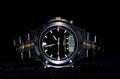
Black Watch on Black Velvetby JB707Comment: lighting and focus are good, and the fact that the object is centered in the frame seems to work okay here. i think the only thing that bothers me is that the watch is on its side. i think it makes me want to tilt my head to see what's going on. i'd rather see a vertical shot, and without the velvet textures below it. 5. |
| Photographer found comment helpful. |
| 06/20/2003 11:44:07 AM |
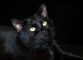
Black Cat on Black velvetby ladpupmoeComment: this more or less feels like a snapshot to me. the lighting is pretty flat and doesn't offer much contrast on the cat's hair. overall i just don't find the image very interesting. 4. |
| Photographer found comment helpful. |
| 06/20/2003 11:33:39 AM |
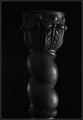
Candle Stickby DennisFComment: my primary gripe with this image is that it is a tad tilted to the right. this is so easily fixed in any photo editing software that it really makes me wonder why you didn't. although it is very very minor so maybe you didn't notice. the lighting here is pretty good, although i like to see more contrast in these types of images. brighter light on the one side of the candle stick and less light on the other side would serve to highlight the shapes and contours of the object. overall, a good effort. 6. |
| Photographer found comment helpful. |
| 06/20/2003 11:31:49 AM |
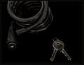
Low Keyby ToddhComment: although this is well focused and decently well lit, the subject matter really does nothing for me. i suppose you're trying to play on "low key", but it still makes for a pretty boring photo. technically well done, except maybe for the liberal crop of the chain. 5. |
| Photographer found comment helpful. |
| 06/20/2003 07:09:49 AM |
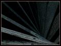
dark woodby deceptiveComment: this is nice. simple, effective. i dig the spiral effect and how you've placed it's vortex off-center. i think my only gripe would be the lack of overall contrast. i like to see more direct and contrasting light on the subject in these kinds of images. overall, good work. 7. |
| Photographer found comment helpful. |
| 06/20/2003 07:04:33 AM |
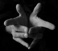
handsby grigrigirlComment: i find two pretty basic faults in this photograph. one is that the subject matter is kind of dull. no real interest or emotion here. and two, the contrast of the image is on the low side. i think getting more light to reflect off the hands would act to further outline the shapes and contours while hiding some of the textures of the hands, which could make the image more abstract and appealing, at least to me. 5. |
| Photographer found comment helpful. |
| 06/20/2003 07:02:38 AM |
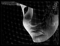
Veiled Tragedyby ursulaComment: this is kind of spooky, but i think the netting in front kind of ruins it. if you took that off and just shot this ominous mask, i think the image would be a lot stronger. the lighting and shadows are nice. 6. |
| Photographer found comment helpful. |
| 06/20/2003 06:58:40 AM |
Eggby SharQComment: this is a good effort, but i think you're lacking interest in the subject matter. also, i think maybe just a little more light to give some more contrast to the top and sides of the egg would make this a little better. for some reason, i think i'd also rather see the egg on the other side of the frame, but i'm not sure. seems less balanced the way it is. 5. |
| Photographer found comment helpful. |
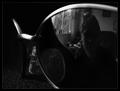
| 06/20/2003 06:57:09 AM |
Shadesby marcoComment: this is a good idea and a good effort, but i think it falls a little short. the lighting on the glasses is good, but i think you need a little more contrast on the person. also, the cluttered backhround in the reflection is taking away from the clean lines of the glasses and making the shot seem busy. maybe trying it with a black curtain or sheet behind the person and more directional light on them would give this more punch. also, either with digital editing or lighting techniques, i'd try to get that nose piece out of the reflecting lens. good effort. 6. |
| Photographer found comment helpful. |
Home -
Challenges -
Community -
League -
Photos -
Cameras -
Lenses -
Learn -
Help -
Terms of Use -
Privacy -
Top ^
DPChallenge, and website content and design, Copyright © 2001-2025 Challenging Technologies, LLC.
All digital photo copyrights belong to the photographers and may not be used without permission.
Current Server Time: 04/09/2025 10:01:35 AM EDT.