| Author | Thread |
Comments Made During the Challenge  |
|
|
06/25/2003 05:53:29 PM |
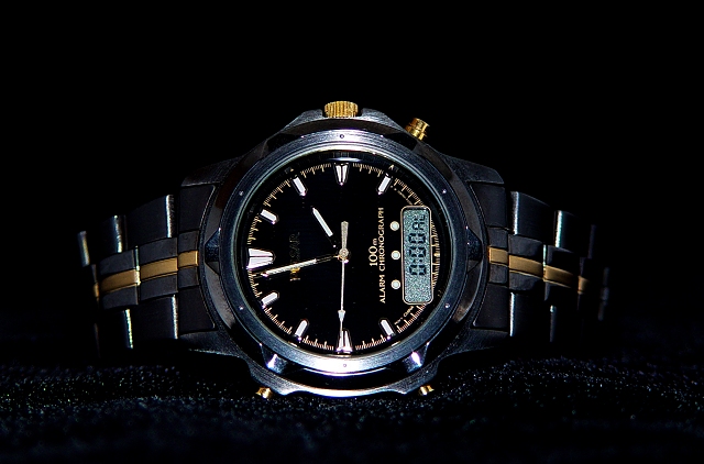
| The black background really does help the watch pop out a bit more. Perhaps a different angle/point of view would help in make the watch seem more . . . special. Nice tones and levels here. |
|
 Photographer found comment helpful. Photographer found comment helpful. |
|
|
06/24/2003 10:58:20 AM |
| Nice shot, but the lighting's a bit harsh and face-on. A bit more directional, softened light would have been good and would have prevented the light bouncing back from the specks on the material. [5] |
|
| Photographer found comment helpful. |
|
|
06/23/2003 02:17:19 PM |
|
|
|
06/20/2003 03:42:50 PM |
| Like an advertisement in a glossy magazine!. Good job! |
|
| Photographer found comment helpful. |
|
|
06/20/2003 11:45:21 AM |
| lighting and focus are good, and the fact that the object is centered in the frame seems to work okay here. i think the only thing that bothers me is that the watch is on its side. i think it makes me want to tilt my head to see what's going on. i'd rather see a vertical shot, and without the velvet textures below it. 5. |
|
| Photographer found comment helpful. |
Home -
Challenges -
Community -
League -
Photos -
Cameras -
Lenses -
Learn -
Help -
Terms of Use -
Privacy -
Top ^
DPChallenge, and website content and design, Copyright © 2001-2025 Challenging Technologies, LLC.
All digital photo copyrights belong to the photographers and may not be used without permission.
Current Server Time: 04/07/2025 12:52:03 PM EDT.