American Psychoby
rmtm333Comment: My (not worth much) thoughts on this image.
Firstly, I gave it a 5. In a brief look, it's far from tripe, but it has areas of definite improvement.
(segue)
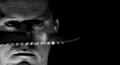
Let me explain! : ) Now keep in mind I don't hold any of the crudentials of a worthy comment (ie, ribbons). That being said, let's get started. Firstly, the picture is too dark. I understand that was the effect you were going for, and it can be done very effectively; however it just seems to me that the darkness loses so much that could be there, and if it were would contribute to the image. Also, I wouldn't have gone with Black and White for this. When you've got that much black space beckoning for your attention, you need something to command it, and a dimly lit black and white shadowed face won't do it for me, at least. Which (sort of) segues into my next point of commency. The cropping on this photograph. I'm not sure why you'd crop it like this because there really isn't anything that this crop does, besides make the shot feel unbalanced and draw the attention further away from the face (which I assume is the intended subject :D) So anyways... right, the crop. While you've more or less balanced the negative space with the subject, which is good, the placement of the face, in my opinion, doesn't work. I would've personally liked to have seen some negative space to the left of the face (which subsequentially means showing the entire face). Having it fill the frame vertically is ok, I guess. I mean, I can't think of, off the top of my head, a way to improve it, but it just doesn't do much for me, y'know? Anyways, I'll move on to my next point of critiquois, the blur. I understand what you were trying to go for. Unfortunately, you didn't pull it off. Blur can be an effective tool, if in juxtaposition with sharpness. Also, to go for something like you were trying to do, you'd need not only a firm sharpness, but also more detail, so you'd be able to distinctly identify the object. The darkness has lost a lot of your detail, making the blur slightly ineffective. If you wanted the "action" on the knife, I would've gone for more sharpness in the face, and a steadier movement to get a more solid figure of the knife. Currently, the only thing identifying the knife is the seraded teeth, which are blown and unsteady from the lighting placement, I assume. Come to think of it, it'd be pretty tough to pull off the action in a way that would please the voters. Off the top of my head I can think of 1 shot where blur went well with the voters, and it involved a naked Imagineer. And that almost segues into the next topic, the lighting. I'll be frank, I don't like it. At least, I don't like the shadows. I don't like it because A) the picture is too dark and B) the shadows, though possibly intended for effect, do nothing but detract elements that could improve the image. The eyebrow extensions I don't like, the nose I don't like, and the upper lip and chin I don't like. As dimly lit and lacking detail as this shot is, you can't afford to lose any more detail by "artistic" shadows for effect. That's my only real gripe.
In closing, I hope I've been affective in understanding why 47 people gave you a low score. I guess a good closing comment would be "If you're going to break the rules, do it well" or "A tip for scoring higher is don't be creative, unless being creative conforms with the voters' opinions." but I won't end with one of those. Instead I'll end with the following:
"Where's my duck?"