|
|
| Image |
Comment |
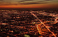
| 05/19/2006 07:18:02 AM | Dusky Pulsating Cityby DigiFotoBuddyComment: From the CTP MkII
First Impression: Wonderful sky
Composition: the sky is on thirds, and in the city there's a disgonal on the right, but it seems a bit busy or chaotic with all that light.
Subject: OK, nice title and subject
Technical: I'm not sure if it's my monitor, but I see the lights of the city a bt blurred. Red color is really great. You capture a nice tonality.
Improvement: It's difficult, but IMO this photo needs a pattern, some shape on the lights, not sure about how to achieve it, sorry
Summary: Nice colors but a bit busy. Keep shooting.
├āülex
|  Photographer found comment helpful. Photographer found comment helpful. |
| 05/19/2006 07:06:20 AM | Driving People Crazyby margiemuComment: From the CTP MkII
First Impression: My first impression was, I've commented this photo before. Then realized was another one with same title...LOL. The first impression is "that boy has too many cameras".
Composition: Good, but would have improved IMO if you cropped tighter to the boy on the left.
Subject: Nice, as this was a very difficult challenge IMO.
Technical: You achieve a really good DOF with your subject on focus and the BG blurred. the colors are a bit washed, I would liked more saturated colors.
Improvement: More contrasted colors, there's a bit of halo around the boy
Summary: Nice take and good score.
├āülex
| | Photographer found comment helpful. |
| 05/17/2006 07:19:55 AM | "Determined Penguin Caper"by RebeccaComment: From the CTP MkII
First Impression: Nice, but a bit difficult to understand at first to me.
Composition: Good. Nice set up with all the papers around. Too much vigneting for my taste.
Subject: OK. It was a very difficult challenge IMO. I tried to enter but couldn' get any good idea, so I respect very much all of you that had one.
Technical: the colors are nice. Focus is OK, but maybe could be a bit better on the main paper. Very good use of DOF.
├āülex | | Photographer found comment helpful. |
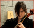
| 05/17/2006 07:09:53 AM | Playing for Jesusby GunnsiComment: From the CTP MkII
First Impression: WOW. Love this one. Really good IMO
Composition: Great. She on thirds, the neck of the cello making a diagonal, the free space on top left...
Subject: Nice. Maybe some people voted you down because they expected a church, but this shot is very subtle and acurate for the challenge. She is very nice.
Technical: Colors are great, focus is tack sharp on her, the lighty blurred BG works very well.
Improvement: to improve your score you must change the border...LOL I supose many of the commenters would say that. I would have preffered a thiner and black one, but it's OK like is.
Summary: Wonderful. Sorry it didn't scored better, because it deserved more IMO.
├āülex | | Photographer found comment helpful. |
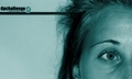
| 05/17/2006 06:48:55 AM | Driving People Crazyby GunnsiComment: From the CTP MkII
First Impression: Sorry for the score, but it doesn't seem of DPC's taste.
Composition: Not bad, but the face, in which you can see part of the nose is a bit strange. I mean, it would be better if the entire nose was in the image or nothing at all.
Subject: The idea is great. But the lady doesn't seem crazy.
Technical: the duotone is nice, but blue is a color that transmits peace, quietness, and not crazyness. Maybe a duotone in oranges or reds would work better for your idea. The light of the face is a bit harsh.
Improvement: I've said some things up^^.
Summary: Not very for DPCers. Keep shooting.
├āülex | | Photographer found comment helpful. |
| 05/17/2006 06:34:55 AM | park trystby blackenedwhiteComment: From the CTP MkII
First Impression: nice night candid.
Composition: I like it, he on the very right and she more centered.
Subject: wonderful. You take a good subject and original on the challenge. She seems so in love with him!
Technical: the colors are a bit desaturated, but I like them that way. The light in her is great, but in him is a bit too dark. The focus is the main flaw IMO. She is not very sharp.
Improvement: First of all, the sharpness. I know how difficult is in that low light conditions, but if you could achieved her with a tack sharp focus this photo would have bumped a lot its score. The other thing is about the light on the top; it's a bit distracting. I'm not sure but maybe if you could make it in landscape and left more space on the left. But that's just an opinion.
Summary: Very nice work. It's your second highest score, so it isn't so bad.
├āülex
| | Photographer found comment helpful. |
| 05/11/2006 08:08:18 AM | Band Nerdsby RebeccaComment: From the CTP MkII
First Impression: Now I understand it, thanks. Nice shot.
Composition: like the composition, as it is dynamic and creates a movement through the image.
Subject: Nice subject, but a bit difficult to make a photo of, so it´s very shiny.
Technical: Good use of DOF. The nerds are too brilliant, so the light is a bit harsh.
Improvement: It's a bit noisy, I don't know if your ISO was too high.
Summary: Good job.
├āülex
| | Photographer found comment helpful. |
| 05/11/2006 07:46:10 AM | A Stitch in Time Saves Nineby xianartComment: From the CTP MkII
First Impression: wonderful idea, very good cliche selected.
Composition: I like it, you use quite properly the rule of thirds.
Subject: very nice clock. The thread is a bit too thick, IMO.
Technical: I like you have nore light in the nine, but I don't like the shadows, they are too intense for me. The upper side of the clock is a bit too black, without detail. The focus is good.
Improvement: use a softer light.
Summary: wonderful shot. Good job.
├āülex
| | Photographer found comment helpful. |
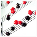
| 05/11/2006 07:35:58 AM | Rhythmic Curvesby DigiFotoBuddyComment: From the CTP MkII
First Impression: Nice and rhythmic studio shot.
Composition: very good diagonal from left bottom to upper right.
Subject: Quite interesting subject for this challenge. It creates a nice sense of rhythm, with the reflection.
Technical: Very good light and DOF.
Improvement: I don't like the BG, it's distracting to me, sorry. I think it would have worked better with a black BG, but it's just an opinion.
Summary: Very nice shot with good lightening.
├āülex
| | Photographer found comment helpful. |
| 05/11/2006 07:25:38 AM | The Gift of Loveby OddfrogComment: From the CTP MkII
First Impression: A really nice idea and composition but a bit dark.
Composition: I like composition, with both of you on the corner. Maybe it will improve if you put the names more in diagonal, not so frontal and create a guide line from left down to the present and you.
Subject: OK, but if the present, the gift is the subject it should be more relevant in any way (maybe changing a bit the comosition as suggested).
Technical: Here the image has the main flaw, IMO. The DOF is nice, maybe the focus should be more on the gift and less in the names, but the light is very poor here. You have a problem of light and you didn't repair it in the postprocessing. I had the same problem in some of my first shots for DPC (and some of the late also, LOL). When you learn to PP more, your results improve a lot.
Improvement: Basically light and white balance.
Summary: Don't even feel bad for the score, that's a way of learning, maybe cruel (LOL), but I assure you will improve if follow shooting. Don't stop making photos.
├āülex
| | Photographer found comment helpful. |
Home -
Challenges -
Community -
League -
Photos -
Cameras -
Lenses -
Learn -
Help -
Terms of Use -
Privacy -
Top ^
DPChallenge, and website content and design, Copyright © 2001-2025 Challenging Technologies, LLC.
All digital photo copyrights belong to the photographers and may not be used without permission.
Current Server Time: 04/07/2025 10:15:08 PM EDT.
|