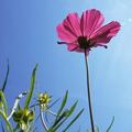
| Image |
Comment |
| 08/25/2004 04:41:32 PM |
|
 Photographer found comment helpful. Photographer found comment helpful. |
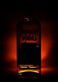
| 08/25/2004 04:33:56 PM |
Ironyby RedOakComment: The dark and red lighting certainly makes this a depressing shot - you have achieved the exact opposite of "hope" - which I assume is your point! I know that sometimes you can give the feeling of something by showing the opposite - get to fear by showing somebody being brave or something, but, while well done, this just sucks the hope right out of me. |
| Photographer found comment helpful. |
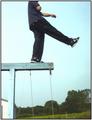
| 08/25/2004 06:59:09 AM |
hope against hopeby shoesComment: Nice idea - I would suggest cropping out the bottom - get rid of all the trees and whatnot - it would make him look a lot higher and add intensity to his "hope". |
| Photographer found comment helpful. |
| 08/25/2004 06:56:46 AM |
I Wish ...by elru21Comment: Great idea! I find the background a bit distracting. |
| Photographer found comment helpful. |
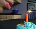
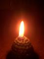
| 08/25/2004 06:52:50 AM |
Candleby NewtComment: I'm sure you will have other comments about the focus ... I'd really like to see more of it in this shot. Composition is good and the exposure level looks fine - I think it just needs something for the eye to latch onto. |
| Photographer found comment helpful. |
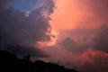
| 08/25/2004 06:50:33 AM |
Hope In The Skyby LongComment: Nice colors - but I don't like the tilted houses. I think that it really detracts from the interesting clouds. |
| Photographer found comment helpful. |
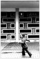
| 08/25/2004 06:44:21 AM |
The Hope of the Childrenby FotowereldComment: Good lighting and contrast. I would suggest to crop out the stuff at the top - compared to the rest it's pretty dull and to my eye detracts from the action of the running child. |
| Photographer found comment helpful. |
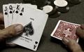
| 08/25/2004 06:41:54 AM |
The Ten of Spades?by kyeboshComment: Good one - I feel the "hope"! I like how the desaturation draws attention to the draw card. I would suggest that the cards in hand be randomly ordered - I think that would help it feel more real and less staged. |
| Photographer found comment helpful. |
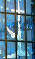
| 08/24/2004 08:14:15 PM |
Church and Stateby JeremyFleuryComment: It looks like some kind of reflections are washing out the colors in the glass - perhaps a polarizer would help? |
| Photographer found comment helpful. |
| 08/24/2004 05:07:06 PM |
Self-Censoredby annasenseComment: This is a very nice image - the "modest" sign seems funny at first, but the expression of the lips makes it serious. Overall it comes across as very honest and real - great job! (9) |
| Photographer found comment helpful. |
Home -
Challenges -
Community -
League -
Photos -
Cameras -
Lenses -
Learn -
Help -
Terms of Use -
Privacy -
Top ^
DPChallenge, and website content and design, Copyright © 2001-2025 Challenging Technologies, LLC.
All digital photo copyrights belong to the photographers and may not be used without permission.
Current Server Time: 04/07/2025 10:05:36 PM EDT.