| Image |
Comment |
| 01/25/2004 02:58:46 AM |
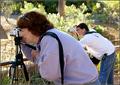
On Assignmentby rcrawfordComment: I like this better with a much tighter crop on the woman. I just find the man distracting. Using the rule of thirds though has paid off though as if the man has to be there he is almost drawing the eye to the female. Well exposed. If you had gone (may not have been possible I know) to have gone to the left slightly it may have been possible to have hidden him behind her and she would have filled the frame - and that would have still retained her obvious concentration - at the same time hiding some of the fence which is a little intrusive. |
 Photographer found comment helpful. Photographer found comment helpful. |
| 01/25/2004 02:52:47 AM |
She sings for her supper.by kavamamaComment: Love this shote - beautiful colours - Try cropping much tighter around the dog and friend and I think it gives it much more impact and gets rid of the traffic light control growing out of his head |
| Photographer found comment helpful. |
| 01/25/2004 01:45:12 AM |
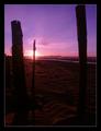
Getawayby roy204Comment: I see what you were trying to do but try this.
Crop out the whole of the stump on the left hand side. The middle stump, left stump and river then draw the eye straight to the setting sun. I think it makes a dramatic shot even more dramatic. If I had seen it presented like that I think it would be a fefinate 8 poss 9 |
| Photographer found comment helpful. |
| 01/25/2004 01:41:32 AM |
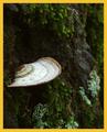
Nature's Umbrellaby sherComment: If the aperture could have been a bit smaller and the depth of field extended to bring just that bit more of the fungi into focus this would have been great. A couple more stops exposure would (I think have brought out that little more detail in the dark area and plant above it. Really nice composition |
| Photographer found comment helpful. |
| 01/25/2004 01:38:41 AM |
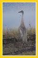
Federally Protectedby NukktaComment: Nice picture (not sure what the bird is). Unsure if this was a grabbed or planned shot. If it was planned, if you could have got the camera a little closer to the ground, not so much of it would have been lost in the mud/grass or going to the other exteme - moving higher to show how well camoflaged it is!. |
| Photographer found comment helpful. |
| 01/25/2004 01:35:09 AM |
Castles of the Frozen Tundraby alanfreedComment: So hard to get exposures right on this sort of shot but it has been done here. Still retaining detail in the shadows of the balconies. That patch on the left bothers me though. Hold a piece of card along the left to crop that out and it seems to tighten everything up without losing the essence of the picture. |
| Photographer found comment helpful. |
| 01/25/2004 01:29:14 AM |
Mates for Lifeby HRoxasComment: Always difficult to get the exposure right on swans on a sunny day. and this is almost perfect. Try cropping the blank space so that the heads of the swans are at the edge of the picture. It seems to elongate the swans necks and make them even more impressive |
| Photographer found comment helpful. |
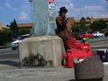
| 01/25/2004 01:22:52 AM |
A street vendor takes a break under the midday sunby GinaRothfelsComment: I personally found the tilt disruptive and did nothing for the image. Would also have liked to have seen you move slightly to the right to get rid of what appears to be a broken concrete litter bin. I think the condition of the pole, pavement and seller would still have looked stark against the modern car/buildings roadway. I think about 1.5 shots extra exposure would have helped pull some facial detail out. |
| Photographer found comment helpful. |
| 01/24/2004 03:03:35 AM |
Indian Toolby katlynComment: I love the texture you have managed to bring out. This could so easily have been "just a lump of stone".
I have 2 points
1: Background colour. Blue detracts from the tool, a very neutral grey may have been even better.
2 The hard shadow, at the bottom of the tool. Maybe a very very soft diffuse light may have softened the shadow. I think it is right to have the shadow, as it gives the tool its shape but the edge is just that tad too hard. |
| Photographer found comment helpful. |
| 01/24/2004 02:47:20 AM |
Lurkingby soupComment: There is a very similar picture to this in the competition except they had lots of the cat in it. Yours has done exactly what I suggested would improve theirs. Get in tight. |
| Photographer found comment helpful. |
Home -
Challenges -
Community -
League -
Photos -
Cameras -
Lenses -
Learn -
Help -
Terms of Use -
Privacy -
Top ^
DPChallenge, and website content and design, Copyright © 2001-2025 Challenging Technologies, LLC.
All digital photo copyrights belong to the photographers and may not be used without permission.
Current Server Time: 04/07/2025 10:05:31 PM EDT.