| Image |
Comment |
| 02/18/2004 02:05:47 PM |
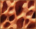
Unused Spongeby ChrisW123Comment: That dark hole on the right draws my attention too much, I don't think you ment that to be your subject. When taking photos like this its better for something to stand out, and not just have a random pattern. |
 Photographer found comment helpful. Photographer found comment helpful. |
| 02/17/2004 05:57:59 PM |
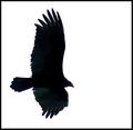
LUCKY SHOTby Rando D300Comment: A tighter crop would be better, but I understand how hard it is to capture a bird, especcially in a unique pose. I think you can improve the composition, the branch makes it interesting, but it could be better. Maybe moving the frame to the left so the bird is on the right half. |
| Photographer found comment helpful. |
| 02/17/2004 05:51:56 PM |
Letting go?! any feelings?!by kinksComment: I like the effect (used a similar one in my shot). Ithink it would work better with a dark background. This is because you wouldn't see through the hand as much, and would fit with the picture better, I assume you weren't trying to get a happy mood out of it. |
| Photographer found comment helpful. |
| 02/16/2004 07:23:38 PM |
Mysteriousby crabappl3Comment: I really like how you made the eyes stand out. Tilting the photo at an angle makes it better, less ordinary. The white in the bottom right corner is distracting. |
| Photographer found comment helpful. |
| 02/16/2004 06:08:13 PM |
Winning Shot or Window Breaks by JPRComment: This has got to be one of the best shots of the challenge. Love the reflection in the ball, and the title which goes with the photo very well. |
| Photographer found comment helpful. |
| 02/16/2004 02:52:14 PM |
Vultureby GolferDDSComment: I like the contrast between the black vulture, and white bakground, but the vulture is so black that most of the detail in the wings, and feathers is lost. If there was more detail in the vulture this would be a much better photo. |
| Photographer found comment helpful. |
| 02/16/2004 02:50:34 PM |
My Black Beautyby terjeComment: I think that the shallow depth of field could have been used better here. If you were trying to draw attention to the L you should've made it red to stand out. Try a different composition, the subject is too centered for my taste. |
| Photographer found comment helpful. |
| 02/16/2004 02:44:00 PM |
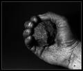
Coal made once the world go 'round by Harz_JoergComment: The detail of the hand, and grains of coal is great. I also like that you used a black background, instead of white. That gives the shot a mood, and atmosphere. Having the hand dark all the way to the bottom right corner would bet better since the white of the hand is a little ditracting. |
| Photographer found comment helpful. |
| 02/16/2004 02:41:20 PM |
Spilled Blackby MickComment: I like the idea. I think you turned the contrast up a little too much, the white bottle cap blends into the background which I don't like. Having a bigger depth of field so that the bottom of the letters was in focus would also help. But overall, a great job, it stands out from the rest of the entries |
| Photographer found comment helpful. |
| 02/15/2004 07:18:31 PM |
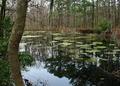
Winter in Garden's Corner IIby davidbedardComment: I like the reflections in the still water, and the atmosphere of the scene, but you need a subject in your picture. There isn't a major focus point here. |
| Photographer found comment helpful. |
Home -
Challenges -
Community -
League -
Photos -
Cameras -
Lenses -
Learn -
Help -
Terms of Use -
Privacy -
Top ^
DPChallenge, and website content and design, Copyright © 2001-2025 Challenging Technologies, LLC.
All digital photo copyrights belong to the photographers and may not be used without permission.
Current Server Time: 04/07/2025 09:55:10 PM EDT.