| Image |
Comment |
| 06/25/2004 01:39:22 PM |
WE cAn MovE mOUntAInsby ursulaComment: I just happened to be browsing my comments that others found helpful and couldn't help but notice this one again. Was this photo/entry really your work? The title and photo seem so out of place in your portfolio, especially for someone who has earned 5 ribbons! The quality of your other photos are phenomenal but this appears as if it were taken by your son or daughter. |
 Photographer found comment helpful. Photographer found comment helpful. |
| 06/25/2004 01:20:39 AM |
Drink or Driveby wkoffelComment: Great shot but the picture seems somewhat static. I'd liked to have seen the glass being shot in mid-tilt as it was spilling or at least see an alcohol puddle on the table. A coaster or rings of water beneath the glass would've also added realism if not being a distraction by adding too many elements to the photo. Furthermore, a tad too many keys me thinks. Perhaps 3 would've gotten the idea of a keychain across.
Other than that, nice lighting and great focus. Perhaps I would've cropped a slice off the right side as well as the composition does feel heavy on the left. |
| Photographer found comment helpful. |
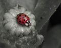
| 06/24/2004 12:33:54 AM |
. . . Ladybugby ladpupmoeComment: Nice composition, you really got in there up close and personal. Would've liked a tad sharper focus on the ladybug, seems that thing it's sitting on stole the focus. |
| Photographer found comment helpful. |
| 06/24/2004 12:31:49 AM |
"Pink Daisy"by sfarrell23Comment: I suppose the pink was desaturated to the grayish white? That stray yellow dot at 1 o'clock adds a little chaos to the image, some may like it, some may not. Personally, I think it adds some interest to the picture. Other than that, the background may be dull, but it helps contrast the flower petals nicely. |
| Photographer found comment helpful. |
| 06/24/2004 12:29:07 AM |
Summer at the Farm by L1Comment: Nice sharp focus and strong contrast! That juicy watermelon sure looks good right about now :) |
| Photographer found comment helpful. |
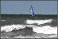
| 06/24/2004 12:27:28 AM |
Battling the wavesby pitsamanComment: Horizon looks slightly tilted. I think this would still be an uninteresting photo, even in full color. |
| Photographer found comment helpful. |
| 06/24/2004 12:26:01 AM |
Lurkingby weavercComment: Pretty creepy but 80% of this photo is blurred foreground which is very distracting. |
| Photographer found comment helpful. |
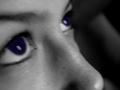
| 06/23/2004 05:38:55 PM |
Eyes to the Skyby ClickyChickyComment: Image a bit too soft on the focus which I believe was caused by impoper focus (shot without macro) and camera shaking while shutter depressing or model moving or any combination of the above. This photo also lacks any white, you've established black and gray values but there are no highlights. The area you chose to keep color is dark as well and from far away or a quick glance, there would appear to be no color at all. |
| Photographer found comment helpful. |
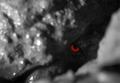
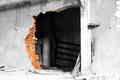
| 06/23/2004 05:35:52 PM |
Urban Decayby VisiBlancoComment: Beautiful shot and composition. Certain areas seem a bit overexposed though, such as the bottom left and the post on the right side of the hole. An image like this should feel dark and dreary but this feels bright and cheery. |
| Photographer found comment helpful. |
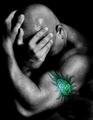
| 06/23/2004 05:31:18 PM |
"Julia"by grigrigirlComment: Excellent lighting and expression. The colors somehow don't match to be a real tattoo and almost seem electric or glowing. Nice crop too, but I would've left a tad more space on the left side. Seems a bit close to his left hand. |
| Photographer found comment helpful. |
Home -
Challenges -
Community -
League -
Photos -
Cameras -
Lenses -
Learn -
Help -
Terms of Use -
Privacy -
Top ^
DPChallenge, and website content and design, Copyright © 2001-2025 Challenging Technologies, LLC.
All digital photo copyrights belong to the photographers and may not be used without permission.
Current Server Time: 04/07/2025 09:55:21 PM EDT.