| Image |
Comment |
| 07/05/2004 04:49:47 AM |
4th of Julyby jas0420Comment: The purple looks natural but the aqua/teal color looks "out of place." The background also has the same hue resulting in a painted/watercolor look, rather than a photo. |
 Photographer found comment helpful. Photographer found comment helpful. |
| 07/05/2004 04:47:58 AM |
Trip Hazardby BradComment: The weeds in the foreground appear slightly purple, providing good balance with the purple thingymabob on the left. Nice sharp focus and DOF. |
| Photographer found comment helpful. |
| 07/05/2004 04:46:46 AM |
Up and Awayby prettyshoes1Comment: This image contains purple but the theme of "purple" is not suggested to me when I see it. Nice crop on the top but I wouldn't cut off so much at the bottom. I'd have liked to see at least the bottom of the basket and some sky beneath it for reference. |
| Photographer found comment helpful. |
| 07/05/2004 04:44:09 AM |
Navy Pierby pitsamanComment: Nice contrast of colors which I think works well here due to the cloudy/muggy Chicago skyline. One question though, why does everything appear to have sharp focus (people, benches, leaves, fence, boat, buildings) EXCEPT the flowers? I wonder what the shot would look like with a shallow DOF with the flowers in focus and everything else slightly blurred but not too much. |
| Photographer found comment helpful. |
| 07/05/2004 04:41:36 AM |
Fireworksby hopperComment: Excellent DOF and nice sharp focus. My mind said "oh no.." when I first read the title before the image loaded but was pleasantly surprised to find this. Beautiful shot! Background appears a tad grainy which could have resulted from sharpening. |
| Photographer found comment helpful. |
| 07/05/2004 04:39:59 AM |
Flower Blowing Awayby troyloxComment: Image appears heavily processed and applied some sort of motion blur filter. Would've liked to see a bit more natural color. Nice crop/framing though. |
| Photographer found comment helpful. |
| 07/05/2004 04:37:49 AM |
Reflected Purpleby HRoxasComment: Nice sharp focus and interesting backround. Not sure of what I'm looking at, but it's a great photo and definitely fits the challenge. Would've liked to see a bit smoother transition in the background, fading from purple to silver rather than the somewhat abrupt change above the top of the star. There almost appears to be a hard edge to it. |
| Photographer found comment helpful. |
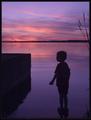
| 07/05/2004 04:35:41 AM |
One Last Dipby ToddhComment: Lighting seems very soft and delicate for this photo. Almost appears hazy. Would've liked stronger contrast, but that could be personal preference. Had this been darker, the woodgrain on the left and the details of the boy would be lost since they are so subtle. Also, that vertical "streak" in the clouds above the boy's head, adjacent to the tops of the weeds looks out of place and distracting. I would've cloned it out. Otherwise, nice composition. |
| Photographer found comment helpful. |
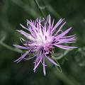
| 07/05/2004 04:30:12 AM |
Purple petalsby scrooslooseComment: My eyes for some reason are drawn to the orange or the bee. Perhaps zooming in closer or having more of your frame consist of petals, the viewer would get the idea that the purple area was the subject of your photo.. at least for me anyway. |
| Photographer found comment helpful. |
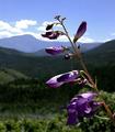
| 07/05/2004 04:26:30 AM |
In the Rockiesby vtruanComment: Image looks ever so slightly oversharpened as the bokeh in your background seem to have hard edges instead of being soft and blurry. Nice composition and leading lines. |
| Photographer found comment helpful. |
Home -
Challenges -
Community -
League -
Photos -
Cameras -
Lenses -
Learn -
Help -
Terms of Use -
Privacy -
Top ^
DPChallenge, and website content and design, Copyright © 2001-2025 Challenging Technologies, LLC.
All digital photo copyrights belong to the photographers and may not be used without permission.
Current Server Time: 04/07/2025 10:08:56 PM EDT.