|
|
|
Showing 191 - 200 of ~286 |
| Image |
Comment |
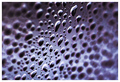
| 05/07/2006 06:42:20 AM | Event Horizonby LouisComment: ~trading post~
Now what I want you to do is explain exactly how it represents an event horizon :P Nah, title's cool but when you think about it I'm not sure it could be argued to represent such a thing.
Anyway, I like this one. The dof works well but I feel its a tiny bit too narrow, giving a very quick transition from focus to OOF.
The diagonal works well, and the rich tones are good. In fact, I was surprised at the lack of sharpness on the original - you've obviously
managed to bring it out well with curves/USM.
Plain white border suits fine
Its a very nice macro, and technically spot on, but i guess it doesnt have much wow, and the inversion doesn't really add to it - had you played with hue/sat to give the original the same colour, I'm guessing you'd be hard-pressed to tell a major difference, they would just look like a reflection of each other (as shadows would be t'other way round) Message edited by author 2006-05-07 10:43:49. |  Photographer found comment helpful. Photographer found comment helpful. |
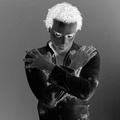
| 05/07/2006 06:04:56 AM | spookyby DanSigComment: ~trading post~
This the kind of shot I expected to see in the challenge, and didn't think anyone would be able to pull it off well - you've proven me wrong. I say that because a negative image just of a person is pretty familiar, and could so easily look like a kid messing around with crazy effects in PS; it takes a lot to give it real depth and make the inversion add to the image. You've achieved this with the atmosphere created by the posture and the really spooky eyes. The expression is perfect for this. I'm wondering whether it would have been good to have a slightly darker/lighter b/g, so its not the same tone as his skin, but obviously both the shirt and hair need to stand out, so this may not have been possible.
I've never really had much experience with portraits, but would it have been possible to eliminate the catchlights? - they look great on the positive, but without them the negative eyes could have looked even more spooky.
The shadows (that have turned into highlights) are kinda distracting, and could have been reduced by more careful lighting - using reflectors to fill in or something)
Seems like not everyone liked it, I guess cause its hard to make a negative of a person look good. Personally I think the stare and expression really makes it, and it works well as a negative. Having said that I think the score was fair - didnt have the ingenuity or simplicity of composition needed to compete with some of the top scorers. | | Photographer found comment helpful. |
| 05/05/2006 07:06:45 AM | Missing Man Formationby MelethiaComment: ~Trading Post~
This is a great example of where the negative is a lot more dynamic than the positive. First of all, congrats on the 2nd best score to date.
The inversion has really brought out the textures in the marble (?) of the sculptures. The colours are very bold and contrasting. This all adds together to make a really bold, cool, graphical image.
The thing that distracts here imo is the background - it gives context with the inversion, but detracts from the very graphical style of the photo. I'd like to see a lower angle, so that the trees disappear into the horizon, and are barely noticeable.
Other than that, you've caught it at a good time of day light-wise - I love how the shadows on the righthand faces give the bold, contrasting white outline in negative. Overall, great image, good work, well done etc.
Keep it up, its an honour to critique :) | | Photographer found comment helpful. |
| 05/03/2006 12:20:51 PM | Divisionby nards656Comment: ITs a nice simple idea, and I didnt even notice the red/blue thing for ages*, but the stick used as the division is a bit..well, ..boring imho. I would like to see the same idea but with something more dynamic - I'm sure I'm seen a similar design (albeit achieved in PS) with a lizard, that was used for some logo or something.
The scratches on the blue b/g detract, guess they could easily be removed outside of basic editing. The idea is simple and cool but needs something extra for that 'wow'
Hope you're feeling better anyway :)
*Yes, its very much red to me, but then again, my monitor isn't greatly calibrated itself | | Photographer found comment helpful. |
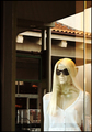
| 05/01/2006 02:08:31 PM | Reflectively Staring at Her Manby chaliceComment: Hmmmm, I've tried to make it say something to me, but I just can't. Seems as though it could have something if you were making some comment on consumerism or fashion, or purely harking back to Dr Who-style mannequin monsters, but with the title "Reflectively Staring at Her Man" it just seems a shot through a window that was entered just in order to enter something.
The more I look at it, the more I dislike the title - it shouldn't be an issue, but it obviously is here on DPC, and I would even have prefered it untitled.
Maybe if the focus wasn't just on her, but there was some context given, by shoppers walking by, and her gaze unchanged or something, maybe that could work...Sorry I don't really have any suggestions for improvement, its just that the subject matter doesn't do anything for me. | | Photographer found comment helpful. |
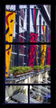
| 05/01/2006 01:55:59 PM | Colorful viewby MelethiaComment: The bright colours work really well with the black borders - certainly you did well to spot the potential. I really like the dynamics, but it does seem a bit busy a composition. The 4 different "windows" add a real interest to the scene, but haven't been fully exploited - there don't seem to be distinct different subjects in each frame, except the row of plants in the middle one. If they all had centred on somthing different, or some been empty to contrast with more full ones, this could have, I believe, added somewhat to the composition.
I'm curious as to how the scene changed at different times of day. The light seems to be high in the sky, facing the wall directly - maybe earlier/later you may have got some more exciting lighting - maybe backlightinh on the flags, or raking light across the jutting-out-bits of the building.
after reading thru other comments - I agree that maybe it could have been made less busy by cropping out the bottom frames. I think this could have lent interest had they bee nframing something specific, but as it is, they just add confusion | | Photographer found comment helpful. |
| 04/30/2006 02:55:48 PM | are you done ?by DanSigComment: Sorry, this is gonna be a stream of random thoughts rather than anything proper. Struggling to catch up last entries before rollover. Will be better next week :)
Its a pretty portrait, nice relaxed expression/pose. Part of me doesn't like the fact that theres very little contrast between the colours of skin, b/g and jumper, but maybe that aint so bad, just could tweak the white point so the b/g's whiter
I'd like to see slightly more sharpness/dodge/burn on the eyes to bring them out slightly
Very cute overall Message edited by author 2006-04-30 18:56:09. | | Photographer found comment helpful. |
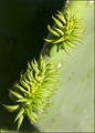
| 04/30/2006 02:46:34 PM | Prickly new cactus budsby MelethiaComment: Sorry, this is gonna be a stream of random thoughts rather than anything proper. Struggling to catch up last entries before rollover. Will be better next week :)
Technically good macro, the black vs green b/g works well. I'd prefer to see some more dramatic lighting, to give a bit more contrast - maybe lighting from the other side so shadows on the right could echo the black b/g on the left for example.
dof is good, but the lighting on the right hand side is quite flat, so the effect of the dof is not so noticeable because theres not much texture shown
typos
Message edited by author 2006-04-30 18:47:49. | | Photographer found comment helpful. |
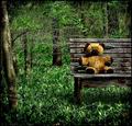
| 04/30/2006 02:38:08 PM | Lost in the woods ages agoby timfythetooComment: Sorry, this is gonna be a stream of random thoughts rather than anything proper. Struggling to catch up last entries before rollover. Will be better next week :)
I really like the grungy atmosphere, suits the subject well (although there is a danger now of it being done too often). The vignetting works well with this style, and the colours are nice and rich.
However, the teddy itself doesnt' really look that old or abandoned, partly 'cause of the lighting/dodging. Maybe if it were hanging off the end of the bench of something...not sure. Maybe just a bit darker (the teddy not the picture) and it would work.
| | Photographer found comment helpful. |
| 04/30/2006 02:31:44 PM | Available, first month freeby ericwooComment: Sorry, this is gonna be a stream of random thoughts rather than anything proper. Struggling to catch up last entries before rollover. Will be better next week :)
This has a really nice, fantasy-woodland feel to it - partly the colours, partly the glow filter. It has a nice, cosy nostalgic feel to it. I like the composition, with the diagonal leading to the focus on a third.
I would prefer a shallower DOF so that dof and glow worked together, rather than just the glow.
Actually, the more I look at it, the more it seems to have a yellow hue slightly like others have pointed out.
I'm surprised it didnt do better tbh | | Photographer found comment helpful. |
|
Showing 191 - 200 of ~286 |
Home -
Challenges -
Community -
League -
Photos -
Cameras -
Lenses -
Learn -
Help -
Terms of Use -
Privacy -
Top ^
DPChallenge, and website content and design, Copyright © 2001-2025 Challenging Technologies, LLC.
All digital photo copyrights belong to the photographers and may not be used without permission.
Current Server Time: 04/08/2025 06:16:03 AM EDT.
|