| Author | Thread |
|
|
05/01/2006 09:13:42 AM |
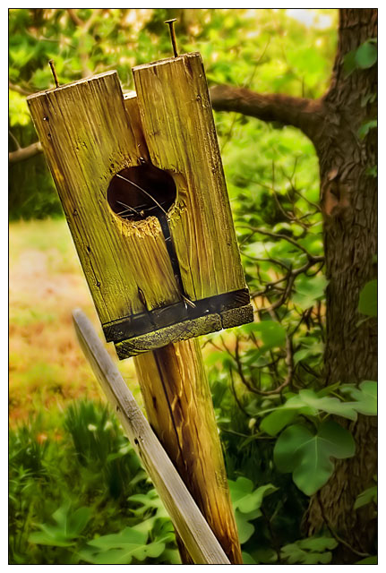
Somehow I almost missed this one in my Trading Post critiques - sorry. I gave this shot a 5, and to be honest that was probably a little harsh, second view says "6". It's almost monochromatic, in my eye, and there's a little too much yellow. The edge of the vertical board that the birdhouse is sitting on has something wierd going on, can't tell if it's color related or if it's something actually in the photo.
It SEEMS that a larger aperture to blur the background to obliteration would help this. I'm continually distracted by all that color back there. Looks like you've done some nice work to get good solid "edges" in the photo, but the background bothers me.
I do like the overall composition, with the exception of that tree limb poking into the side of the subject. |
|
 Photographer found comment helpful. Photographer found comment helpful. |
|
|
04/30/2006 02:31:44 PM |
Sorry, this is gonna be a stream of random thoughts rather than anything proper. Struggling to catch up last entries before rollover. Will be better next week :)
This has a really nice, fantasy-woodland feel to it - partly the colours, partly the glow filter. It has a nice, cosy nostalgic feel to it. I like the composition, with the diagonal leading to the focus on a third.
I would prefer a shallower DOF so that dof and glow worked together, rather than just the glow.
Actually, the more I look at it, the more it seems to have a yellow hue slightly like others have pointed out.
I'm surprised it didnt do better tbh |
|
| Photographer found comment helpful. |
|
|
04/29/2006 07:24:26 PM |
my first (and only) real problem with this is that it is the wrong color. in my little mind anyway. like you changed the white balance to give it that gold feel. not that it is a bad thing, just that i hike in several nature preserves and they are all that horrible brown color. lol.
other than that, great shot. ifn i stopped to look at it long enough to get over it being the wrong color i would have scored it higher than ifn i looked, noticed it was not the right color, hit a number and moved on. |
|
| Photographer found comment helpful. |
|
|
04/29/2006 04:48:19 PM |
this subject could have been photograped from a much more interesting angle, even though this is a nice image there really isn't anything to look at...
the wooden board at the bottom colides with the pole, but taken from a different angle could be used to lead the eye from the frame to the pole and up to the birdhouse.
and I think this image would look much better in B&W. |
|
| Photographer found comment helpful. |
|
|
04/29/2006 03:51:45 PM |
I have to tell you that I find myself taking pictures like this ALL THE TIME... I live next to a huge provincial park, my favourite spot to take pictures, and this type of scene is very familiar to me. For that reason, because I cast such a critical eye on my own stuff, I think I may be more critical than others of this type of picture. :)
Having said that, I like the concept, and the composition is great. The face of the birdhouse is angled in such a way as to draw the eye down through the centre of the picture, and we find interesting elements all the way down. There's a nice mix of textures in the wood, the tree, and the softer leaves.
There is a green, or, more likely, yellow cast to the picture that may have been taken care of with hue/desat in post. I think you may have overdone the noise reduction a bit, as the bokeh seems a bit artificial somehow. Though the tree works to offset the textures, it's a tad dark, and kind of distracts from the foreground.
Other than that, I love the placement of the house in the image; compositionally, this is a superior picture. |
|
| Photographer found comment helpful. |
|
|
04/29/2006 12:26:46 PM |
| First, I love the title! I had to chuckle and it helped establish the subject of the picture (a bird house instead of simply a hole in some wood). Next I noticed, and appreciated, the DOF with the blurring of the background setting off the bird house. I even like the fact that the leaves in the lower right corner are somewhat in focus (albeit softly). I did find the tree branch a little distracting, but perhaps there is nothing you could have done about that. |
|
| Photographer found comment helpful. |
|
|
04/29/2006 04:50:08 AM |
| I'm going to comment without looking at other comments first, that way my perspective isn't affected by others opinions. That said, the DOF is excellent and you can almost feel the splinters coming off the wood. There does seem to be a color cast of some type (haze), maybe too much green? As far as this particular challenge, it's seems more broken than old to me which is why you probably didn't score higher. Overall I really like the picture. |
|
| Photographer found comment helpful. |
|
|
04/28/2006 10:01:24 PM |
| I am surprised this didnt do better. I found it funny. For me I think the color has an odd yellow/green cast to it all. You may have been able to blend the blur in a bit better on the tree in the immediate background - a bit too much in parts. But still I found it better than a 5.0. Good concept. Maybe going black and white would have been good. |
|
| Photographer found comment helpful. |
|
|
04/28/2006 07:35:07 PM |
| Maybe not "old" as most would perceive it, but works well when taken with the title. Color is excellent - very rich and vibrant - I like the golden tones to it. The tree branch on the right does compete for a bit of attention, but not sure how else you could have composed the shot. DOF is used well here. |
|
| Photographer found comment helpful. |
Comments Made During the Challenge  |
|
|
04/25/2006 09:31:16 AM |
Am I the only one, who gave u 10/10, my dear friend? Great pic and is refreshing. Be happy and try the same shot in black and white.
Best of luck,
soham,
soham.gupta@gmail.com |
|
| Photographer found comment helpful. |
|
|
04/24/2006 08:15:20 AM |
| Brought a giggle to me. Nice take. |
|
| Photographer found comment helpful. |
|
|
04/23/2006 07:03:06 PM |
| nice softness suits this shot |
|
| Photographer found comment helpful. |
|
|
04/22/2006 10:19:09 AM |
|
| Photographer found comment helpful. |
|
|
04/21/2006 02:49:25 PM |
| It looks like it has passed it's use by date..... |
|
| Photographer found comment helpful. |
|
|
04/21/2006 02:21:14 PM |
|
| Photographer found comment helpful. |
|
|
04/19/2006 08:34:19 PM |
| lol... i really like the color and dof |
|
| Photographer found comment helpful. |
Home -
Challenges -
Community -
League -
Photos -
Cameras -
Lenses -
Learn -
Help -
Terms of Use -
Privacy -
Top ^
DPChallenge, and website content and design, Copyright © 2001-2025 Challenging Technologies, LLC.
All digital photo copyrights belong to the photographers and may not be used without permission.
Current Server Time: 04/07/2025 09:22:22 PM EDT.