|
|
|
Showing 131 - 140 of ~286 |
| Image |
Comment |
| 06/04/2006 11:33:07 AM | Failure: Another Loser DPC Score!by chaliceComment: Composition
composition is good, in terms of the "baghead" in the upper left third, and the laptop in the bottom right. The home/offic-ey environment makes it a more cluttered composition though, especially with the detail in the blinds.
Technical stuff (exposure, dof, lighting etc�)
wb seems a little off, but exposure and focus seem good. You may have been able to isolate the subject from the b/g more with a shallower dof though
Post-processing
I'd like to see a little more contrast in it, to make it pop more and be less snapshotty
Message/atmosphere portrayed
Well, you did kinda bring it upon yourself with that title! :P Although the paper bag fits, another way of "hiding" from your score may have been better, so as to make your expression visible and give more emotion.
Meeting the challenge
Yeah, sure
My personal opinion
I wouldn't have expected this to score very high, just because its quite a familiar idea - not necessarily exactly that idea, but in terms of comments on scores/people at laptops etc. Would have needed an extra creative something to bring it further Message edited by author 2006-06-05 05:16:46. |  Photographer found comment helpful. Photographer found comment helpful. |
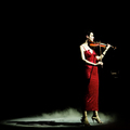
| 06/04/2006 11:23:46 AM | total successby DanSigComment: First off, congrats on the personal best :)
Composition
Lovely. The only thing I would change slightly is leaving a tiny bit more space on the left, so that the spotlight is more centralized.
Technical stuff (exposure, dof, lighting etc�)
Lighting is beautiful, but seem to be blown highlighs on her face/arms/chest. Focus is fine.
Post-processing
only basic rules, so not much to say really. In advanced I would clone out that distreacting bit on the right.
Message/atmosphere portrayed
Has a very elegant feel to it, and the crispness & clean composition make it seem very professional, which really suits the subject matter.
Meeting the challenge
I'm in 2 minds about this, tbh - it does fit the challenge, but to me says more about "performance" or "perfection" than success.
My personal opinion
Beautiful image, worthy of its place in the challenge. Well done! | | Photographer found comment helpful. |
| 06/04/2006 11:08:37 AM | A child's crowning achievementby KelliComment: Composition
I would prefer the medal to be less centralized - maybe in the middle horizontally, but on the bottom third vertically
Technical stuff (exposure, dof, lighting etc�)
Focus is spot on, and exposure very good. I'm impressed with the lighting on the background to give a nice plain white b/g
Post-processing
Not much to say really, good amount of saturation, good contrast
Message/atmosphere portrayed
imho, if it were to include a grinning child, or the medal being held aloft for example, it would portray the desired feeling (of achievement, success, your kid's pride...) a lot more.
Meeting the challenge
Obviously
My personal opinion
Whilst all the technicalities are good, the way you have approached the theme (imho) gives a rather clinical, stock photo kind of feel, rather than the emotions associated with the feeling of success. | | Photographer found comment helpful. |
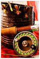
| 06/04/2006 08:45:02 AM | Baited and Readyby ericwooComment: I'm really sorry, I must have overlooked yours when I commented on Still Life.
This definitely deserves the top 10 place it received, its very crisp and well-lit, and fits the challenge very well - it keeps to the traditional style of still life but with more original content then fruit and wine (eg).
The red b/g complements the green perfectly, and this contrast makes the colours pop. I like the composition, with the reel in the bottom right and the bait/float thingies (you can tell I don't fish!) in the top left, but I'm not entirely sure about the positioning of the rod in the middle - it looks a bit awkward and central, but I'm not sure where it would be better.
Lighting is very good, but I'd like to see a bit more light (or dodging if advanced ed) around the right-most two floats.
Other than that, there's not much I can say except congrats on the top ten, and new image on your profile page. | | Photographer found comment helpful. |
| 06/01/2006 12:50:08 PM | Hot Handby timfythetooComment: This is a great shot; the composition and lighting is spot on, and it has that extra "ouch" factor. hehe. I'm impressed at your bravery/stupidity :P Don't really have much to add, its a great shot so well done | | Photographer found comment helpful. |
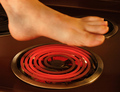
| 06/01/2006 12:15:59 PM | Hot Footin' Itby chaliceComment: To be honest, while the concept is ok, the blur on the foot and the "painted on" nails really spoil this. Also, theres the matter of "why are you holding your foot over a stove?" Its not bizarre enough to be quirky, imho, just a bit strange. Having said all that, I was surprised it did not do better than this. | | Photographer found comment helpful. |
| 06/01/2006 11:53:29 AM | Careful...beverage...extremely hotby MelethiaComment: This was a great entry to the challenge! I love it, crisp shot, good flame captured, and with a nice dose of humour :) Definitely deserved 15th, if not higher.
I guess its a bit pot-luck, but I'd like to see a less tight crop on the flame on the lefthand side - it feels a little chopped off. Also, whilst the foil base works well, it could do with a little straightening out, it gives a wonky "horizon" as it is. Other than that, you've got perfect timing, and its a very nice photo. | | Photographer found comment helpful. |
| 06/01/2006 11:33:49 AM | Man in a Panama Hatby chaliceComment: Looks like you got an awesome CC club comment, so I can't add much, but I'll add my $0.02 anyways
The lighting is very atmospheric, which works well with the posture, which I like, but does look a little awkward. The main thing that brings it down is the softness due to the long exposure. I don't personally mind the composition, because you're not looking out of the frame as such, you're just looking into the camera at an angle. | | Photographer found comment helpful. |
| 06/01/2006 11:12:56 AM | Invasion of Privacyby tngrndreamComment: The composition is good, but because of the high ISO and long shutterspeed you've used, theres a lot of grain and its all a bit soft. You were obviously struggling with light to have to use iso400 and 1/3sec, so you could have avoided these problems by lighting it more, for example with a desk lamp and reflector.. or even just used a larger aperture (higher f number). Because of the "dull" light, you've also lost detail in your eyes, which should be the most important part, so I think this aspect has let you down. | | Photographer found comment helpful. |
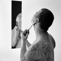
| 06/01/2006 10:56:25 AM | my daily shaveby DanSigComment: I really like the cleanness of the composition, with the white background, and the clarity/sharpness in both the reflection and the foreground figure. I like how the position and shape of the mirror means that there's almost 2 facets of "you" visible - with attention drawn to the tattoo in the f/g, and then the view of your face in the mirror to give you an identity.
Lighting is very good, no harsh shadows but everything softly lit really well. To be honest, I completely missed the knife to start with, but its a good element.
The only thing I'd suggest if you were reshooting is possibly to try and get the mirror straighter - because the background is plain white, you don;t have a wall to give context to the perspective, which is a bit weird. Other than that, really nice crisp shot, good score, well done. | | Photographer found comment helpful. |
|
Showing 131 - 140 of ~286 |
Home -
Challenges -
Community -
League -
Photos -
Cameras -
Lenses -
Learn -
Help -
Terms of Use -
Privacy -
Top ^
DPChallenge, and website content and design, Copyright © 2001-2025 Challenging Technologies, LLC.
All digital photo copyrights belong to the photographers and may not be used without permission.
Current Server Time: 04/08/2025 07:50:34 AM EDT.
|