|
|
|
Showing 121 - 130 of ~286 |
| Image |
Comment |
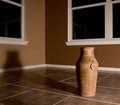
| 06/16/2006 01:52:13 AM | Earth tonesby MelethiaComment: Composition
Nice composition but I'd like to see it a little wider. Not really much to say
Technical stuff (exposure, dof, lighting etcâ€Â¦)
Beautiful lighting, enough to get the nice long shadow which is very important compositionally, but not enough to light the vase too harshly. Seems perfectly exposed, everything else spot on.
Meeting the challenge
Yeah, its wide enough and empty enough to not be a corner so of course
Other
I find the reflections of the frames in the windows distracting. If I were you i'd clone them out.
My personal opinion
If I'd voted on this challenge, I would have picked this out as one of yours. Your shots like this are always so beautiful (as is this one). Great to have a "signature shot" based on fundamental photography skills such as subtle lighting and tones rather than just the content. Pretty impressive that you can score a 6+ and not even make a dent on your profile page! |  Photographer found comment helpful. Photographer found comment helpful. |
| 06/16/2006 01:40:55 AM | Persian Pedistal at Duskby chaliceComment: Composition
Love the composition of this one, following the rule of thirds. The placement of the pedistal is just right
Technical stuff (exposure, dof, lighting etcâ€Â¦)
I like how the 2 walls are different shades because of the lighting, and the shadow of the pedistal parallel to the back wall.
Although I like the warm tones, it does seem as though the WB is a touch off.
Meeting the challenge
It doesn't not meet the challenge, but not give a bit of an impression of "I'm not emptying a room just for dpc, so here's a corner". :P It would have seemed more appropriate with a wider angle (but I'm assuming there was stuff in the way)
My personal opinion
I was surprised that this didn't score higher - I think it would have done better in a different challenge, because its a great photo, but doens treally say "empty room" but rather "empty corner". Guess its hard to compete when some people are dedicated enough to dpc that they'll empty a whole room for a photo lol. | | Photographer found comment helpful. |
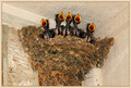
| 06/11/2006 03:25:27 PM | "Crying, Waiting, Hoping"by MelethiaComment: Congrats on a PB and another top-20. Sorry to leave it to the last minute
Composition
Because the surroundings aren't the most exciting (ie if you'd cropped less you wouldnt have introduced new interest) you needed to fill the frame pretty much, but you've managed to do that without it being too centred and static.
Technical stuff (exposure, dof, lighting etcâ€Â¦)
FOcus is brilliant, especially considering the fleeting moment and the borderline shutterspeed. Exposed well for the dark birds and much lighter b/g
Meeting the challenge
Without a doubt. Not only does the quote fit the photo, it helps give it extra emotion.
Post-processing
Didnt think there was much to say about PP work 'til I looked at the original - you've very mcuh got the full potential out of the photo, much better than I would have done.
Misc
I love the earthy tones. The border fits well with these. Awesome timing.
My personal opinion
Great entry to the challenge, well-deserving of the score & placement. Well done Message edited by author 2006-06-11 19:25:44. | | Photographer found comment helpful. |
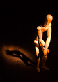
| 06/11/2006 03:14:16 PM | unwilling modelby timfythetooComment: Composition
I like the tall crop but the composition does seem possibly a tiny bit too centred, with the eye almost right in the middle both vertically and horizontally.
Technical stuff (exposure, dof, lighting etcâ€Â¦)
I love the lighting, leaving one side of the face very dark. The shallow dof gives a very soft look.
Meeting the challenge
Yeah, very nicely lit.
Post-processing
I'm not sure if it was PP work or if it was due to the lighitng, but his chin seems to stand out against his chest more than it should, which makes it a little disjointed.
My personal opinion
I haven't decided if I like this style or not - I'm used to seeing portraits very sharp, and this is much more coft and dreamy. If you achieved that effect through NI I wouldn't like it,but I think I;m growing to love it. His expressin is certainly perfect. | | Photographer found comment helpful. |
| 06/11/2006 02:39:35 PM | Woody Presleyby tngrndreamComment: Firstly, congrats on a new PB with this entry
Composition
I love the composition, with the woody on the edge and his shadow leading across behind him
Technical stuff (exposure, dof, lighting etcâ€Â¦)
The lightings beautiful, but slightly overexposed on his left arm/right leg. Focus good.
Post-processing
Would like to know your processing steps, it seems a touch overprocessed in places.
Meeting the challenge
Really nice use of a single light source.
My personal opinion
Great clean shot, shame about the little bit of blownoutness, very good score for a Woody pic | | Photographer found comment helpful. |
| 06/11/2006 02:15:03 PM | Well, she was just seventeen, You know what I mean, And the way she looked was way beyond compare.by KelliComment: I think you've already identified the main issues with what you've said in the thread but here goes:
Composition
Nice to be offcenter, looking back across to the viewer.
Technical stuff (exposure, dof, lighting etcâ€Â¦)
Focus seems a tad soft on the face, but this may be just something to do with the lighting, because if you look along the same plane focus seems ok (ie on back, dress), and shutterspeed wasnt slow enough for blur.
You're already aware of the blownout highlights, must have been difficult lighting to work with. This brings it down a lot, in terms of what I (or others I suspect) would have voted it.
Meeting the challenge
Definitely, a lot of people chose that lyric, although I think I personally would have preferred a less posed photo for the quote, but then again I'm too young to really know the songs well so that may just be me.
Post-processing
You've done as well as you could have to rescue the highlights, but sometimes you just need to get it right (with luck) in-camera. I think the spotlight works to give interest (ignoring the rules here)
My personal opinion
A nice picture for her to keep, but the blownoutness ruins it in a dpc context. Sorry about the DQ though, its easy to misunderstand the rules as they are now, but at least now you know and won't do it again | | Photographer found comment helpful. |
| 06/10/2006 12:41:46 PM | A Glass of Wine with a Bottle to Goby chaliceComment: Composition
I like the composition with the wine glass in the top right and the bottle acroos at an angel, but it seems a tad unbalanced - maybe composing it so you could crop tighter on the left, or just not cropping so tight on the right may have helped
Technical stuff (exposure, dof,
lighting etcâ€Â¦)
I love how you've captured the glow on both the bottle and liquid in the glass, but the glass seems to have blown highlights. Also, I'm not sure I like how the bottle merges into the black b/g. I guess it was hard to get an even exposure with the single spotlight.
Focus is crisp
Meeting the challenge
Nice still life, fitting th challenge well.
Post-processing
Only thing I'd suggest changing is masking the red bottle top when you applied NeatImage, it just seems a bit too smooth/plastic-ey
My personal opinion
Ironic but the single light source limited the potential imho - could have been much better lit with a moving source, so you didnt get the extremes of lighting. I think the score was reasonably fair (although I wouldn't be particularly surprised if it had been higher) | | Photographer found comment helpful. |
| 06/05/2006 01:49:35 AM | Public Libraryby MelethiaComment: Composition
At first look the composition seemed a little arbitrary, but looking again i like the shapes and shadows, but would prefer a slightly less angled viewpoint. Although this may not have fitted architecture so well, I would like to see a tighter crop on the 2 sphere things, which are beautifully lit.
Technical stuff (exposure, dof, lighting etcâ€Â¦)
considering its such a bright scene, you've done well to expose well, and keep good strong colours.
Meeting the challenge
Yes, nice to see a closer study of shapes/lines etc within local architecture.
Post-processing
You've got the sky very well exposed in relation to the rest, so looks like whatever you did to it worked well
My personal opinion
Nice interplay of shapes and shadows, but I'm not convinced abou the composition. | | Photographer found comment helpful. |
| 06/05/2006 01:34:07 AM | Enjoying my ultimate success.by timfythetooComment: Composition
I like how the subject is in the corner, but I think there is too much negative space - or at least not the right negative space - could have been better had you for example been on a hill, with a simple b/g, just grass and sky.
Technical stuff (exposure, dof, lighting etcâ€Â¦)
I like the dappled natural light, especially on your son, although theres a bit that seems a litte blown on his face
Message/atmosphere portrayed
Gives a nice happy, summery kinda feel, which fits the subject
Meeting the challenge
Yes, interesting take on the theme.
Other
Muddy soles of feet bug me :P
My personal opinion
The b/g is too distracting, but other than that its good. I think it scored reasonably fairly | | Photographer found comment helpful. |
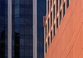
| 06/05/2006 01:24:33 AM | Architectural Colorsby chaliceComment: Composition
Very nice shapes/angles, maybe would have suited a slightly tighter crop on the righthand side, so the transition wasnt right in the middle. Whilst I love all the lines and shapes and colours, the angle does make the righthand side a little busy (aat 640*480ish at least) just because there is so much detail.
Technical stuff (exposure, dof, lighting etcâ€Â¦)
Exposure and lighting seem good, I like the brightness of the reds against the duller blue glass.
Post-processing
n/a, all is fine and dandy imo
Message/atmosphere portrayed
very nice study of shapes and colours, with the juxtaposition of different styles of architecture
Meeting the challenge
Nice take on architecture - a real study of details rather than "a picture of an impressive building" (for example)
My personal opinion
This was underrated by far - I didn't vote on this challenge, but would probably have voted 7/8 | | Photographer found comment helpful. |
|
Showing 121 - 130 of ~286 |
Home -
Challenges -
Community -
League -
Photos -
Cameras -
Lenses -
Learn -
Help -
Terms of Use -
Privacy -
Top ^
DPChallenge, and website content and design, Copyright © 2001-2025 Challenging Technologies, LLC.
All digital photo copyrights belong to the photographers and may not be used without permission.
Current Server Time: 04/08/2025 07:50:42 AM EDT.
|