| Image |
Comment |
| 12/16/2002 08:06:56 AM |
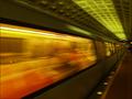
accelerationby magnetic9999Comment: The Critique Club
Your photo captures the movement of a subway train very well. One can almost hear the thunder of the wheels. Inevitably the issue of the blurring of the still parts of the photo comes up?I agree that it would be best if they had been perfectly sharp and if that had happened I am sure your photo would have finished even higher than it did?so why didn?t people mark you down more? I am sure it is because in each of us we can feel the train ?hear the noise and feel the rush of air as the train goes past. You captured more than movement you captured the feeling of the subway?the lights?and the movement.
It is hard to criticise the technicalities of the shot?because even if they could be improved one has to bear in mind the circumstances. Exposure is correct for this genre- you have managed to capture details in the compartment?the colours are saturated and strong. Your composition is excellent with the train rushing past with a good view along the side of the train to the end when it disappears into the tunnel. The large window is deep orange and warm with the contrast of the green lighting in the station. The lights on the platform disappear into the distance. Everything emphasises the movement and perspective of a subway train huge and engulfing close to us and disappearing into the distance.The lines of blurring and movement are strong and dominant.
A very good entry.Well done.
Andrew Message edited by author 2002-12-16 13:10:41. |
 Photographer found comment helpful. Photographer found comment helpful. |
| 12/15/2002 09:14:58 PM |
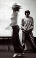
Blue Streakby inspzilComment: I am sorry this didn't do better--to me it is the image of a child that age--all that energy--great shot! |
| Photographer found comment helpful. |
| 12/12/2002 06:36:58 PM |
|
| Photographer found comment helpful. |
| 12/12/2002 06:35:40 PM |
|
| Photographer found comment helpful. |
| 12/12/2002 06:34:13 PM |
|
| Photographer found comment helpful. |
| 12/12/2002 06:31:27 PM |
|
| Photographer found comment helpful. |
| 12/12/2002 06:27:50 PM |
|
| Photographer found comment helpful. |
| 12/11/2002 08:05:04 PM |
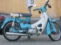
Flat tire blues.by catpixelComment: The Critique Club
Technically your photo is well exposed for the conditions but I think the focus is out and not pin-sharp. I can’t see where the camera focussed so maybe you were moving when you took this shot. The photo seems to be well processed with no digital artefacts although I think a bit more colour saturation and contrast may have helped this photo.Your cropping is very close which detracts from the image.
Compositionally—as you say a simple shot of a motorbike—but this is where I feel you missed many opportunities for a great photo. If this had been taken from any of many angles such as-- from the front wheel -- emphasising the flat tyre and the blue mudguard. Look at Grayces’ splendid photo of the vintage car—the angle of the photo emphasises the curves and grace of the design. Sometimes the composition and angle of the photo gives one a new view of a commonplace object and this is what your photo lacks. Your title however gives a wry angle to the shot with a nice double meaning.
Andrew
|
| Photographer found comment helpful. |
| 12/11/2002 07:34:41 PM |
Blue Heart Shadowsby erin_m02Comment: The Critique Club
I have to admit a bias in my evaluation of this photo—I love wrought iron—it always gives me a feeling of Spain and hot summer nights-and this is what your photo does. The contrast between the blue and the wrought iron and the white and the shadow is what makes this photo sing.
Technically the blue is slightly underexposed because of the camera adjusting to the white wall—but I don’t mind that—the very dark blue adds to the interest of the photo although some may criticise this aspect. The white wall is well exposed with no burn-out and the shadows well shown in detail and the texture of the wall is good—this all adds to the feel of the photo—as you say the shadows are your favourite bit and indeed they are great!
The thorny question of composition—I think you did a good job with a very difficult composition. But the distracting elements are the symmetry and the slight slope in the photo. I think personally that if you start to be symmetrical it is safer to stay that way and make the photo truly symmetrical. The slight diagonal diverts and distracts the eyes as does the slope of the wall- if you went for another angle maybe a greater slope on the wall and almost make this a diagonal and shoot the iron from below at a greater diagonal but I don’t know the structure of the area-as it is your photo confuses the eye by being not one thing or the other.
I rated this photo quite highly—I think it is well observed and atmospheric.
Andrew
|
| Photographer found comment helpful. |
| 12/10/2002 03:40:45 AM |
Primarily Blueby jimmythefishComment: Critique Club
Your photograph transforms a very ordinary part of modern life to a very striking image. The centre of interest –the parking meter—is clearly focussed and this contrasts well with your selected background, the yellow car. The juxtaposition of these two colours and objects is what your composition is about and you convey this powerfully. I particularly like the reflections on the meter and the reflections on the windscreen—both these root your photo firmly in the city with the buildings on the windscreen—this is a very urban image and a very urban blight. Your title sums up the picture, the primary colours ( including the red ) and the urban blues of an expired meter
I like the way you have cropped this image—enough detail of the scene is left in for the viewer to grasp what the photo is about. I see no problem digital artefacts-the image is smooth and clear where it is needed.
To sum up—a very clever use of colour—contrasts and objects, reflections and a very witty title manage to transform the mundane into a good photograph. To me the only criticism I could make about this well thought out photo is the very thing that attracts me to it—it is a very ordinary subject that no one is going to get excited about—and it is a tribute to your skill that you scored this highly!
Andrew
|
| Photographer found comment helpful. |
Home -
Challenges -
Community -
League -
Photos -
Cameras -
Lenses -
Learn -
Help -
Terms of Use -
Privacy -
Top ^
DPChallenge, and website content and design, Copyright © 2001-2025 Challenging Technologies, LLC.
All digital photo copyrights belong to the photographers and may not be used without permission.
Current Server Time: 04/09/2025 05:35:14 AM EDT.