| Author | Thread |
|
|
12/11/2002 08:05:04 PM |
The Critique Club
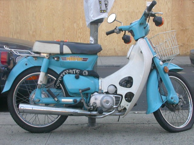
Technically your photo is well exposed for the conditions but I think the focus is out and not pin-sharp. I can�t see where the camera focussed so maybe you were moving when you took this shot. The photo seems to be well processed with no digital artefacts although I think a bit more colour saturation and contrast may have helped this photo.Your cropping is very close which detracts from the image.
Compositionally�as you say a simple shot of a motorbike�but this is where I feel you missed many opportunities for a great photo. If this had been taken from any of many angles such as-- from the front wheel -- emphasising the flat tyre and the blue mudguard. Look at Grayces� splendid photo of the vintage car�the angle of the photo emphasises the curves and grace of the design. Sometimes the composition and angle of the photo gives one a new view of a commonplace object and this is what your photo lacks. Your title however gives a wry angle to the shot with a nice double meaning.
Andrew
|
|
 Photographer found comment helpful. Photographer found comment helpful. |
Comments Made During the Challenge  |
|
|
12/08/2002 04:07:06 PM |
| The focus could be a little sharper |
|
|
|
12/08/2002 04:50:40 AM |
|
|
|
12/05/2002 05:27:31 PM |
| Bood shot, great bike. Sorry about the flat. The focus could be sharper and con't crop out any of the front tire, but that's about all I'd change. Good shot. PTL7 |
|
| Photographer found comment helpful. |
|
|
12/05/2002 04:07:58 PM |
| Good subject and title match. Wit pays off |
|
| Photographer found comment helpful. |
|
|
12/05/2002 07:51:10 AM |
| Nice clear photo but I feel that it's a little too tightly cropped. |
|
| Photographer found comment helpful. |
|
|
12/03/2002 08:29:00 PM |
| I think this shot taken from a different angle would have been more effective. |
|
| Photographer found comment helpful. |
|
|
12/02/2002 11:17:00 AM |
| Good double meaning for this photo... It looks a little blurry to me though... Interesting subject... andwould have liked slightly brighter colors, and more contrast? Good luck. |
|
| Photographer found comment helpful. |
|
|
12/02/2002 07:43:00 AM |
challenge met -- yes, even twice :)
technical -- this image looks a little too flat, i wish the colors would pop a little more. increasing contrast would do that for you. i've got an example if you are interested ... email me. focus and lighting good.
composition -- ok.
-- gr8photos. |
|
| Photographer found comment helpful. |
Home -
Challenges -
Community -
League -
Photos -
Cameras -
Lenses -
Learn -
Help -
Terms of Use -
Privacy -
Top ^
DPChallenge, and website content and design, Copyright © 2001-2025 Challenging Technologies, LLC.
All digital photo copyrights belong to the photographers and may not be used without permission.
Current Server Time: 04/09/2025 12:03:50 PM EDT.