| Image |
Comment |
| 09/07/2006 05:28:55 PM |
|
 Photographer found comment helpful. Photographer found comment helpful. |
| 09/07/2006 02:17:35 AM |
Party with me?by spreadpanicComment by twm122: Now thats just odd. I like your composition though. I even like the tilt it actually add to the oddness of the shot. Your light is nice |
| Photographer found comment helpful. |
| 09/04/2006 12:42:26 PM |
|
| Photographer found comment helpful. |
| 09/02/2006 02:40:54 PM |
Party with me?by spreadpanicComment by gerdagrice: Very cleverly conceived and well shot, with great colours and clarity. I think, though, that this image would be even more effective if you cropped down a bit from the top--to about 1/2 way from the top of the hat to the brim. |
| Photographer found comment helpful. |
| 09/02/2006 07:52:55 AM |
|
| Photographer found comment helpful. |
| 05/13/2006 09:40:07 AM |
The Wall Comes to Townby spreadpanicComment by HBunch: *Critique Club*
I have to wonder how this would look with the classic 'desaturate everything but yellow' trick. I might look neat, but then again, it might just look cliche. Something worth playing with anyway.
I think that the candles add a little clutter that I feel the photo would benefit without. Not sure if crop would have helped, or maybe a different placement of the flower, but I don't feel that the flowers are adding positively to the photo.
Focus and clarity are great. Nice crispness in the flower, and the wall. I feel that the DOF works as well.
Lighting is also good. No distracting hot spots or shadows.
My eyes are drawn down the stem of the flower to the bright red of the little flag. This is where a desaturation technique might have been beneficial, as I feel the bright red placed at the bottom of the stem draws the attention away from the 'subject' to a lesser interesting part of the photo. As well, a different crop could also eliminate that.
Overall, I think that it's a very nice image with the only issues I can find to improve upon are the 'background clutter'/distracting elements.
Very nice shot. I feel it works it's way into the challenge too.
~Heather~ |
| Photographer found comment helpful. |
| 05/05/2006 03:35:52 PM |
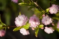
Spring's Getting Comfortableby spreadpanicComment by olbol: Front bloom is distracting in its unsharpness. I've done a fair bit of cherry- plum- and appletree hugging and I know it's difficult to keep it all in focus especially if the breeze comes, but that's what separates good shot from an average. |
| Photographer found comment helpful. |
| 05/05/2006 03:02:46 AM |
Spring's Getting Comfortableby spreadpanicComment by JunieMoon: Lovely pastel colors. Focus is very uneven, though. With multiple points of distance from the camera, it is hard to get a defined focal point. Sometimes if you have a move function on the camera, you can adjust where the focus will be. |
| Photographer found comment helpful. |
| 05/02/2006 04:31:07 PM |
|
| Photographer found comment helpful. |
| 05/02/2006 12:31:10 PM |
Spring's Getting Comfortableby spreadpanicComment by ericwoo: I like the idea here, but your subject gets lost in the frame. Perhaps taking the main focus out of the center and focusing on one of the brighter blooms would have remedied all this. Great potential, just not the best of all execution. |
| Photographer found comment helpful. |
Home -
Challenges -
Community -
League -
Photos -
Cameras -
Lenses -
Learn -
Help -
Terms of Use -
Privacy -
Top ^
DPChallenge, and website content and design, Copyright © 2001-2025 Challenging Technologies, LLC.
All digital photo copyrights belong to the photographers and may not be used without permission.
Current Server Time: 04/11/2025 05:49:29 AM EDT.