| Author | Thread |
Comments Made During the Challenge  |
|
|
08/24/2004 07:11:25 PM |
| How in the heck did you get the dark spots so non-grainy!?!?! I'm in awe of your technique. I'm really learning a lot with this challenge-- thanks! |
|
 Photographer found comment helpful. Photographer found comment helpful. |
|
|
08/24/2004 04:58:30 PM |
|
| Photographer found comment helpful. |
|
|
08/24/2004 04:43:40 PM |
not a bad shot. i'd prefer it with a little more foreground, though.
Message edited by author 2004-08-25 09:12:00. |
|
| Photographer found comment helpful. |
|
|
08/22/2004 12:05:39 AM |
| good work. if you could have zoomed further out or moved further away that would have helped your composition. 8 |
|
| Photographer found comment helpful. |
|
|
08/20/2004 02:55:26 PM |
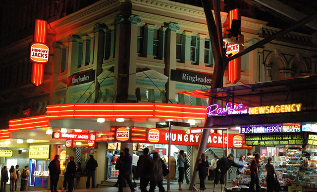
| To much going on in this photo fore my taste and it brings the photo down to cut off the feet as you do, just a little bit lower aim and it would have raised the ratings. On the other hand I would have suggested a vertical framing with focusing on the left side of the motive focusing on the Hungry Jack's, then with all of the feets in the frame and also more of the house at the top. |
|
| Photographer found comment helpful. |
|
|
08/20/2004 08:51:07 AM |
| Your title makes me think the people should be blurry from a tight apeture and long exposure. Nice. |
|
| Photographer found comment helpful. |
|
|
08/19/2004 02:39:12 PM |
| Would have been so much better if the people in the shot were actually blurred, further denoting the "hussle and bustle" you've captured. I probably would have focused on either the newstand -or- the restaurant, but not both. |
|
| Photographer found comment helpful. |
|
|
08/18/2004 11:57:54 PM |
| nice sharp, but the composition is not very interesting. 6 |
|
| Photographer found comment helpful. |
|
|
08/18/2004 09:59:21 AM |
| I like street photography but there should be something to capture my attention and this shot is lacking that something. The only thing that really captured my attention is the "Hungry Jacks" logo appears to be borrowing heavily from Burger King. |
|
| Photographer found comment helpful. |
|
|
08/18/2004 09:12:58 AM |
| Has a lot of different neon colors and parts to it. I like the city life in this. You met the challenge and made this a great shot as well! |
|
| Photographer found comment helpful. |
|
|
08/18/2004 05:16:54 AM |
|
|
|
08/18/2004 01:00:25 AM |
| I think less of a straight on shot would have been better. - 5 |
|
| Photographer found comment helpful. |
|
|
08/17/2004 09:58:12 PM |
| i love the liveliness from this photo especially compared to the lifelessness of some of the others ive seen so far |
|
| Photographer found comment helpful. |
Home -
Challenges -
Community -
League -
Photos -
Cameras -
Lenses -
Learn -
Help -
Terms of Use -
Privacy -
Top ^
DPChallenge, and website content and design, Copyright © 2001-2025 Challenging Technologies, LLC.
All digital photo copyrights belong to the photographers and may not be used without permission.
Current Server Time: 04/07/2025 12:54:22 PM EDT.