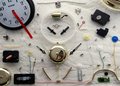
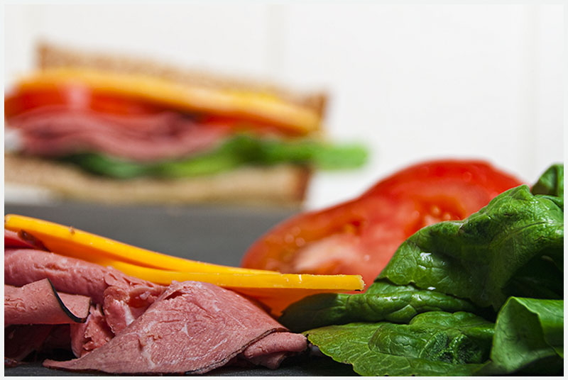
Have a feeling this one is going to tank, but I like it, and hope that it will be 100% different than anything else in the challenge. I wanted to disassemble something organic, and play around with the idea of defining what an 'object' has the opportunity to be.
This was taken handheld on my kitchen counter, the grey is my cutting board. I have it lit high on the right side w/ softbox.
I forgot the bread in this shot, and most of my other outtakes, and that's where the title comes from.
---
Post processing involved some Raw conversion, saturation of the individual color channels. Clarity+35. Used Topaz Adjust (Clarity-- Low strength) and Topaz Clean (DeGrunge). Finished it off with a bit of unsharpmask, resized, and added a small white border for some breathing room.
I feel like this is a bit too post-processed for me, A bit hyper-sharp, or HDR ish. Feels computery and obnoxious. Let's see what everyone else thinks.
Statistics
Place: 24 out of 71 Avg (all users): 5.4934 Avg (commenters): 7.2500 Avg (participants): 5.2973 Avg (non-participants): 5.5316 Views since voting: 1230 Views during voting: 404 Votes: 227 Comments: 6 Favorites: 0
Hello and greetings from the Critique Club-
First and foremost, the thing that strikes me about your entry is that the challenge prompt desires that we show the whole of an object through its constituent parts. You have disassembled your object, but I am not personally given a definitive sense of a sandwich through what I see. Part of this is due to the shallow depth of field, which shifts me away from the parts, denies me the chance to reconstruct the object through its parts, and the assembled sandwich in the background simply shows me the whole object on its own, but not through the parts. As a general rule, setup shots of this nature need to be exceptionally clean to really push them over the top into the really successful realm. I would suggest you study Oliver’s work (h2) to get an idea of what I mean.
Beyond that, your lighting is pleasing. It has a very natural feel to things, providing a nice depiction of shape, light and dark. Your sandwich parts are well saturated, but not terribly garish either, so they look luscious and enticing (everything has a fresh look to it with perhaps a small exception going to the cheese, which looks like it might be getting a bit dry).
Overall a good take on the challenge, but suffers from the pedigree of shots in this category that precede it. To score well with a shot like this, the voting community largely expects perfection, so it’s a tough field style to score well with.
I gave this a 6, which in my scale means good but nothing special. The composition and dof are nice and work well to attract the attention to the food on the foreground, which is sharp, colorful and looks tasty. The lighting is good. There are no distraction nor flaws. But unfortunately there is nothing else... the subject is not interesting, there is no story, there is no extraordinary view on an ordinary object (like if the food was floating in the air or something else). Based on your two submissions so far, I think you have good technical skills and a creative and unconventional approach to photography that will bring you soon to very good results. Good luck!