| Author | Thread |
Comments Made During the Challenge  |
|
|
07/27/2004 07:56:47 PM |
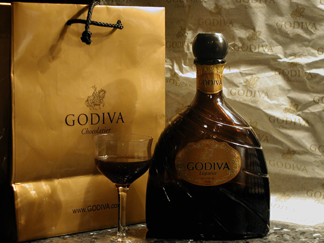
| Like to see a little more diffuse light coming in from the left to help illuminate the label and glass some more. It might get rid of some of the shadow cast by the bottle too |
|
 Photographer found comment helpful. Photographer found comment helpful. |
|
|
07/27/2004 07:39:42 AM |
| Don't go drink and Godriva. |
|
| Photographer found comment helpful. |
|
|
07/26/2004 09:55:55 PM |
| there's another photo similar to this one, check it out |
|
| Photographer found comment helpful. |
|
|
07/26/2004 09:09:03 PM |
| a wee too bright on the paper, I think it's just the odd lighting used |
|
| Photographer found comment helpful. |
|
|
07/25/2004 05:33:13 PM |
| Way too dark. Could have been great. |
|
| Photographer found comment helpful. |
|
|
07/25/2004 08:43:44 AM |
Looks a bit like an advertisement for this drink but I think it needs some improvement in setup and technically for you to be able to sell this image to the company. Think 1/2 or 1 stop longer exposure would have given a better expression and then you can add more contrast, probably you need a better lightning. Also the WB should without a doubt be much warmer. The image needs tighter croping from above and from left. About the setup; the bag and the background paper have obviously been under to much usage to give good expression and are rather distracting.
But good experiment. |
|
| Photographer found comment helpful. |
|
|
07/25/2004 03:47:14 AM |
| you've arranged the items well, I like the bit of space empty to the right, would like the background a bit blurred (the lighting here is great), a bit more space under the glass and A crisper bag (perhaps the other side of the bag w/o the fold?). a touch more light on the bottle to bring out details (but keep that partial shadow as it adds interest) Good luck with your shot! |
|
| Photographer found comment helpful. |
|
|
07/23/2004 12:38:48 PM |
| I like the idea. I think just the bottle and the glass would of been enough. |
|
| Photographer found comment helpful. |
|
|
07/23/2004 08:13:35 AM |
| the shadows in the wrong places detract from this. But a good subject, and nice composition. |
|
| Photographer found comment helpful. |
|
|
07/22/2004 05:45:13 AM |
| To much "godiva". I would have cropped out more of the right side removing most that hotspot from your picture or maybe even cropping the right side centering the glass. <6> with the crop suggestions in my opinion would have been at least an <8> |
|
| Photographer found comment helpful. |
|
|
07/21/2004 06:21:53 AM |
| Step back one pace, then shoot. We need the whole bottle and glass in the picture, otherwise this is an excellent shot. |
|
| Photographer found comment helpful. |
|
|
07/21/2004 12:19:09 AM |
| Elegant... I hope the rest of the voters see that it is chocolate liqueur. I see there is more than the glas missing :) You would have do well if you shapened the image some more. I love the concept though. (7) |
|
| Photographer found comment helpful. |
|
|
07/20/2004 09:10:41 PM |
| Seems a bit off-balance. Maybe a tighter crop would work. |
|
| Photographer found comment helpful. |
Home -
Challenges -
Community -
League -
Photos -
Cameras -
Lenses -
Learn -
Help -
Terms of Use -
Privacy -
Top ^
DPChallenge, and website content and design, Copyright © 2001-2025 Challenging Technologies, LLC.
All digital photo copyrights belong to the photographers and may not be used without permission.
Current Server Time: 04/07/2025 12:13:18 AM EDT.