| Author | Thread |
|
|
10/14/2009 12:10:04 PM |
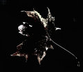
| Too bad this one didnt do better... I had it in the top 5. The low key really adds to the shot in that it makes the bull look very sinister. |
|
 Photographer found comment helpful. Photographer found comment helpful. |
|
|
10/14/2009 08:37:11 AM |
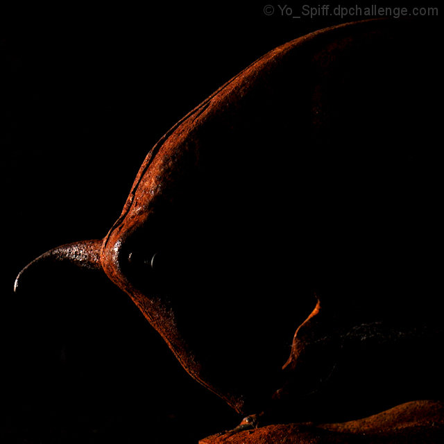
| Funny how abstract just doesn't work in some challenges. I like the way this came out. Good colors, good lighting (imo) and it clearly meets challenge. Should have scored better... |
|
| Photographer found comment helpful. |
|
|
10/14/2009 01:19:48 AM |
I'm still trying to figure out the challenge, but I liked the pic. Did you experiment with the light? Maybe less harsh and broader coverage? Just trying to figure out what I would have done with it.
) |
|
| Photographer found comment helpful. |
Comments Made During the Challenge  |
|
|
10/12/2009 02:03:29 PM |
| Great study. Beautiful color and very good composition. 10. |
|
| Photographer found comment helpful. |
|
|
10/10/2009 12:13:48 PM |
| Love this one, the tones and the compostion is outstanding. |
|
| Photographer found comment helpful. |
|
|
10/08/2009 10:32:58 AM |
| I couldn't recognize the subject without your title. A little more lighting on the front side would've provided more definition, at least on my monitor. |
|
| Photographer found comment helpful. |
|
|
10/08/2009 03:33:37 AM |
| Very nice colours and lighting here, I love the fact that you can just make out the outline but there is still enough important details there. |
|
| Photographer found comment helpful. |
|
|
10/07/2009 12:07:52 AM |
|
| Photographer found comment helpful. |
Home -
Challenges -
Community -
League -
Photos -
Cameras -
Lenses -
Learn -
Help -
Terms of Use -
Privacy -
Top ^
DPChallenge, and website content and design, Copyright © 2001-2025 Challenging Technologies, LLC.
All digital photo copyrights belong to the photographers and may not be used without permission.
Current Server Time: 04/07/2025 05:56:14 AM EDT.