| Author | Thread |
Comments Made During the Challenge  |
|
|
06/04/2004 10:56:51 PM |
|
 Photographer found comment helpful. Photographer found comment helpful. |
|
|
06/04/2004 11:11:02 AM |
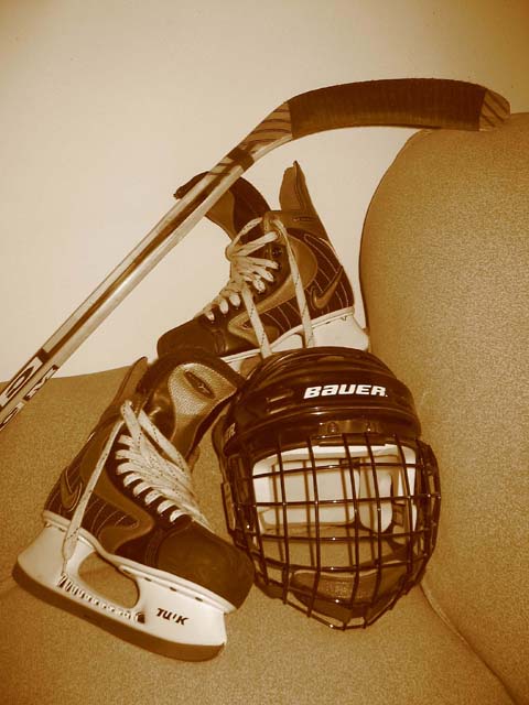
| Adding some contrast would help this shot. I think it needs a bit of actual black in there, rather than mid-greys (or their sepia equivilent) as there are currently |
|
| Photographer found comment helpful. |
|
|
06/03/2004 05:07:56 PM |
| Interesting setup and I like the sepia tones, but the background is very amaturish (for lack of a better word.) The couch makes it look like a quick snapshot rather than a serious photograph. I have bought a length of black velvet to use for photo's that require a neutral background. In a pinch a tablecloth will usually work as well. I this case I would have brought the objects outside (better lighting) and used a white or wooden background. That's my opinion, for what it's worth. |
|
| Photographer found comment helpful. |
|
|
06/03/2004 05:01:21 PM |
| not keen on the coloring. the backgound furniture looks like a large butt crack to me. Sorry, but that's what it reminds me of. |
|
| Photographer found comment helpful. |
|
|
06/03/2004 02:40:58 PM |
| I think I would have liked this better if the equipment was sitting on some ice. I like the sepia tones, but the couch and the blank white wall doesn't really do anything for the composition. Maybe if the equpiment was cropped a bit closer it woud have imprved things just slightly. |
|
| Photographer found comment helpful. |
|
|
06/03/2004 12:41:50 PM |
| This flat white wall and uphostered chaird is a poor choice of background for this subject. If you can't place your subject in context than it would be better to have a very simple background. This is kind of a mundane arrangement. It doesn't make a lot of sense. Why place one skate on the arm of the chair instead of resting it near its partner. The lighting is very straightforward and dull. Sepia does not improve this poor image. I wish I could say something more positive. Keep trying. |
|
| Photographer found comment helpful. |
|
|
06/03/2004 11:08:19 AM |
As a still life it is ... boring It looks like This picture from concept to completion
meaning from set up to upload to DPchallenge took all of 5 minutes.
So I scored you a 5
How could you have done this better?
1 suggestion ,find a good old worn wood or brick background with a nail and hang your skates on it . Make the composition good by proper placement and Ta Da you would have had a much better photo.IMO
Placement of this equipment just removes it so much from its element. |
|
| Photographer found comment helpful. |
|
|
06/02/2004 04:10:20 PM |
| Im not really to keen on the toning here. It also looks like you have some vignetting. |
|
| Photographer found comment helpful. |
Home -
Challenges -
Community -
League -
Photos -
Cameras -
Lenses -
Learn -
Help -
Terms of Use -
Privacy -
Top ^
DPChallenge, and website content and design, Copyright © 2001-2026 Challenging Technologies, LLC.
All digital photo copyrights belong to the photographers and may not be used without permission.
Current Server Time: 02/01/2026 10:34:53 AM EST.