| Author | Thread |
|
|
06/08/2004 02:20:41 PM |
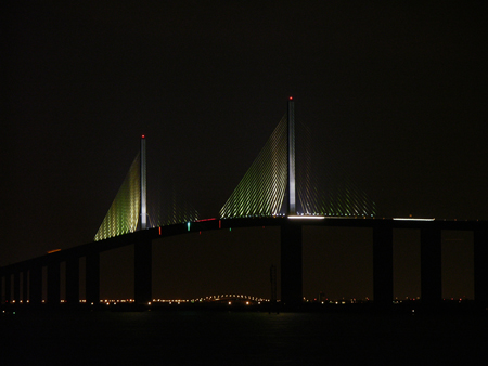
Hi, well reading through the comments folks left on your image during thechallenge, there appears to be 2 main issues which can be dealt with faily easily.
The first is the size of the submission, its obviously less than the 640 pixels which you are allowed, and this makes it difficult to see much detail in the image. I don't know which image processing software package you use but its usually possibl the save at a given size. It certainly is with Photoshop, and with Paintshop Pro. The aim is to maximise the size (one side 640pixels) whilst maintainging the quality and keeping the filesize under 150k. Sometimes this is a bit of a juggle.
The second issue most people picked up on was the lighting. I think that the lighting is fine, doark enhances the lights on the bridge, but because of the size issue, we can't actually see the details, Most people would have given you the benefit of the doiubt had the detail been available to them.
Compositionally I think there are a couple of tricks you could have used to help this image. I would have liked to see the large uprights placed on the 1/3 and 2/3 lines within the image. These are strong elements and placing them at the golden third intersections would really emphasise the structures.
Someone has already pointed out that theres a fair bit of wasted space at the top of the image, I would agree and crop some of this off in Photoshop (PS)
I notice that there are two vehicles crossing the bridge. With a longer exposure these lights could have been used to emphasise the line of the bridge roadway. Use a neutral density filter to extend the exposure. I'd be aiming for 8-10 seconds timed to co-incide with the vehicles.
Hope some of that helps.
Falc |
|
Comments Made During the Challenge  |
|
|
06/01/2004 03:39:51 PM |
| this is really dark, and doesn't seem to be focused as well as it could be... but a fun idea! |
|
|
|
06/01/2004 12:38:01 PM |
|
|
|
05/31/2004 08:21:44 PM |
| Ordinarily, a shot this small would lose points with me. However, I really like this shot for it strong lines and interesting lighting. |
|
|
|
05/31/2004 01:27:47 AM |
| godamn i just love these city shots |
|
|
|
05/30/2004 07:12:16 PM |
|
|
|
05/29/2004 02:51:49 AM |
|
|
|
05/28/2004 08:10:11 AM |
| I like the picture, but I think it is a little bit under exposed |
|
|
|
05/27/2004 11:55:33 AM |
| a tad underexposed or under-cropped (lop off some of that black sky and sea) |
|
|
|
05/26/2004 12:05:33 PM |
| interesting shot, might be a little better if you cropped closer in and used the 640xSomething |
|
|
|
05/26/2004 11:27:38 AM |
| You should have exposed longer to get more detail...now it's not quite clear what's in the picture...for an abstract it is too centered to be exciting to look at.. |
|
|
|
05/26/2004 09:09:56 AM |
| Beautiful, I recongnize the bridge. |
|
|
|
05/26/2004 07:38:29 AM |
| This would be amazing with a wider shot stictched together - the lighting is beautiful I can only imagine how cool it would be closer up. |
|
|
|
05/26/2004 06:19:50 AM |
|
Home -
Challenges -
Community -
League -
Photos -
Cameras -
Lenses -
Learn -
Help -
Terms of Use -
Privacy -
Top ^
DPChallenge, and website content and design, Copyright © 2001-2025 Challenging Technologies, LLC.
All digital photo copyrights belong to the photographers and may not be used without permission.
Current Server Time: 04/07/2025 12:18:37 AM EDT.