| Author | Thread |
Comments Made During the Challenge  |
|
|
05/23/2004 06:50:30 PM |
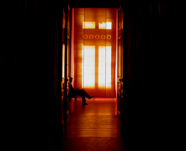
| Really like the warm colors of this one. It does seem as though it's slightly tilted, which distracted me trying to figure out if it was or if that was just an optical illusion. I love the hcoice to frame it with the darkness, it really emphasizes the colors. |
|
|
|
05/22/2004 01:04:49 AM |
| Great photo, I like the clever use of negative space, the color cast from the shears (sp?), and the silhouette effect on the reader. However, I don't understand the title. Could you PM me after the challenge? |
|
|
|
05/19/2004 02:32:45 AM |
| Great colors! It seems slightly tilted to the right, and cropping could have been tighter to cut off the large dark areas left and right. |
|
|
|
05/18/2004 05:05:53 PM |
| I really like the color and composition -- for this challenge especially -- it's got to be level |
|
|
|
05/18/2004 03:14:05 PM |
| Good photo but I would have cropped it on the sides a little. I still like it though. 7 |
|
|
|
05/18/2004 10:14:08 AM |
| I really like this picture. The lighting and perspective really make some nice effects. It seems like the camera is slightly tilted though, or maybe slight barrel distortion? |
|
|
|
05/18/2004 10:13:27 AM |
| tilts to the right ... nice though ... 8 |
|
|
|
05/18/2004 06:53:43 AM |
| Love the use of light vs. dark. The colors are very warm and wonderful. I llike the use of negative space to emphasize the center subject. |
|
|
|
05/17/2004 07:07:45 PM |
| Seems a little crooked, but nice effect. |
|
|
|
05/17/2004 06:15:41 AM |
| Tilting this counter clockwise to correct the angle would help tremendously. I like the colors and "mood" of this image. |
|
|
|
05/17/2004 05:40:29 AM |
| .Not level, a bit over exposed |
|
|
|
05/16/2004 10:29:11 PM |
| I like this, but I think there is to much negative space on the sides. |
|
Home -
Challenges -
Community -
League -
Photos -
Cameras -
Lenses -
Learn -
Help -
Terms of Use -
Privacy -
Top ^
DPChallenge, and website content and design, Copyright © 2001-2025 Challenging Technologies, LLC.
All digital photo copyrights belong to the photographers and may not be used without permission.
Current Server Time: 04/08/2025 06:24:59 AM EDT.