| Author | Thread |
Comments Made During the Challenge  |
|
|
05/18/2004 06:45:55 PM |
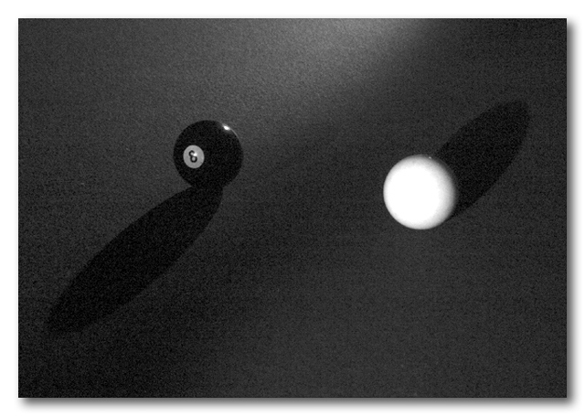
| Very concise and simple. I like the addition of grain, it removes it from reality and gives it more of an abstract feel. The white ball is slightly overexposed (I think) but I like the opposing shadows. |
|
 Photographer found comment helpful. Photographer found comment helpful. |
|
|
05/15/2004 09:39:24 PM |
| little to soft for me...but good idea |
|
| Photographer found comment helpful. |
|
|
05/15/2004 05:05:02 PM |
| Interesting idea. I'd like it better if a) the shadows were more pronounced, b) the cue ball were in sharp focus. 5 |
|
| Photographer found comment helpful. |
|
|
05/15/2004 01:43:43 PM |
That's WEIRD! how did you do it ? :)
I gave you an 8 cuz you have the 8 ball there ;-) |
|
| Photographer found comment helpful. |
|
|
05/14/2004 12:49:12 PM |
|
|
|
05/14/2004 09:34:34 AM |
| aside from the grainyness, i like the idea. |
|
| Photographer found comment helpful. |
|
|
05/14/2004 07:58:09 AM |
| This shot meets the challenges on a couple of levels but the shot itself seems a bit out of focus and noisy and while the idea is good the lack of contrast leaves the shot looking rather dull to me. A 3 |
|
| Photographer found comment helpful. |
|
|
05/13/2004 05:07:41 PM |
| This is not a very crisp shot,I love the idea just wish it was clear. |
|
| Photographer found comment helpful. |
|
|
05/13/2004 01:05:26 PM |
Nice effect. From all the noise in this shot I have to imagine that this was taken in a relatively dark locale?
The noices works for me in this shot. |
|
| Photographer found comment helpful. |
|
|
05/13/2004 11:45:05 AM |
| Shadows in opposite directions, very creative. |
|
| Photographer found comment helpful. |
|
|
05/13/2004 07:45:51 AM |
| Great idea. Simple and captivating. However, the photo is way to grainy and doesn' t have enough contrast. The whites could be whiter and the black could be blacker. Good attempt. |
|
| Photographer found comment helpful. |
|
|
05/13/2004 12:30:57 AM |
| Good job, i like this photo |
|
| Photographer found comment helpful. |
|
|
05/12/2004 11:15:41 PM |
Simple effective yet not "there" almost real good but just missing something... 6
Good Luck and Cheers |
|
| Photographer found comment helpful. |
|
|
05/12/2004 07:22:20 PM |
| I really like the idea, but the picture is so grainy, and unsharp. Looks like it was taken with a cell-phone camera, perhaps. I'm still a sucker for a good pool-table shot, though. Keep it up! |
|
| Photographer found comment helpful. |
|
|
05/12/2004 06:58:28 PM |
| A little grainy, Plus you can still see the 8 balls reverse shadow. |
|
| Photographer found comment helpful. |
|
|
05/12/2004 09:01:42 AM |
| nice idea, but i think it is too much dark. the black ball is hard to see, the white ball is very blurry. a touch of glare on the black ball. |
|
|
|
05/12/2004 08:59:20 AM |
| Great idea, but way too much noise and white ball is washed out. |
|
|
|
05/12/2004 08:56:02 AM |
| The 3 ball is extremely grainy and almost transparent. It's very obvious on my computer. I'm not sure if maybe you did two-shots on one frame. It may have been more effective to leave the shutter open slightly longer on the black ball. However, it's a very cool idea and effect otherwise - 6 |
|
|
|
05/12/2004 07:59:27 AM |
| This is a great idea but the grain and focus really take away from the shot - 4 |
|
|
|
05/12/2004 07:12:54 AM |
very good ..... although is it just me or is the background a bit grainy ??? just kidding
8
|
|
|
|
05/12/2004 07:10:06 AM |
| Nice idea. The black background makes the 8 ball and shadow blend in a bit too much, and the bright cue ball makes it hard to see the shadow it cast. |
|
|
|
05/12/2004 05:17:52 AM |
| a bit too much with the off screen light being reflect on the surface. also seems blurry. Good idea. |
|
|
|
05/11/2004 11:16:34 PM |
| is this intended to be grainy? it looks kinda neat |
|
|
|
05/11/2004 09:38:53 PM |
| good idea. Nice texture in the felt. A little blown out on the cue ball though. 7. |
|
| Photographer found comment helpful. |
Home -
Challenges -
Community -
League -
Photos -
Cameras -
Lenses -
Learn -
Help -
Terms of Use -
Privacy -
Top ^
DPChallenge, and website content and design, Copyright © 2001-2025 Challenging Technologies, LLC.
All digital photo copyrights belong to the photographers and may not be used without permission.
Current Server Time: 04/07/2025 02:21:21 PM EDT.