| Author | Thread |
|
|
05/19/2004 11:48:14 AM |
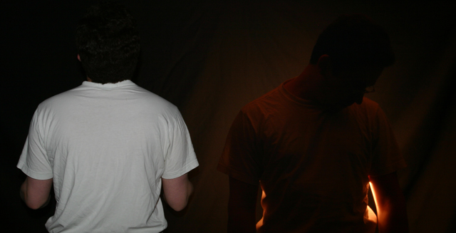
| Looks like in this shot, I was a victim of using my ultra-bright Mac monitor, where the contrast worked well. I noticed on most machines, it does indeed look too dark. Alas. The photo should have been titled "heaven and hell" to show the dramatic point better. And yes, it is just one person, not two, as most people seemed to think. Thanks for the feedback. My worst score yet, and hopefully ever! :) |
|
Comments Made During the Challenge  |
|
|
05/18/2004 10:42:04 PM |
| Interesting photo - I like the silhouette around the right figure but I think the left one is a bit overexposed for this style. |
|
 Photographer found comment helpful. Photographer found comment helpful. |
|
|
05/18/2004 05:53:19 AM |
|
|
|
05/17/2004 11:37:02 PM |
| A bit on the dark side (image-wise) and detail is very lacking on the right side. |
|
| Photographer found comment helpful. |
|
|
05/17/2004 06:18:17 AM |
hmmmmmmmmmmm.
Good effort. Thank you for not doing fire and ice. in other words I like the originality. |
|
| Photographer found comment helpful. |
|
|
05/17/2004 03:59:21 AM |
| Interesting shot, is it one person or two? Cool... |
|
| Photographer found comment helpful. |
|
|
05/16/2004 06:40:42 PM |
| I like this shot. Very interesting. |
|
| Photographer found comment helpful. |
|
|
05/15/2004 05:32:53 PM |
|
| Photographer found comment helpful. |
|
|
05/14/2004 04:05:50 PM |
|
| Photographer found comment helpful. |
|
|
05/14/2004 12:48:39 PM |
| Way too underexposed on both sides, but creative. |
|
| Photographer found comment helpful. |
|
|
05/13/2004 03:56:37 PM |
|
| Photographer found comment helpful. |
|
|
05/13/2004 03:40:14 PM |
| Maybe it's me, but I don't "get" this photo...sorry |
|
| Photographer found comment helpful. |
|
|
05/13/2004 03:05:25 PM |
| I think I've got it.......The shot on the left is rubbish..disposable camera flash and uninteresting, the picture on the right is interesting, moody and lit interestingly.......is that it? well done. As a whole I'm not sure I'll be rushing to add it to my favourites though! |
|
| Photographer found comment helpful. |
|
|
05/12/2004 11:48:00 PM |
| Poor exposure on the right side of pic. You almost can't see that person without looking carefully. Switch to no flash and a longer exposure with the camera on a support. |
|
| Photographer found comment helpful. |
|
|
05/12/2004 11:18:14 PM |
| good idea but way too dark. can't see what you are portraying. |
|
| Photographer found comment helpful. |
|
|
05/12/2004 09:09:08 PM |
| All I can see is the guy on the rights white shirt. A little ambient light would fill in the what is way too dark. 2 |
|
| Photographer found comment helpful. |
|
|
05/12/2004 02:26:23 PM |
| Good try, but it just doesn't seem very captivating or well thought out. I like the idea, but needs a bit more planning to really catch my attention. |
|
| Photographer found comment helpful. |
|
|
05/12/2004 01:45:21 PM |
| Too dark and to me it is uninteresting. |
|
| Photographer found comment helpful. |
|
|
05/12/2004 01:24:01 PM |
| Not following you on the whole opposite concept...maybe it's too cerebral for me. Is it light/dark? Not easy to rate this one. |
|
| Photographer found comment helpful. |
|
|
05/12/2004 01:04:10 PM |
| An evocative picture, but whatever you are trying to say is not said clearly enough for me to understand. |
|
| Photographer found comment helpful. |
|
|
05/12/2004 03:54:46 AM |
| more contrasting colors would be nice, and the guy on the right a little more bright and the left one a little less bright |
|
| Photographer found comment helpful. |
Home -
Challenges -
Community -
League -
Photos -
Cameras -
Lenses -
Learn -
Help -
Terms of Use -
Privacy -
Top ^
DPChallenge, and website content and design, Copyright © 2001-2026 Challenging Technologies, LLC.
All digital photo copyrights belong to the photographers and may not be used without permission.
Current Server Time: 02/01/2026 10:35:23 AM EST.