| Author | Thread |
|
|
12/26/2008 11:42:04 PM |
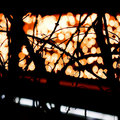
Greetings from the Critique Club...
I was not able to vote on this challenge, but if I had, I probably would have given you a 6 or 7.
I am a little surprised with the score this image finished with. I guess it is a little out of the box for many people. Frankly, I think it is great. I like the fact that most of the image is out of focus. The background is just awesome. It reminds me of a stained glass window. I'm sure you got voted down because the focus is on certain parts, but not one entire area. Normally I would complain about this, but the overall image is just so nice, I really don't have any criticism for you. Cool image.
If you need any clarification on any of my comments, please feel free to pm me. It might take some time for me to get back to you. |
|
 Photographer found comment helpful. Photographer found comment helpful. |
Comments Made During the Challenge  |
|
|
12/22/2008 06:40:06 PM |
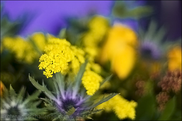
| Would have liked it better had the focal point been at the center of the flower which is now in focus |
|
| Photographer found comment helpful. |
|
|
12/21/2008 07:21:22 AM |
| There are too many parts without focus on your shot and this makes confused about which is the main object. The colors are good and the bokeh is good too, but it got confused by the "non-focused" areas too. |
|
| Photographer found comment helpful. |
|
|
12/20/2008 12:45:15 PM |
The bokeh is really nice, but I find the brightest part of the shot is the yellow and the parts of the shot in the DOF don't stand out enough. Moving perspective and/or increasing the DOF might have yielded a really nice shot!
The shot is very nice and should do well. I guess my point is that it could great and a medal contender. |
|
| Photographer found comment helpful. |
|
|
12/19/2008 08:15:48 PM |
| the composition and mixture of textures doesnt work for me |
|
| Photographer found comment helpful. |
|
|
12/19/2008 01:41:40 PM |
|
| Photographer found comment helpful. |
|
|
12/19/2008 10:51:49 AM |
|
| Photographer found comment helpful. |
|
|
12/18/2008 01:37:45 PM |
| While there are a lot of OOF areas in this image, I just find them to be a little bit too busy. I find myself hunting for other shapes and trying to make out what could be back there rather than enjoying the viewing pleasure of your subject. You might have considered taking out that purple flowery thing in front too... a good subject is usually alone in it's splendor. Your colour scheme is very very eye pleasing though. This idea has a lot of potential. My suggestion is to re-shoot it with some of the above suggestions in mind so you can see what kind of difference it makes. Good luck! :) |
|
| Photographer found comment helpful. |
|
|
12/16/2008 10:08:22 PM |
| A little messy - hard to tell what's supposed to be in focus. |
|
| Photographer found comment helpful. |
Home -
Challenges -
Community -
League -
Photos -
Cameras -
Lenses -
Learn -
Help -
Terms of Use -
Privacy -
Top ^
DPChallenge, and website content and design, Copyright © 2001-2025 Challenging Technologies, LLC.
All digital photo copyrights belong to the photographers and may not be used without permission.
Current Server Time: 04/09/2025 04:30:19 PM EDT.