| Author | Thread |
|
|
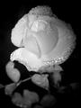
06/12/2004 06:47:37 PM |
|
|
|
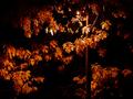
08/19/2003 08:04:41 PM |
| Dang... Very well constructed! |
|
|
|
10/28/2002 04:05:00 AM |
| Get us a How-To please :) |
|
Comments Made During the Challenge  |
|
|
10/26/2002 05:19:00 PM |
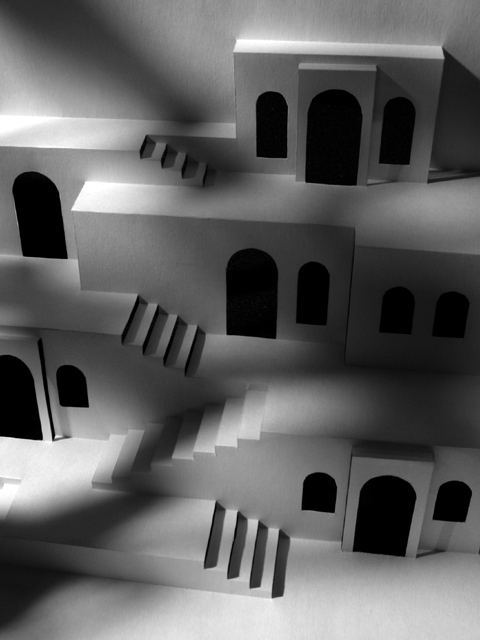
| Don't understand the title. Like the building. Pretty good shot. Like the shadows. |
|
|
|
10/26/2002 05:17:00 PM |
| this is so cool! does the title mean it was made with only one sheet of paper?? i'd like to know how. good job. 9--shutterfly |
|
|
|
10/26/2002 09:20:00 AM |
| very cool image. I think this is great subject for black and white, and the shadows really make it stand out, imo. it certainly doesn't look like a single sheet of 8.5 x 11 paper (it looks MUCH larger) but I guess thats what you were going for. (9) ~mcmurma |
|
|
|
10/25/2002 05:57:00 AM |
|
|
|
10/24/2002 11:34:00 PM |
| Nicely lit - good toneality here! B&W perfect. Like it very much. /carsten |
|
|
|
10/24/2002 05:59:00 PM |
| don't know, the shadows are ok but a little distracting. |
|
|
|
10/24/2002 03:43:00 PM |
Impressive - and that's just the woodwork.
The lighting (or maybe the shadowing) is very good on this. |
|
|
|
10/24/2002 02:42:00 PM |
Really nice! Is the title really correct? How is this done? Impressive paperwork!
9 Swash (Oh, yes, good lighting, focus, etc.) |
|
|
|
10/24/2002 11:48:00 AM |
| very interesting photo...not sure about all the shadows happening..good luck...zadore |
|
|
|
10/24/2002 08:37:00 AM |
|
|
|
10/23/2002 07:28:00 AM |
| Nice play of shadow and light on the pop-up, but I do wish that the hilights were a bit brighter -- this feels very grey. Maybe it's because I expect this to be white paper -- perhaps it isn't -- in which case the grey tones may be entirely appropriate. |
|
|
|
10/22/2002 08:05:00 PM |
| I like the shady lighting, and would love to know how the structure was made from 1 piece of 8 1/2 x 11 with no glue. |
|
|
|
10/22/2002 02:42:00 PM |
| The two main parts of this photo, the buildings, and the shadows, would be incredibly boring by themselves, or in any otherway. VERY good interplay of both subjects! |
|
|
|
10/22/2002 01:07:00 PM |
|
|
|
10/21/2002 08:55:00 PM |
| Cool shadows. Props for all the work you did on this. Only thing that bugs me is the perspective/angle. It isn't straight-on and makes everything seem tilted. I guess you did it on purpose, but I'd like to see a little less distortion. I think it would make the lines stand out more. 7 ~indi |
|
|
|
10/21/2002 03:10:00 PM |
| Great photo and great piece of art. |
|
|
|
10/21/2002 01:40:00 PM |
|
|
|
10/21/2002 11:53:00 AM |
| well done. missing just that little something though to bring it higher,. 5 |
|
|
|
10/21/2002 08:18:00 AM |
| nice shadow play--good b&w and good composition--9bobgaither |
|
|
|
10/21/2002 05:43:00 AM |
One Piece, 8.5 X 11, No Glue< wow. I really like this and the shadows are wonderful. Good work. Justine
|
|
|
|
10/20/2002 08:41:00 PM |
| I don't get the title, but I do like the image. |
|
Home -
Challenges -
Community -
League -
Photos -
Cameras -
Lenses -
Learn -
Help -
Terms of Use -
Privacy -
Top ^
DPChallenge, and website content and design, Copyright © 2001-2025 Challenging Technologies, LLC.
All digital photo copyrights belong to the photographers and may not be used without permission.
Current Server Time: 04/06/2025 10:36:11 PM EDT.