| Author | Thread |
|
|
05/12/2004 12:54:12 PM |
Nice shot Nick, should've placed higher, IMO
You're definitely in tune with what DPCers want. It won't be long before you have a ribbon ;) |
|
 Photographer found comment helpful. Photographer found comment helpful. |
|
|
05/12/2004 09:58:21 AM |
| I definatelly think this should have been in the top 3. 2nd or 3rd place for sure, I think its far better. (just my oppinion) |
|
| Photographer found comment helpful. |
Comments Made During the Challenge  |
|
|
05/11/2004 10:01:00 PM |
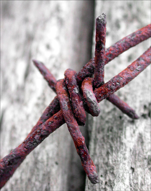
| Almost insect-like. Great macro; love the colors. |
|
| Photographer found comment helpful. |
|
|
05/11/2004 01:14:48 PM |
| Great focus! I also like the contrast between the subject and the background. |
|
| Photographer found comment helpful. |
|
|
05/10/2004 04:30:44 PM |
| The tilde kinda gives your identity away. its a nice photo tho. Well done. |
|
| Photographer found comment helpful. |
|
|
05/10/2004 07:37:16 AM |
| I like this, shows a lot of detail and character. |
|
| Photographer found comment helpful. |
|
|
05/09/2004 12:38:26 PM |
| Too bad, this could have been a very nice photo if you hadn't tampered with it so much. I'm rating down any photo that had been obviously digitally altered, as your had. |
|
|
|
05/09/2004 10:15:01 AM |
| great idea but the rust looks abnormally too red. |
|
|
|
05/09/2004 09:42:09 AM |
Composition: Subject Placement, Cropping, Background 7
Technical: Focus, Exposure, Lighting, Processing 8
Appeal: Is it Interesting, Motivating, Etc.? 4
How well does it meet the challenge: 10
Total Averaged Rating 7.25 Dick
|
|
| Photographer found comment helpful. |
|
|
05/08/2004 05:34:59 PM |
| Good overall, but I think the shot could be strengthened by pulling the wire away from the wood and adjusting the depth of field so that all of the barbs are in sharp focus and the wood is softly blurred. |
|
|
|
05/08/2004 05:27:34 PM |
I liked: your title, the composition, the power of the barbed wire junction, your excellent use of aperture and focus, the red rust, the quartz quality of the background.
I would have preferred greater complexity in the subject matter. There is not enough here to hold attention for long.
An 8. |
|
| Photographer found comment helpful. |
|
|
05/07/2004 09:46:23 PM |
|
| Photographer found comment helpful. |
|
|
05/07/2004 09:25:42 AM |
| Wow, was there really that much magenta in the rust or did you adjust the colors? |
|
| Photographer found comment helpful. |
|
|
05/07/2004 08:55:33 AM |
| Nice macro...great colors. 9 |
|
| Photographer found comment helpful. |
|
|
05/07/2004 08:47:29 AM |
Composition: Subject Placement, Cropping, Background 6
Technical: Focus, Exposure, Lighting, Processing 6
Appeal: Is it Interesting, Motivating, Etc. 5
How well does it meet the challenge: 7
Total Averaged Rating(Rounded) 6
|
|
| Photographer found comment helpful. |
|
|
05/07/2004 03:08:09 AM |
| This is typical of the sort of image I expected to see for the challenge and I think it's one of the most sucessful. The colours and focus are excellent. |
|
| Photographer found comment helpful. |
|
|
05/06/2004 10:30:44 PM |
| Very nice -- good use of Hue/Saturation. I like the extremely graphic quality. If it doesn't get hammered for "ooh, too photoshoppy", I'd expect to see this in the top 20. |
|
| Photographer found comment helpful. |
|
|
05/06/2004 10:14:50 PM |
|
| Photographer found comment helpful. |
|
|
05/06/2004 06:22:31 PM |
| Classic photo. I've seen some bleached wood out in the west that is very close to that shade of grey, which makes me wonder if this has been desaturated or if it really was that color. |
|
| Photographer found comment helpful. |
|
|
05/06/2004 03:56:06 PM |
| weird colors... should have kept it natural |
|
|
|
05/06/2004 01:38:15 PM |
|
| Photographer found comment helpful. |
|
|
05/06/2004 09:51:49 AM |
|
| Photographer found comment helpful. |
|
|
05/05/2004 04:09:31 PM |
| I like this one better than others I have looked at of the same type subject....composition is nice, and the blurred background brings focus to the main subject |
|
| Photographer found comment helpful. |
|
|
05/05/2004 01:10:55 PM |
| I like this picture,nice red color against the b&w background, would mabey have cropped a bit more of the top to have equally much space at the top and bottom (isnt very much though) Good luck :) |
|
| Photographer found comment helpful. |
|
|
05/05/2004 10:00:35 AM |
| This picture is, realy cool.. i think the colurs er awsome, and the backround is cool to |
|
| Photographer found comment helpful. |
|
|
05/05/2004 07:43:40 AM |
| Lol, nice title (if it was on purpose, I assume it was!) :P And nice photo!!! |
|
| Photographer found comment helpful. |
|
|
05/05/2004 02:53:21 AM |
| Nice composition and just the right amount of colour saturation |
|
| Photographer found comment helpful. |
Home -
Challenges -
Community -
League -
Photos -
Cameras -
Lenses -
Learn -
Help -
Terms of Use -
Privacy -
Top ^
DPChallenge, and website content and design, Copyright © 2001-2026 Challenging Technologies, LLC.
All digital photo copyrights belong to the photographers and may not be used without permission.
Current Server Time: 02/01/2026 11:58:30 AM EST.