| Author | Thread |
|
|
10/21/2002 01:07:00 AM |
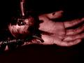
| I didn't have the time to vote on your photo in time, but I like it very much. The focus on the hand is great! I also like the colouring. But I have to admit that I don't get the connection to the challenge theme, too. It would be nice if you could explain it a little bit. |
|
Comments Made During the Challenge  |
|
|
10/20/2002 08:38:00 PM |
|
|
|
10/18/2002 04:28:00 PM |
| A fantastic image, and in another context I'd have rated it highly. But I looked at this for 2 whole minutes and couldn't figure out which Sin it was meant to be. Sorry. |
|
|
|
10/17/2002 09:47:00 PM |
| Normally love this type of photo but can't explain why this one turns me off other than not good focus and yellow not best choice of light |
|
|
|
10/17/2002 08:29:00 PM |
| the picture is great..good composition and use of color..but I don't get the message. |
|
|
|
10/17/2002 07:25:00 PM |
| The title is an important part of the work and besies: where is the sin? |
|
|
|
10/17/2002 03:28:00 PM |
Hmmm....I am sure you got this reaction alot. Nice idea.
Vote 7
Sonifo |
|
|
|
10/16/2002 05:40:00 PM |
| The lighting and the shadows in this photo make it very interesting. However, I'm not getting the message. Sorry. 6 nevertheless; mcrael |
|
|
|
10/16/2002 08:26:00 AM |
| Sin is not obvious here. Fails on topic. Might be a great shot. Topic and theme first. |
|
|
|
10/16/2002 05:16:00 AM |
| I'm not getting this one.. |
|
|
|
10/15/2002 03:38:00 PM |
| I doubt I am seeing exactly what you are saying, but it's obvious that you are saying something, and saying it well. The dark band in the upper left distracted me a bit, but this is a very well done entry :) ~ MyQyl ~ |
|
|
|
10/15/2002 03:12:00 PM |
|
|
|
10/15/2002 12:57:00 PM |
| Composition: Subject Placement, Cropping, Background 6 , Technical: Focus, Exposure, Lighting, Processing 4 , Appeal: Is it Interesting, Motivating, Etc.? 5 , Total Averaged Rating 5 . smshats |
|
|
|
10/14/2002 10:35:00 PM |
|
|
|
10/14/2002 10:16:00 PM |
| glad I had a second look... envy right? anyway anyway great shot.. might look better if the silloutte was crisper and blacker... maybe not.. either way I like it |
|
|
|
10/14/2002 08:59:00 PM |
|
|
|
10/14/2002 08:54:00 PM |
|
|
|
10/14/2002 06:20:00 PM |
| well u should of gave it a title it gives it more meaning, but i just get your picture |
|
|
|
10/14/2002 04:41:00 PM |
| I would prefer a title to help lead the veiwer in A direction with this photo. looks great but leaves me wondering what it has to do with the 7 sins |
|
|
|
10/14/2002 10:57:00 AM |
| don't understand which sin this picture is representing |
|
|
|
10/14/2002 08:46:00 AM |
| A very impressive shot! I like, that you didn't gave a title. So I have to think a litte more about it and I can get my own interpretation. -10 |
|
|
|
10/14/2002 04:25:00 AM |
| Fun shot. Good luck Justine |
|
|
|
10/14/2002 01:33:00 AM |
| I like this a LOT ! Shiiizzzam |
|
Home -
Challenges -
Community -
League -
Photos -
Cameras -
Lenses -
Learn -
Help -
Terms of Use -
Privacy -
Top ^
DPChallenge, and website content and design, Copyright © 2001-2026 Challenging Technologies, LLC.
All digital photo copyrights belong to the photographers and may not be used without permission.
Current Server Time: 02/01/2026 09:42:18 AM EST.