CRITIQUE CLUB CRITIQUE
by karmat
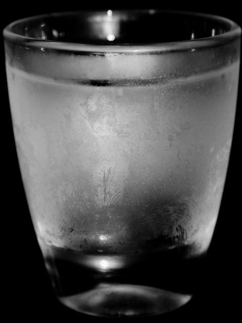
Overall, I think you have met the challenge in an obvious enough fashion. The visible thumprint is actually a neat touch (no pun intended) and adds a bit of interest and "story" to the shot. (again, no pun intended).
Compositionally, I like how it "fills" the frame, but it seems a bit static to me. There is really nowhere for the eyes to "go," or anything to see except the glass. As a result, the dpc voter probalby looked, said, "Cold glass," voted and moved on. Perhaps a more dramatic angle or perspective would have helped to add interest. As it is now, I feel like I am almost eye level with the glass, maybe a touch above, and while this is a natural viewing level, it doesn't add to the interest much at all. Also, the crop is just a touch off so it is not symmetrical, though it feels it should be.
technically, I think the bw is a good choice for this. the focus and exposure are very good.
Again, I think you had a good idea, and you executed it well, technically, but the composition leaves it a bit "ho-hum" and doesn't compel the viewer to stay with it long. |