| Author | Thread |
|
|
06/04/2008 09:35:04 AM |
CRITIQUE CLUB CRITIQUE
by karmat
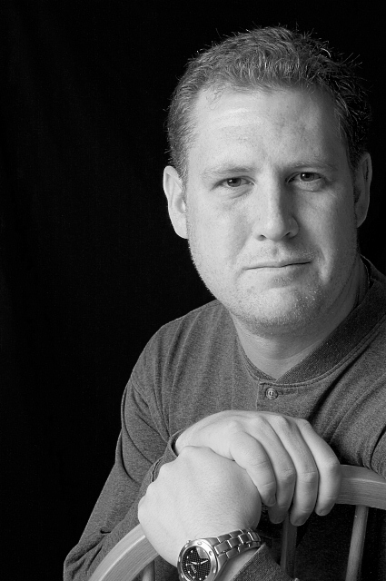
First off, this is a very strong portrait, that has a very nice, relaxed look to it.
Compositionally,I like the vertical orientation, but it feels a bit tight on the right. A wider crop would have made it feel less cramped, I think, and would have helped to counterbalance the good use of negative space.
Technically, exposure and focus are good on this shot. I see littlegett's comments about lighting, and while I wouldn't argue with them, I do like how the light "falls off" of through the frame. To me, it imitates natural light and also gives a bit of depth that even lighting and even "highlighting," sometimes doesn't do.
Overall, I think it is definitely an "above average" portrait.
Karma |
|
 Photographer found comment helpful. Photographer found comment helpful. |
|
|
06/03/2008 09:36:58 PM |
At for notice this is an extremely solid image. The tones are nice and even and the clarity is good. Since this is a nice strong piece, I do not have much to say on 'fixing' anything. So I will talk about what I would do differently to make it pop a bit more.
One aspect to really make the portrait stand out from the rest would be to use a rear light at 45 degrees to form a nice highlight line. This line should catch the side of the head down the jaw just a little and follow through the shoulder and arm. This is just a thin line of light that allows the subject to really break out away from the background and add a touch of depth.
A hair light on the dark side high above the models head and narrowed to just highlight the hair on that side I believe would also pop the subject forward.
I am guessing the basement window is what 'aided' the dark side of your face from going completely dark? I nice bounce would work there as well. I think if you used something to bounce, foam core or reflector it would create another shadow line that would add more depth and character to the model.
Last item is the watch seems to have caught a bit of light and the glare really draws the viewers eye down. A slight more angle or even removal of the watch may help.
Even though my ideas are not 'classic' portrait lighting technicals I think they may be fun even just to try out and see what happens. Just do not forget to baffle the rear light from spill and camera flare.
Overall this is a strong classical portrait. There does not seem to be a lot of 'wow' or 'pop' but most classic portraits don't. Very nice work with the single light.
Andrew |
|
| Photographer found comment helpful. |
Comments Made During the Challenge  |
|
|
06/03/2008 07:30:34 PM |
| Good, Strong Portrait! Simple & direct! Great Work! :) |
|
| Photographer found comment helpful. |
|
|
06/02/2008 06:27:59 AM |
| The rule of thirds is nicely applied here. |
|
| Photographer found comment helpful. |
|
|
05/28/2008 10:10:28 PM |
| Great Shot, Hope you do well! |
|
| Photographer found comment helpful. |
|
|
05/28/2008 04:55:18 PM |
| Nice comp, good shot. Would like to see more detail/character |
|
| Photographer found comment helpful. |
|
|
05/27/2008 10:52:50 PM |
| Good pose and composition. I'd like to see a version with more contrast in the subject (perhaps tweaking the grayscale conversion, also). |
|
| Photographer found comment helpful. |
|
|
05/27/2008 08:46:54 PM |
| nicely lit and composed. lose the watch next time - too distracting. |
|
| Photographer found comment helpful. |
Home -
Challenges -
Community -
League -
Photos -
Cameras -
Lenses -
Learn -
Help -
Terms of Use -
Privacy -
Top ^
DPChallenge, and website content and design, Copyright © 2001-2025 Challenging Technologies, LLC.
All digital photo copyrights belong to the photographers and may not be used without permission.
Current Server Time: 04/07/2025 04:42:46 AM EDT.