| Author | Thread |
Comments Made During the Challenge  |
|
|
04/04/2004 06:20:51 PM |
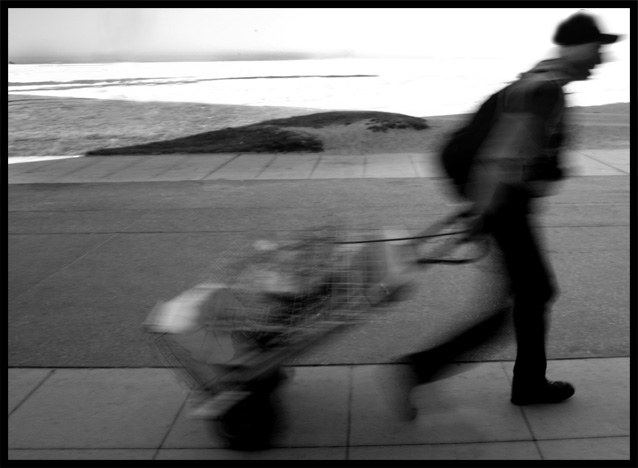
| Despite the blown out sky/sea in the background, this image has a quality that is very appealing. It reminds me of a Cartier-Bresson photo. Many people may say that the figure should be positioned facing inwards so that there is more space between him and the frame, but I like his positioning as he is seperated from the black object in the background. Good job on the blur as well. High score. |
|
|
|
03/31/2004 04:27:26 AM |
|
|
|
03/30/2004 12:55:05 PM |
| title, black and white, and motion blur fit well together. |
|
|
|
03/29/2004 02:55:16 PM |
| I like it - enough mystery to make it interesting - what's he pulling, where is he going, and so on. The blocked up composition against the side/ exiting the frame furthers that feel. Good entry (9) |
|
|
|
03/29/2004 01:51:44 PM |
| Great subject matter & composition |
|
|
|
03/29/2004 11:36:29 AM |
| The motion blur in this photo is nice. Compositionally, I would prefer some open space on the right side of the frame rather than the left. It would give the subject room to 'move' within the frame... = 7 |
|
|
|
03/29/2004 08:55:17 AM |
| Nice composition and there is something intriguing about the content. But it doesn't quite seem to be focused in those areas that aren't in motion - did you use a tripod? |
|
|
|
03/29/2004 05:59:03 AM |
| The background could be sharper, looks like its a bit moved as well. A tripod could have done the trick if it was not used. Good crop, I also like the head on the "overexposed" sky/sea. |
|
|
|
03/29/2004 02:57:03 AM |
| Fantastic composition... I don't know if it was intentional, but I like the burnt out highlights which contrast nicely with the subject's face. I'd have liked the background much more sharp though. This is just blurry enough to look unintentional. I like the fact that the subject is almost out of the frame. The sloping horizon works well. |
|
Home -
Challenges -
Community -
League -
Photos -
Cameras -
Lenses -
Learn -
Help -
Terms of Use -
Privacy -
Top ^
DPChallenge, and website content and design, Copyright © 2001-2026 Challenging Technologies, LLC.
All digital photo copyrights belong to the photographers and may not be used without permission.
Current Server Time: 02/01/2026 09:02:25 AM EST.