| Author | Thread |
|
|
04/16/2008 04:45:00 AM |
| hahaha vá hvað þessi er rosalega kúl! |
|
 Photographer found comment helpful. Photographer found comment helpful. |
|
|
03/27/2008 08:51:04 PM |
Oh wow this is fabulous!!! I really like it alot, colours are fantastic... minor thing is just that it seems slightly tilted =]
Still faving <3 |
|
| Photographer found comment helpful. |
Comments Made During the Challenge  |
|
|
03/25/2008 12:32:15 PM |
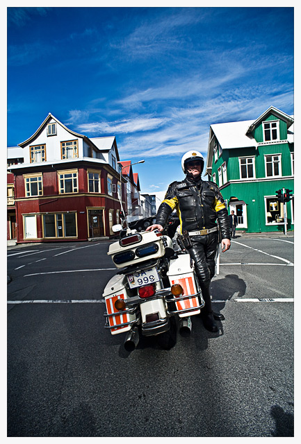
| So is he a Police Officer? Or just a rider? Hard to tell from the distance of the shot. Additionally, I don't think the houses add anything to this. Too many shadows in the face. |
|
| Photographer found comment helpful. |
|
|
03/25/2008 09:47:08 AM |
| Great perspective and posing... too bad about the shadow over his face though... maybe a different position for him might have helped. |
|
| Photographer found comment helpful. |
|
|
03/25/2008 09:32:18 AM |
| nice colors, my eyes went right to left untill it settle on the bike... |
|
| Photographer found comment helpful. |
|
|
03/24/2008 10:11:46 PM |
| very dramatic portrait! I love the colors and sharpness. |
|
| Photographer found comment helpful. |
|
|
03/24/2008 08:48:21 AM |
| Great shot and I like the angle of this one..... |
|
| Photographer found comment helpful. |
|
|
03/24/2008 01:22:38 AM |
| great shot. I like the location you chose with the contrasting color of houses. I actually think this might have worked nicely cropped in tighter as a horizontal. |
|
| Photographer found comment helpful. |
|
|
03/23/2008 09:06:13 PM |
| Skemmtileg mynd, lögreglumaðurinn er nokkuð vel staðsettur á myndinni og litskrúðug húsin koma vel út. Hefði helst, ef eitthvað er, viljað sjá lögreglumanninn aðeins neðar á myndinni svo himininn fengi betur að njóta sín, sömuleiðis eru skuggarnir aðeins að hrella þig. |
|
| Photographer found comment helpful. |
|
|
03/22/2008 07:04:12 PM |
| Stunning photo. It's like Diane Arbus meets the Village People. |
|
| Photographer found comment helpful. |
|
|
03/22/2008 06:38:43 PM |
| Excellent colors, DOF and POV. Would like it better if his face were more visible. |
|
| Photographer found comment helpful. |
|
|
03/21/2008 04:59:31 AM |
| nice colors, good POV and composition, except for the tilt. wish more of his face was visible |
|
| Photographer found comment helpful. |
|
|
03/20/2008 08:31:43 PM |
| Lovely colors, and great framing along the center axis. I really like this image. Some of the other very good portraits in this challenge dont have enough environment, this one suffers from too much environment, and almost no face or expression. While this framing makes it a very stong shot, it loses a point or so for not being as good a challenge entry as it does a composition. |
|
| Photographer found comment helpful. |
|
|
03/20/2008 05:00:18 PM |
| Nice shot but I'd say he's being upstaged by the sky and buildings. If I could see his eyes that might draw me in further and ignore the rest. |
|
| Photographer found comment helpful. |
|
|
03/20/2008 04:44:55 PM |
| Very impressive pose and great colors. I would have liked to see a little more face though. |
|
| Photographer found comment helpful. |
|
|
03/20/2008 11:44:49 AM |
| excellent use of wide angle, composition couldnt be better, colors are simply brilliant...my major concern is, where is the face? this could have been an easy 9 or 10 for me but giving you 6 |
|
| Photographer found comment helpful. |
|
|
03/20/2008 07:11:29 AM |
| the horizontal slant is a bit off putting |
|
| Photographer found comment helpful. |
|
|
03/19/2008 10:20:22 PM |
| Too much shadow in the wrong places. |
|
| Photographer found comment helpful. |
|
|
03/19/2008 08:30:21 PM |
| Great colors and contrast. I wish I could see his face a little better. Still a great shot. |
|
| Photographer found comment helpful. |
|
|
03/19/2008 06:11:53 PM |
| I really like this. Great contrast and colors, good composition, interesting subject. I sort of feel like his motorcycle should be facing the same direction he is, though. |
|
| Photographer found comment helpful. |
|
|
03/19/2008 05:27:05 PM |
| If you would have steped back a little more and got at least one complete house with him not so centered, would have worked for me |
|
| Photographer found comment helpful. |
|
|
03/19/2008 04:03:03 PM |
| He is a case where the "dave hill" type look actually works. The exaggerated colors of the sky and houses work well with his black suite. The processing and the composition is well done, although, either the photo needs to be rotated slightly or there is some barrel distortion in the lens. My only other gripe is that the shadow from his helmut almost doesn't make his face visible. However, the more I look at it and connect it to the title , I think that shadow might work, as it makes it as though this could be just a generic cop...either way, this gets a 7 from me |
|
| Photographer found comment helpful. |
|
|
03/19/2008 02:13:46 PM |
| Nice colours, it's a shame about the shadow over his face |
|
| Photographer found comment helpful. |
|
|
03/19/2008 01:20:47 PM |
| Great concept for this challenge, and the surroundings are spot on, but the shadow over his face hurts this image for me. |
|
| Photographer found comment helpful. |
|
|
03/19/2008 12:15:09 PM |
| nice colors:) though the shadows beneath doesn't work for me |
|
| Photographer found comment helpful. |
|
|
03/19/2008 11:20:55 AM |
| Nice placement and the clouds look awesome between the two homes. |
|
| Photographer found comment helpful. |
Home -
Challenges -
Community -
League -
Photos -
Cameras -
Lenses -
Learn -
Help -
Terms of Use -
Privacy -
Top ^
DPChallenge, and website content and design, Copyright © 2001-2026 Challenging Technologies, LLC.
All digital photo copyrights belong to the photographers and may not be used without permission.
Current Server Time: 02/01/2026 08:30:29 AM EST.