| Author | Thread |
|
|
04/04/2004 07:48:13 PM |
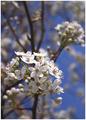
Critique Club:
You have a nice shot here. I wonder how it would look if you shot not only in portrait mode, but also either at a time of day with lower sun, or some how positioning yourself differently to bring the tree more into the shot. Right now the tree seems to be more of a distraction than an addition. I think it may be due to the bushes clutter behind it on the right. It doesn't look so solitary out there. Your saturation is strong on this shot. Did you up that?
Shooting at this time of day can be tough. you did a fine job of portraying the landscape, I just think it'd be stronger with it composed differently to help bring the tree in, or out all together.
-danny |
|
Comments Made During the Challenge  |
|
|
03/26/2004 11:50:20 AM |
|
 Photographer found comment helpful. Photographer found comment helpful. |
|
|
03/26/2004 07:52:35 AM |
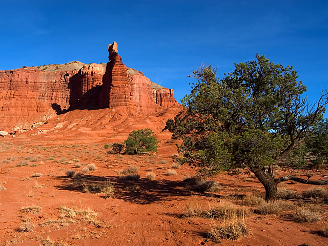
| Wow! excellent color contrast and light, 10 here. |
|
| Photographer found comment helpful. |
|
|
03/25/2004 10:35:24 AM |
| I think you will get some critics saying get rid of the tree. lovely picture. |
|
| Photographer found comment helpful. |
|
|
03/23/2004 01:24:34 AM |
| Great composition and color |
|
| Photographer found comment helpful. |
|
|
03/23/2004 12:08:26 AM |
(I'm writing this to everyone who submitted a landscape shot) The challenge was to produce a shot worthy of a magazine cover but to me a shot like this is not suitable to be put on a "portrait" format magazine.
Beautiful colours though
---ADDITIONAL---
Due to forum discussions and accusations that marking landscapes down is nitpicking, I'm going through them and remarking. I still think some of the landscapes would not make good covers because of their orientation but I am no longer marking down because of that.
I still think landscape is inapropriate for the majority of magazines but I'll give the benefit of the doubt to the photographers. |
|
| Photographer found comment helpful. |
|
|
03/22/2004 10:15:29 PM |
| Colours are just great, this is definately eye catching enough to be on any outdoor magazine. I think for this challenge the picture needs to be portrait - 8 |
|
| Photographer found comment helpful. |
|
|
03/22/2004 08:45:18 PM |
| Wonderful shot, great vivid colors, the sky is outstanding and the color of the dirt is also amazing, this is very good. 10 |
|
| Photographer found comment helpful. |
|
|
03/22/2004 06:58:09 PM |
| great colours here. very nice shot. |
|
| Photographer found comment helpful. |
|
|
03/22/2004 12:17:27 PM |
| Hmmmmm. Looks a lot like Central/Southern Utah, or perhaps Colorado; like maybe Capital Reef National Park. Nice colors, cool shot. |
|
| Photographer found comment helpful. |
|
|
03/22/2004 05:15:29 AM |
| Wow! Love the colors and clarity here. |
|
| Photographer found comment helpful. |
|
|
03/22/2004 04:51:05 AM |
| Rich colors. The blue sky is a key factor in this shot. Nicely done. |
|
| Photographer found comment helpful. |
|
|
03/22/2004 02:32:50 AM |
| Nice idea, but how many magazine covers use the landscape format? Excellent color and sharpness. |
|
| Photographer found comment helpful. |
|
|
03/21/2004 10:11:12 PM |
| The title is a little cliche, but still good. I like the vividness of this photo, how the greens, oranges, and blues contrast with one another. |
|
| Photographer found comment helpful. |
|
|
03/21/2004 07:52:32 PM |
| gorgeous red rock and blue sky. |
|
| Photographer found comment helpful. |
|
|
03/21/2004 07:22:41 PM |
| Wow! This is an awesome shot. This is top quality and pitch perfect. I'm going to give you a high mark; however, you may find others will mark you down for having a horizontally cropped image instead of a vertically cropped image. IT seemed to be an issue in the last magazine challenge. |
|
| Photographer found comment helpful. |
Home -
Challenges -
Community -
League -
Photos -
Cameras -
Lenses -
Learn -
Help -
Terms of Use -
Privacy -
Top ^
DPChallenge, and website content and design, Copyright © 2001-2025 Challenging Technologies, LLC.
All digital photo copyrights belong to the photographers and may not be used without permission.
Current Server Time: 04/07/2025 02:21:11 PM EDT.