| Author | Thread |
|
|
03/27/2008 01:40:22 PM |
CRITIQUE CLUB CRITIQUE
by karmat
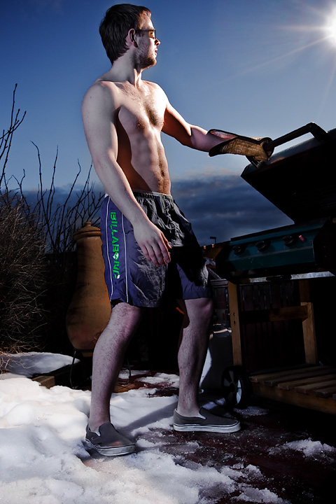
Interesting idea. I remember coming across it when voting and thinking "swimming trunks?"
Compositionally, it feels a little tight at the top. There is a comfortable amount of space under your feet, but just a sliver at the top. This, to me, makes it feel a bit unbalanced and top heavy.
Technically, the exposure is good, the focus is good, and the two different colors of flash was a good idea. However, the "sunshine" flash looks like a flash, and the "cold" flash causes some shadows that take away from the authentic look.
Again, it is a great take on the challenge, I think it just has a couple of minor nitpicks in the execution that hurt you. |
|
Comments Made During the Challenge  |
|
|
03/23/2008 01:57:14 PM |
| Spotted this in my initial scan of all the entries - couldn't wait to see the full size version during my vote. Excellent lighting choices here - I like this a lot. |
|
|
|
03/23/2008 03:34:16 AM |
| The white balance seems off. |
|
|
|
03/22/2008 05:02:17 PM |
| Great use of the light, maybe cropped to tight at the top. |
|
|
|
03/19/2008 01:30:27 AM |
|
|
|
03/18/2008 09:38:48 PM |
Eh, He's wearing a glove!
The close crop on top seems odd. The lighting in the upper half of the image is great. |
|
 Photographer found comment helpful. Photographer found comment helpful. |
|
|
03/18/2008 04:59:33 PM |
| clever idea, clear and focused image |
|
|
|
03/18/2008 04:08:04 PM |
| you did not go all the way in executing your concept. you should not have shoes and gloves on. |
|
| Photographer found comment helpful. |
|
|
03/18/2008 12:22:30 PM |
| Great lighting, only nit-pick would be that it is cropped a bit tight at the top which is a focus area of the image. |
|
| Photographer found comment helpful. |
|
|
03/17/2008 06:40:41 PM |
| This is funny, the lighting is neat, focus is great, but there should be more head room, nice challenge take, 7. |
|
| Photographer found comment helpful. |