| Author | Thread |
Comments Made During the Challenge  |
|
|
03/28/2004 06:04:17 PM |
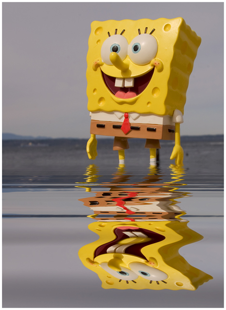
| Gotta love Spongebob! This looks more like digital art (not that i have a problem with that), but it is very well done, and interesting.9 |
|
 Photographer found comment helpful. Photographer found comment helpful. |
|
|
03/28/2004 01:24:52 PM |
| Very nice. Great composition |
|
| Photographer found comment helpful. |
|
|
03/26/2004 11:11:43 PM |
| Clever- very nicely done. |
|
| Photographer found comment helpful. |
|
|
03/26/2004 03:30:37 PM |
| Cool Spongebob shot. Love the reflection in the water. Clean and crisp too. What's that dark spot by Spngebob's left hand? Camera must have been reeeeaaal close to the water. Your are braver than I am. I'd be too scared to drop it of get it splashed. AMong my top 5. |
|
| Photographer found comment helpful. |
|
|
03/26/2004 12:57:05 PM |
| Nice sharp image, the reflection and composition really makes this picture. |
|
| Photographer found comment helpful. |
|
|
03/26/2004 12:20:27 PM |
| cute idea and nice shot but Sponge B color looks so flat due to the lighting |
|
| Photographer found comment helpful. |
|
|
03/25/2004 11:22:57 PM |
|
| Photographer found comment helpful. |
|
|
03/25/2004 07:06:35 PM |
| The grey really takes away from the bright fun spongebob. I would have taken this on a brighter day or used a fake water pool at home with a blue backdrop. |
|
| Photographer found comment helpful. |
|
|
03/25/2004 03:25:22 PM |
I think I am looking at a ribbon here
Brilliant and well executed. 10 |
|
| Photographer found comment helpful. |
|
|
03/25/2004 11:06:25 AM |
| I think the overall gloominess of the picture detracts from what I get from you intent. When I think of Nickelodeon or cartoons, I think of childhood/happiness/bright. The background really clashes with this emotion. If it would have been blue skies with some white puffy clouds thrown in, I think it would be a much stronger picture. The composition is really good and I really like the idea though. Maybe could have tweaked the levels a little to bring out more color on SpongeBob as well. Good luck! |
|
| Photographer found comment helpful. |
|
|
03/25/2004 11:01:35 AM |
| this is a bit to well done a photograph to be on nick's magazine, but i like it |
|
| Photographer found comment helpful. |
|
|
03/24/2004 07:44:44 PM |
Like the idea, love the crazy reflection. Needs an off-center horizon, and just a little interest in the background, e.g. an OOF beach umbrella.
Colors are flat & drab, needs to be "punched up" by increasing contrast, pulling in black point, increasing saturation slightly & getting rid of the yellow cast. |
|
| Photographer found comment helpful. |
|
|
03/24/2004 10:00:59 AM |
| Great subject, I like the reflection. The composition could be improved by not dividing your photo into two vertical halves, it's a bit of a cliche but I think that rule of thirds could have helped you here.Your subject needs more negative space to look into... I think you should have stepped back and allowed more space in the left side of the frame. I also feel that the colours are not saturated enough. The background definitely seems too grey. There is an unfortunate glare in the top-right corner of your subject which detracts a little. |
|
| Photographer found comment helpful. |
|
|
03/23/2004 02:36:27 PM |
I would definitely see this on a magazine. Beautiful reflection, makes it unique.
Good luck... |
|
| Photographer found comment helpful. |
|
|
03/22/2004 08:34:41 PM |
| Made me laugh. The only thing that brought you down was the unhappy feel of the sky and background, it does not contrast well to me. 8. |
|
| Photographer found comment helpful. |
|
|
03/22/2004 07:16:27 PM |
| My kids love this one. Good job |
|
| Photographer found comment helpful. |
|
|
03/22/2004 06:58:55 PM |
|
| Photographer found comment helpful. |
|
|
03/22/2004 03:42:57 PM |
|
| Photographer found comment helpful. |
|
|
03/22/2004 03:28:30 PM |
|
| Photographer found comment helpful. |
|
|
03/22/2004 03:14:21 PM |
| nice shot and treatment. i'm not entirely sure it would go on the cover of Nic magazine but i gave you high marks for technical merit and creativity. |
|
| Photographer found comment helpful. |
|
|
03/22/2004 08:52:13 AM |
| Very cerative and excellent use of reflection. The colors don't seem quite right, but its still a good photo. |
|
| Photographer found comment helpful. |
|
|
03/22/2004 08:46:09 AM |
| You may get nixed for the photoshop generated reflection but this is a clever concept. |
|
| Photographer found comment helpful. |
|
|
03/22/2004 07:49:06 AM |
| Hilarious! Great color, great compositon... ribbon worthy. |
|
| Photographer found comment helpful. |
|
|
03/22/2004 06:19:12 AM |
| Very fitting..hope this does well. |
|
| Photographer found comment helpful. |
|
|
03/22/2004 12:48:54 AM |
|
| Photographer found comment helpful. |
|
|
03/22/2004 12:46:32 AM |
| the 'water' looks really unnatural, like it is just a filter or something. |
|
| Photographer found comment helpful. |
|
|
03/22/2004 12:41:39 AM |
|
| Photographer found comment helpful. |
Home -
Challenges -
Community -
League -
Photos -
Cameras -
Lenses -
Learn -
Help -
Terms of Use -
Privacy -
Top ^
DPChallenge, and website content and design, Copyright © 2001-2026 Challenging Technologies, LLC.
All digital photo copyrights belong to the photographers and may not be used without permission.
Current Server Time: 02/01/2026 11:02:08 AM EST.