| Author | Thread |
Comments Made During the Challenge  |
|
|
04/07/2002 11:32:00 AM |
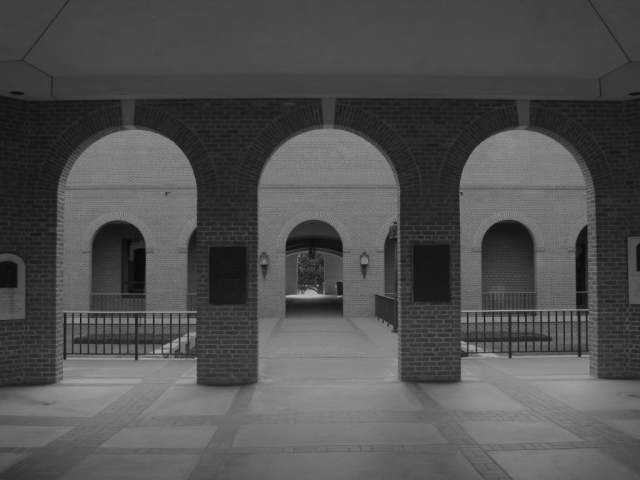
This had potential - but -
Symmetry or not? Too noncommital as far as viewpoint goes.
Needs levels adjustment real bad. |
|
|
|
04/07/2002 08:23:00 AM |
| Tones a little flat - I see the shapes more than the light. Good one, though. |
|
|
|
04/06/2002 07:49:00 PM |
| Sort of static-- not real interesting from this angle. |
|
|
|
04/05/2002 02:57:00 PM |
|
|
|
04/04/2002 03:59:00 PM |
| Cool! This looks like something I've seen in a movie. I like the lighting. |
|
|
|
04/03/2002 09:13:00 AM |
| interesting but needs more contrast |
|
|
|
04/02/2002 11:04:00 PM |
| no contrast, look kind of flat |
|
|
|
04/02/2002 02:56:00 PM |
| Seems a little under-exposed to me. |
|
|
|
04/02/2002 12:13:00 PM |
| great set up; a bit hazy and dark |
|
|
|
04/02/2002 11:53:00 AM |
| love the symmetry you were able to capture here. |
|
|
|
04/02/2002 07:58:00 AM |
| unfortunately you didn't see the correct contrast. No real blacks and definitely no whites. My photo teacher in college would of killed me for this one. |
|
|
|
04/02/2002 07:06:00 AM |
| Slight centering problem, but for the most part it's a good image. |
|
|
|
04/02/2002 04:10:00 AM |
| Could have been a little clearer and some more contrast would have been nice |
|
|
|
04/01/2002 10:20:00 PM |
| needs to be a little lighter ... its all grey, no real whites. The trick with b&w is to have true white and true black in the photograph. The symetry of the composition is nice! |
|
|
|
04/01/2002 10:10:00 PM |
| a little too dark for me, and I would have moved about one step to the right to get a little better symmetry with the light sconces on the wall. Good try! |
|
|
|
04/01/2002 06:25:00 PM |
| Very good composition -- the pattern of repeating shapes really draws you in. Slightly tilted to the left, though. |
|
|
|
04/01/2002 03:08:00 PM |
| Was this shot black and white, or was it done in very very low light w/ an odd white balance? If the former, it would benefit from increased contrast (preferably when the shot was taken, so the "light" would be more visible and clearer), if the later than it would have been better to go with full color, or at least more color than you have... |
|
|
|
04/01/2002 02:10:00 PM |
| kind of boaring and you can't really see whats going on down by the light |
|
|
|
04/01/2002 12:27:00 PM |
| I love the composition but it seems flat overall. |
|
|
|
04/01/2002 11:10:00 AM |
| not enough contrast. no true blacks and whites. just varying greys. not a bad idea. |
|
|
|
04/01/2002 10:39:00 AM |
|
|
|
04/01/2002 10:21:00 AM |
|
|
|
04/01/2002 07:15:00 AM |
| nice pic. might want to increase the contrast tho. altho in retro, i like the delicate lighting ... |
|
|
|
04/01/2002 01:16:00 AM |
| try extra hard to be *perfectly* symmetrical for something like this, I think it would help. |
|
Home -
Challenges -
Community -
League -
Photos -
Cameras -
Lenses -
Learn -
Help -
Terms of Use -
Privacy -
Top ^
DPChallenge, and website content and design, Copyright © 2001-2026 Challenging Technologies, LLC.
All digital photo copyrights belong to the photographers and may not be used without permission.
Current Server Time: 02/01/2026 11:05:05 AM EST.