| Author | Thread |
Comments Made During the Challenge  |
|
|
02/29/2004 03:21:55 PM |
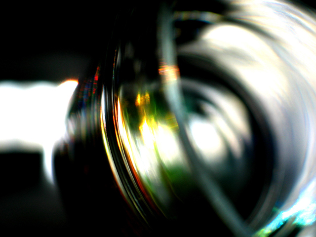
| Great colors in the reflections in the glass. Interesting blend of different hues. Very artistic composition. |
|
|
|
02/29/2004 01:15:59 PM |
| Nice abstract. Didn't know what it was until I read the title but even then still couldn't make it out. It's artistic. For me the blur and the overexposed highlights are elements that make this photo interesting. 8 |
|
 Photographer found comment helpful. Photographer found comment helpful. |
|
|
02/29/2004 05:22:32 AM |
| All a blur....like the lighting highlights. |
|
|
|
02/28/2004 08:42:16 PM |
| i wish i could see it in focus to realize its mundane qualities...it is still an interesting image though |
|
|
|
02/28/2004 06:20:48 PM |
| After your drunk? The picture escapes me. Sorry |
|
|
|
02/28/2004 07:40:58 AM |
| Nope ... can't quite tell what it is w/o title. |
|
|
|
02/26/2004 03:57:23 AM |
Interesting idea, nice colors. IMHO the shallow DOF makes it very difficult to really appreciate it.
Message edited by author 2004-03-01 00:27:24. |
|
|
|
02/26/2004 02:32:56 AM |
| I take it that the blur is to reflect the dizziness caused by the drink. Not a capturing image, though. |
|
|
|
02/24/2004 02:33:17 PM |
| A beautiful abstract; very nicely done. |
|
| Photographer found comment helpful. |
|
|
02/24/2004 11:06:13 AM |
|
|
|
02/23/2004 04:18:03 AM |
| I understand it, just not my style. I do like the color. |
|
|
|
02/22/2004 10:43:46 PM |
| I like the colors here, but the framing is a little bland. I would have tried moving the red/orange areas up and left by 10% or so, pulling the blue/green out of the corner and into a stronger position in the picture. |
|
| Photographer found comment helpful. |
Home -
Challenges -
Community -
League -
Photos -
Cameras -
Lenses -
Learn -
Help -
Terms of Use -
Privacy -
Top ^
DPChallenge, and website content and design, Copyright © 2001-2025 Challenging Technologies, LLC.
All digital photo copyrights belong to the photographers and may not be used without permission.
Current Server Time: 04/07/2025 12:50:21 PM EDT.