| Author | Thread |
|
|
03/03/2004 11:04:31 AM |
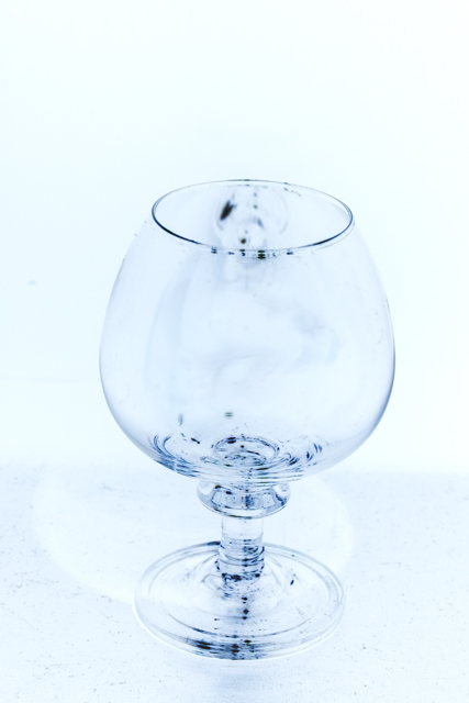
From the critique club: What you're trying to achieve is so subtle that small faults grow out of proportion perhaps... there is a nice rythm in the shapes and the subtle colors are great. But, the small imperfections in the glass look more like specks of dirt once inverted. Also, my eye yearns for more sharpness where the glass takes shape - at the rim, the foot, and the curvature. The shadow and the framing work well.
You may already do this but I'll mention it anyway, just in case you haven't tried it yet. I highly recommend using a filter and then making small adjustments with other tools to create a finished product which is more unique and less dependent on the filter. For example, most filters over-soften or over-sharpen an image as a whole so you can go back in after using the filter to sharpen or soften details and it will sometimes make the result even stronger. |
|
Comments Made During the Challenge  |
|
|
02/29/2004 04:48:15 PM |
| Interesting shot, nice texture and negative effect. |
|
|
|
02/28/2004 08:47:02 PM |
| i like this shot, the image is a little too high constrast. I don't find this beautiful glass to have any mundane characteristics though. |
|
|
|
02/28/2004 02:16:13 PM |
| It looks tilted to the right a little. |
|
|
|
02/28/2004 10:21:18 AM |
| I am not happy with the composition on this....perhaps the subject might have been place down and right a bit more to provide a better angle on the shadow which seems obscured as is. Like the hi key effort. |
|
|
|
02/28/2004 08:38:16 AM |
| Not quite. Needs more depth of field and contrast and tighter crop. |
|
|
|
02/27/2004 11:31:50 AM |
| is your glass dirty?? what are the dark spots? ImhO they destroy the potential of this photo. Also a better contrast between the glass and the background may have help give impact. |
|
|
|
02/26/2004 08:00:50 AM |
| I like the color. Is it a negative? It would be a good attempt but the black spots make it look dirty. Sorry. |
|
|
|
02/25/2004 05:52:28 AM |
| I think this shot would have benefitted from having the subject more perfectly centered. |
|
|
|
02/24/2004 02:12:19 AM |
| blue cast makes raises this from the mundane - would like to see it level and a more gradual fade (dark to light) from bottom to top. |
|
Home -
Challenges -
Community -
League -
Photos -
Cameras -
Lenses -
Learn -
Help -
Terms of Use -
Privacy -
Top ^
DPChallenge, and website content and design, Copyright © 2001-2025 Challenging Technologies, LLC.
All digital photo copyrights belong to the photographers and may not be used without permission.
Current Server Time: 04/07/2025 12:51:23 PM EDT.