| Author | Thread |
Comments Made During the Challenge  |
|
|
09/22/2002 11:31:00 PM |
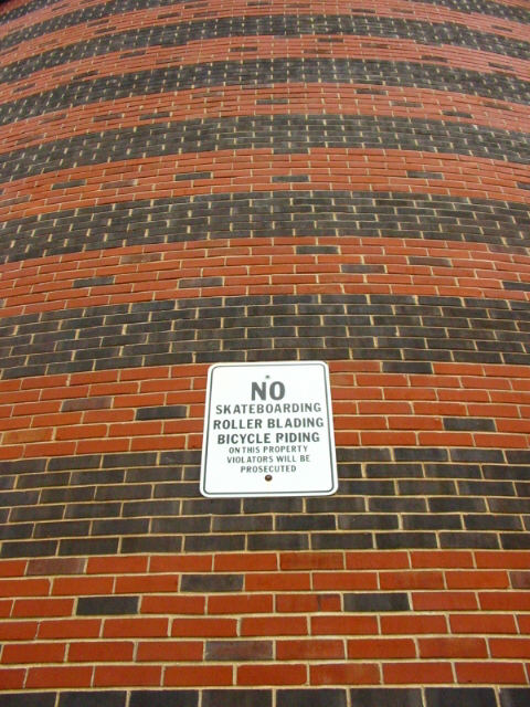
| very nice symetry. use of neg space is clear, and pretty cool. looks like a hard shot to get lined up. was it the angle, or was the wall curved? anyway, I really like it, and your lighting, and framing, and focus is great. good luck in the challenge. ~hbunch7187~ |
|
|
|
09/22/2002 08:37:00 PM |
Very cool!
To good to be real. |
|
|
|
09/22/2002 09:40:00 AM |
| I like the repitition effect. Nice pic |
|
|
|
09/21/2002 06:10:00 PM |
| Focus is a tad soft on the sign, but the wall idea is solid. 6 |
|
|
|
09/20/2002 03:27:00 PM |
| not sure of use of neg space... |
|
|
|
09/20/2002 12:04:00 PM |
| Apologies for not leaving a proper comment. Please email me if you'd really like one. I’ve voted this image a 6. Kavey |
|
|
|
09/19/2002 12:24:00 PM |
| the curvature of the wall, however it was achieved... whether by lens or if the wall is actually curved, really make this shot. i didn't catch it at first, but if i scroll up and down it using my mouse wheel it seems to "breathe." great use of negative space. (8) ~mcmurma |
|
|
|
09/19/2002 10:38:00 AM |
| Interesting shot... My comment here is regarding the negative space... The wall here being considered negative space is ok, but the support it lends to the sign as the subject isn't what I expected. IMO, negative space should not draw any attention away from your subject... it should support it. In this photo, the wall offers a lot of contrast with the lines, colors, and textures. IMO, this creates competition for viewing time with the subject... - jmsetzler |
|
|
|
09/19/2002 08:04:00 AM |
| great idea, great color...I'm only giving this shot a 7 because of the competition, although originally I had it as an 8. Wish the sign was more in focus. - zadore |
|
|
|
09/18/2002 08:03:00 PM |
| perfect because the subject and the space are having a conversation, ten. |
|
|
|
09/18/2002 06:53:00 PM |
|
|
|
09/17/2002 05:42:00 AM |
| Great shot! Nice color and concept. Cool background, not too busy and it enhances the subject. wtg |
|
|
|
09/17/2002 12:14:00 AM |
|
|
|
09/16/2002 10:39:00 PM |
|
|
|
09/16/2002 08:05:00 PM |
| if you scroll up and down really fast it does weird things to your eyes. |
|
|
|
09/16/2002 06:11:00 PM |
| nice use of - space. cool! :) |
|
|
|
09/16/2002 04:04:00 PM |
| Meets this difficult challenge. Congrats! Not everyone did. Good luck in the challenge. Grayce aka Gracious |
|
|
|
09/16/2002 03:23:00 PM |
| beautiful masonry....... and i disagree with the title - not a nice wall for a sign. The sign is grafitti. |
|
|
|
09/16/2002 03:11:00 PM |
| Great angle. Shows that there is a good shot if you just look for it. Well Done. 8-Martin. |
|
|
|
09/16/2002 03:04:00 PM |
| Amazing brick work! Fine work, good luck. Score 7 Justine |
|
|
|
09/16/2002 07:00:00 AM |
Composition: too central too much wall 4
Lighting: good 5,
Appeal: 5, Total Rating 5 Sulamk
|
|
|
|
09/16/2002 01:37:00 AM |
| I like the angle that you took this shot. I looks like a tall building. Kinda round too. Good detail and colors. 8 |
|
Home -
Challenges -
Community -
League -
Photos -
Cameras -
Lenses -
Learn -
Help -
Terms of Use -
Privacy -
Top ^
DPChallenge, and website content and design, Copyright © 2001-2026 Challenging Technologies, LLC.
All digital photo copyrights belong to the photographers and may not be used without permission.
Current Server Time: 02/01/2026 10:02:08 AM EST.